Nasl Z
A playful visual identity connecting computer-game competition with the shared energy of Nasl Z, a television reality show for young viewers.
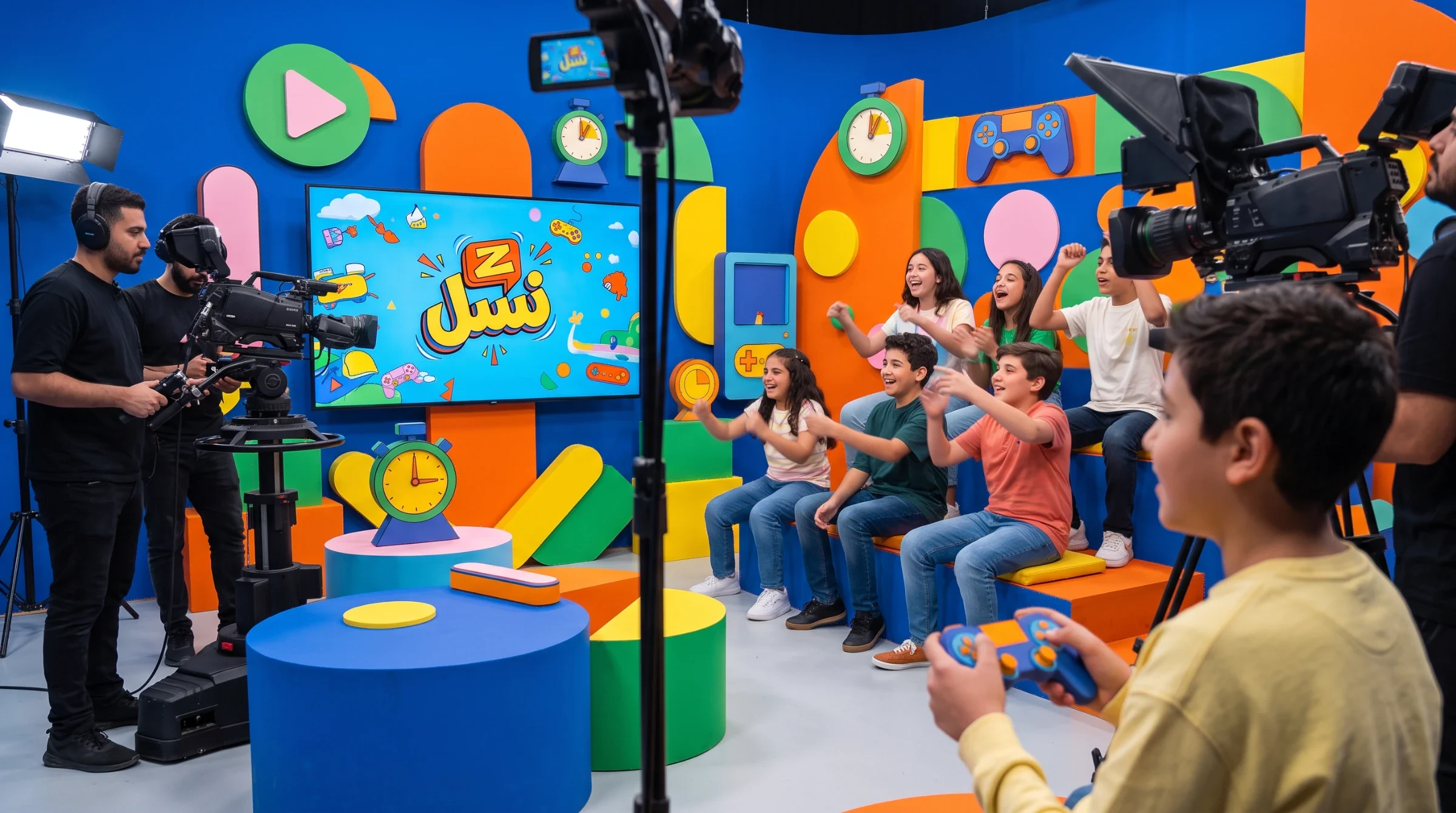
Nasl Z is a television competition and gaming-based reality show broadcast on a children’s channel via Hot Bird. It brings computer-game competition into a shared television experience for young viewers.
Give a gaming-based television competition a recognisable identity that carries excitement across programme graphics, studio environments and crew applications, while keeping the show name clear within a busy visual world.
Visual identity and brand application design
Persian-led logo, colour and graphic language, display typography treatments, studio and wayfinding visualisations, crew apparel and accessory applications.
A connected identity system built around the Nasl Z name, gaming symbols and a bright palette, demonstrated across graphic materials, studio visualisations and crew applications.
Design: Ali Komeili / Desartly.
Gaming becomes a shared spectacle
Nasl Z brings computer-game competition into a television reality-show format, broadcast on a children’s channel via Hot Bird. The identity positions the programme where gaming culture meets entertainment: players take part, while viewers follow the competition from outside the game. Its visual language needs to carry that shared excitement beyond an individual game title.
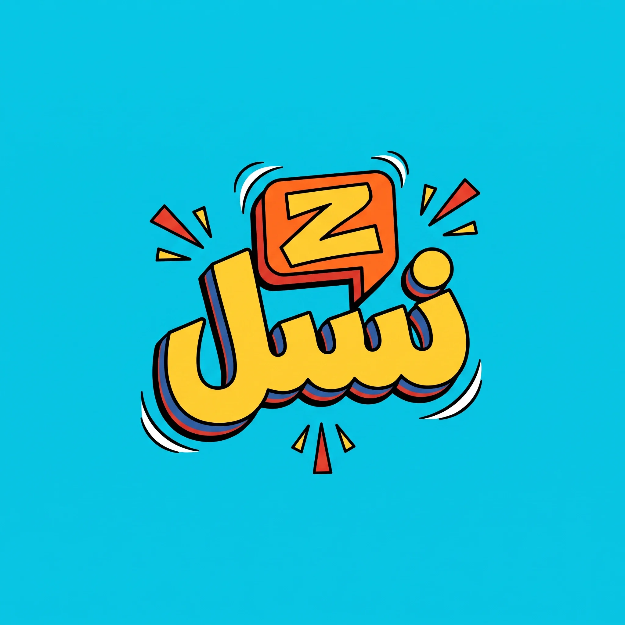
The show name leads the game
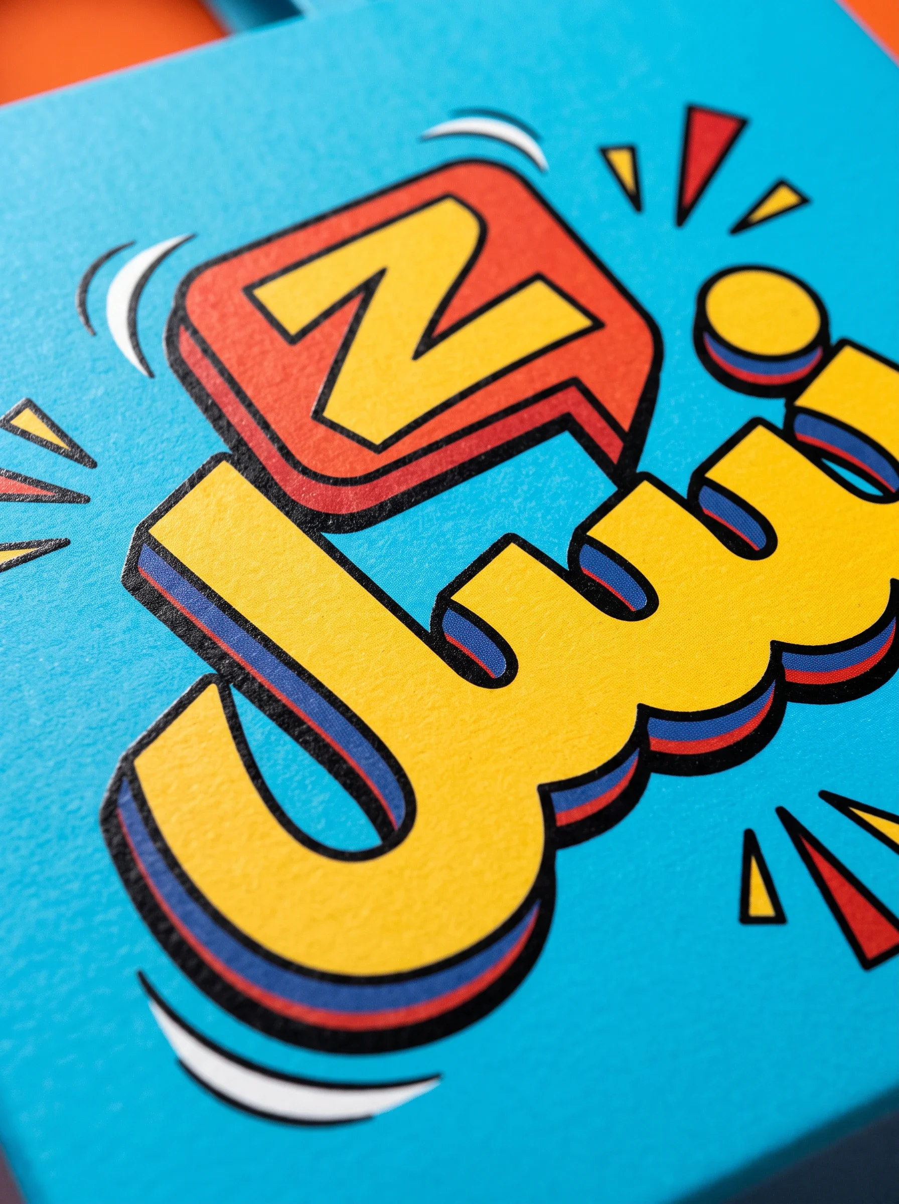
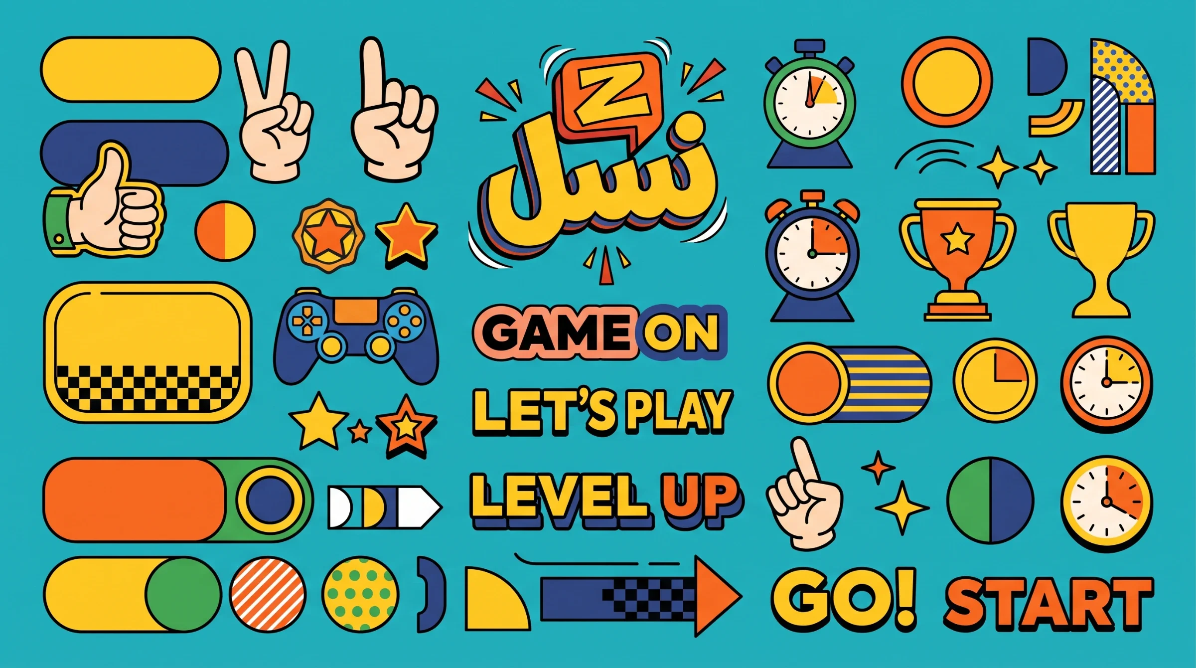
The Persian lettering anchors the identity in the programme’s name. An orange Z sits above the rounded yellow letters like a game tile, with dark outlines and offset shadows giving the mark depth. Small bursts and loose accents extend the energy around it without replacing the name as the focal point.
Competition supplies the visual vocabulary
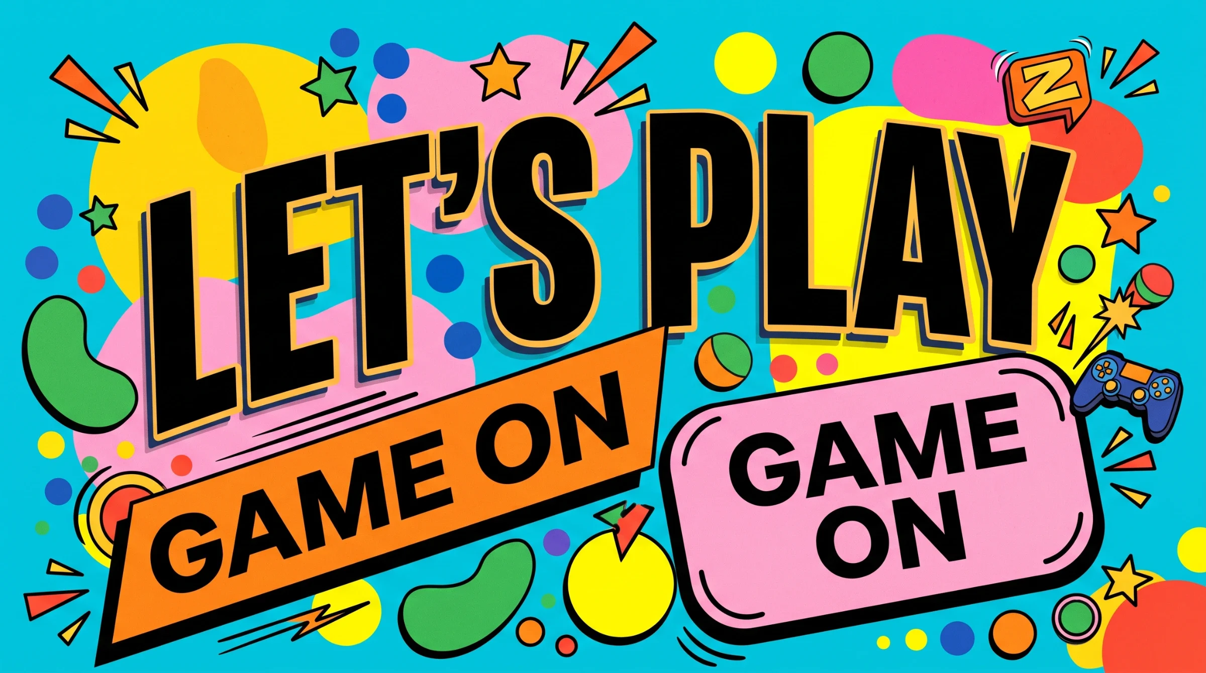
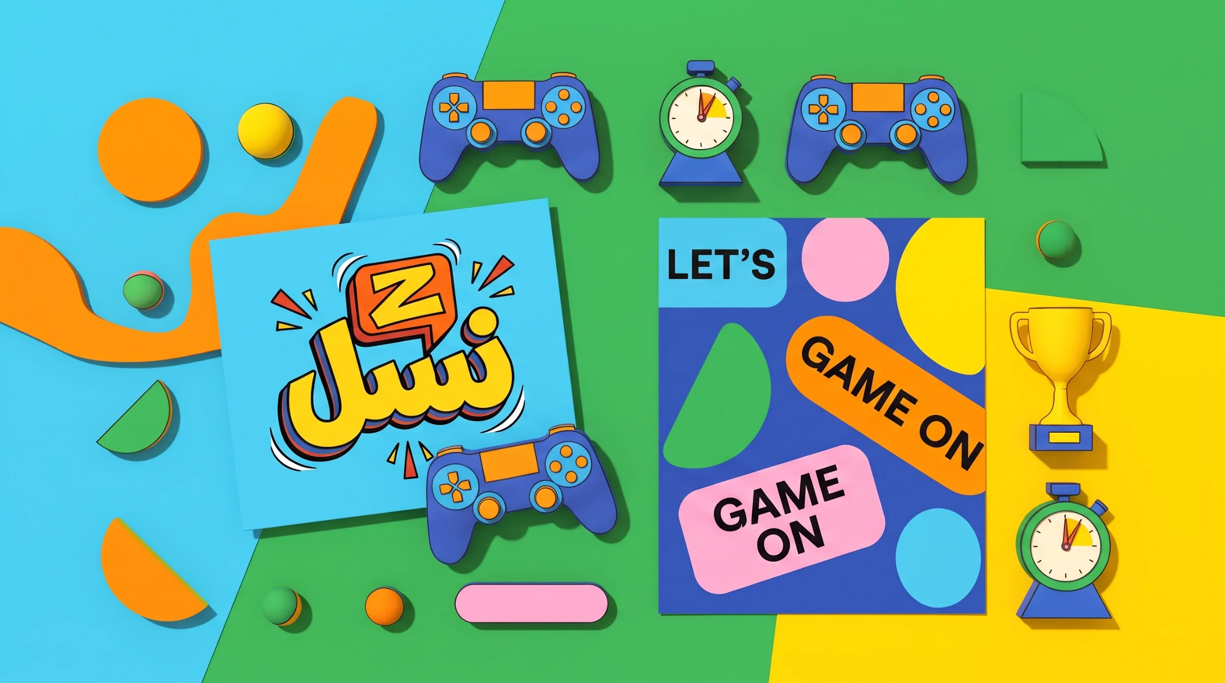
Controllers, stopwatches, trophies and hand gestures turn the format into a reusable graphic vocabulary. Cyan provides a common ground; yellow and orange bring emphasis, while green, blue and pink widen the combinations. Rounded panels hold short prompts such as “Game on” and “Level up”, keeping the tone direct, playful and familiar to a gaming audience.
Build a world around the players
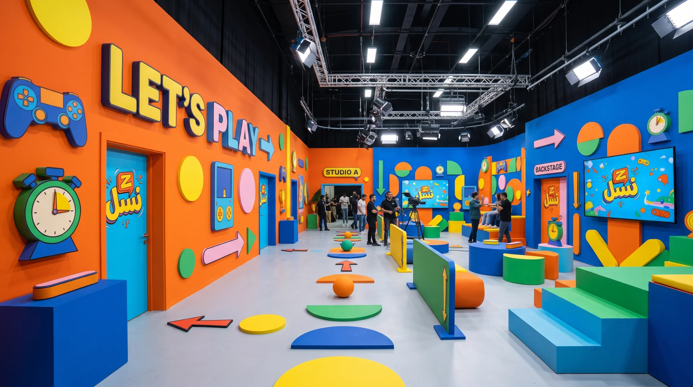
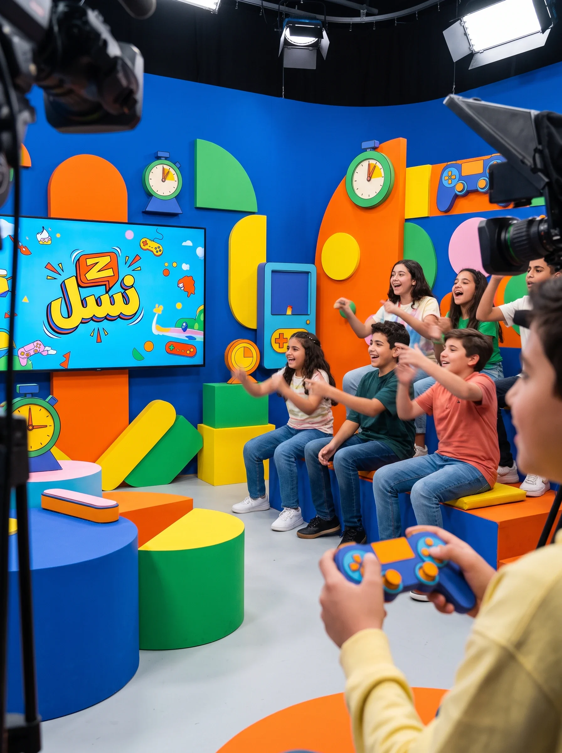
In the studio visualisations, the same panels and symbols move from flat artwork onto walls, screens and seating. Large fields of colour establish the scene, while the repeated mark ties different camera views together. Wayfinding carries the game vocabulary into the surrounding space, extending the programme’s character beyond the central playing area.
Carry the identity behind the scenes
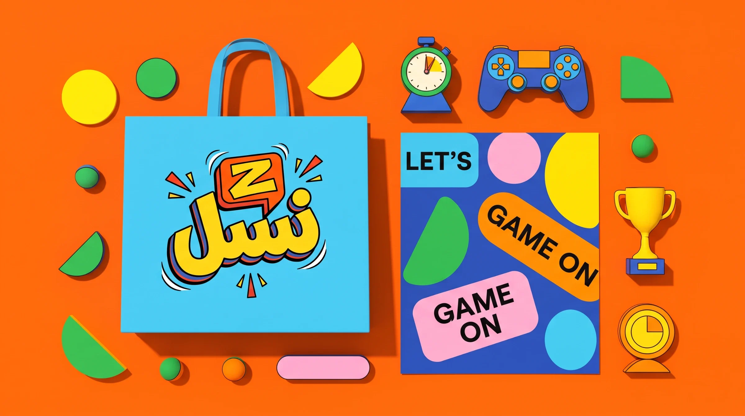
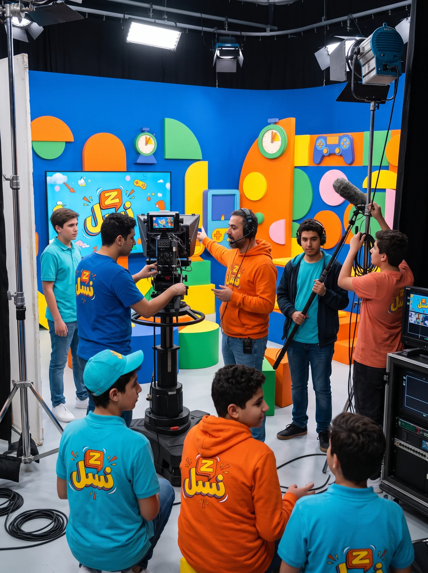
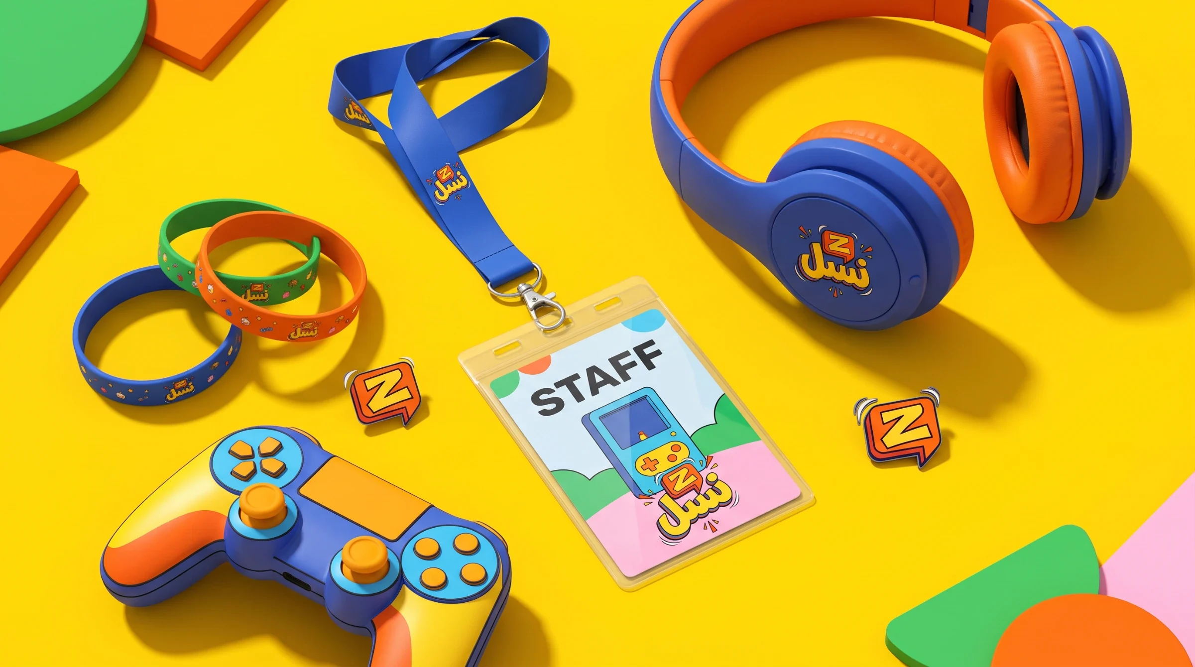
Crew clothing and accessories use the same palette and mark at a smaller scale. The apparel views favour broad colour areas and compact logo placement, while passes and lanyards translate the system into everyday production objects. These application images demonstrate how the identity can belong to the people making the show as well as the space around its players.
A programme identity with room to play
The result is a visual system with a consistent centre and varied applications. The logo identifies the show; colour, game symbols and short prompts provide the surrounding rhythm. The supplied images present identity artwork and application visualisations. They show the design scope rather than audience measurements or production validation.