MyOm
Organic juice packaging for children brings a playful parrot, flavour colours and a faceted bottle into a recognisable family.
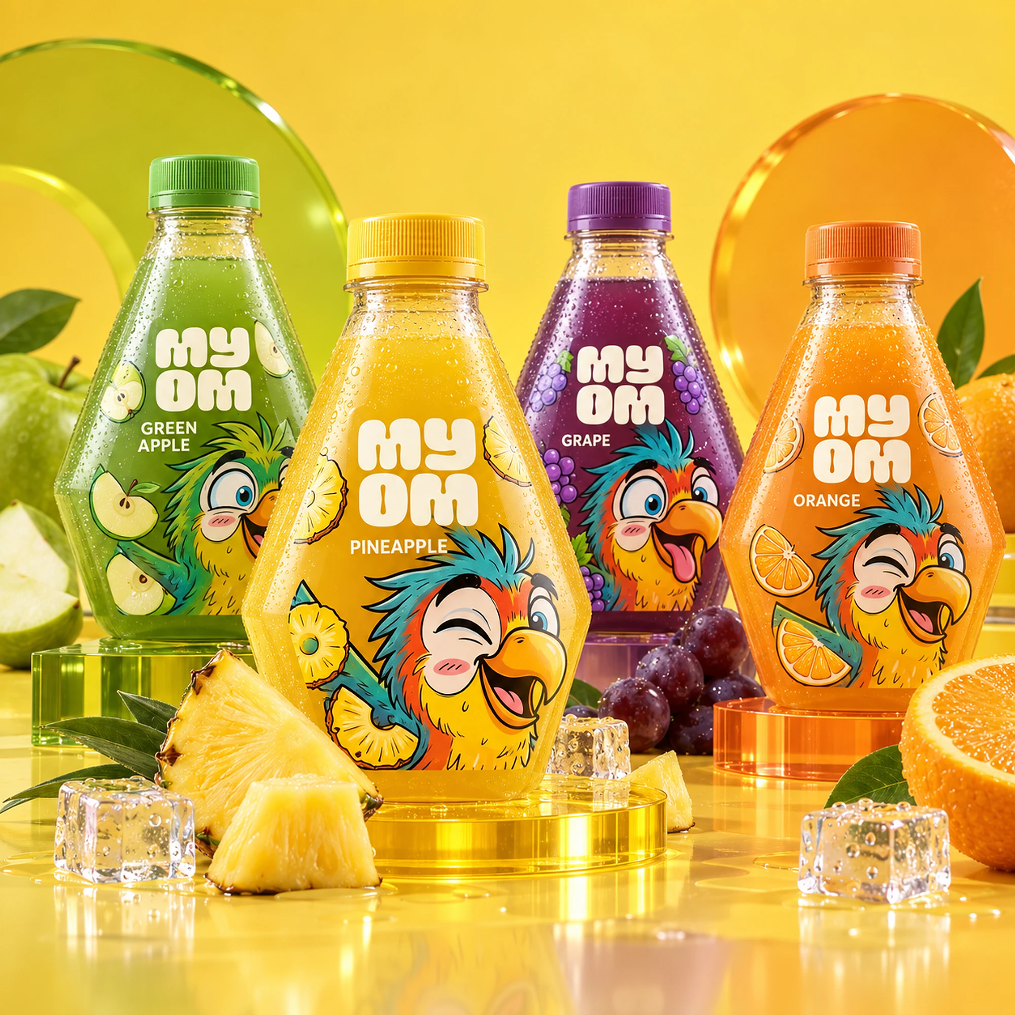
MyOm is a 100% organic beverage brand for children. Its product experience combines natural ingredients, a playful character world and a compact bottle designed to feel approachable for young hands while remaining clear and trustworthy for parents.
Bring character, flavour information and bottle form together in a children’s juice packaging direction with a consistent visual hierarchy.
Packaging design, bottle form development, label system, character direction and visual execution.
Custom bottle design, four-flavour packaging system, mascot application and campaign art direction.
Pineapple, apple, grape and orange each have a colour and fruit cue within a shared label structure. The parrot and faceted silhouette connect the range, giving children a character to recognise and parents a consistent place to find the product information.
Packaging and visual design by Ali Komeili.
A drink children can make their own
MyOm is an organic juice brand for children, with a pack that also needs to make sense to parents. The parrot introduces a playful world; fruit and flavour names explain the drink. I brought the bottle, label and character together so the product feels like one small object with its own personality.
The shape belongs to the character
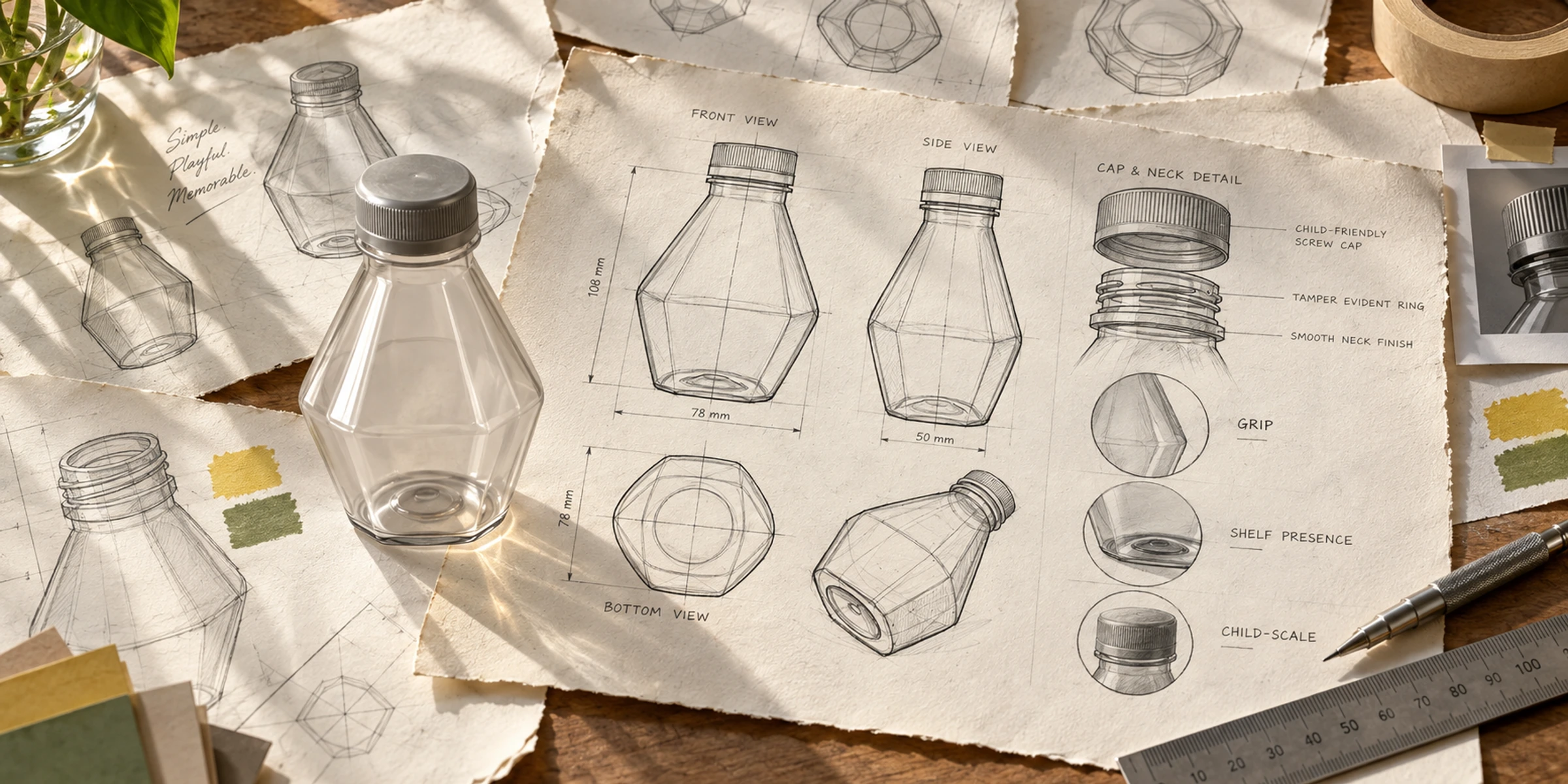
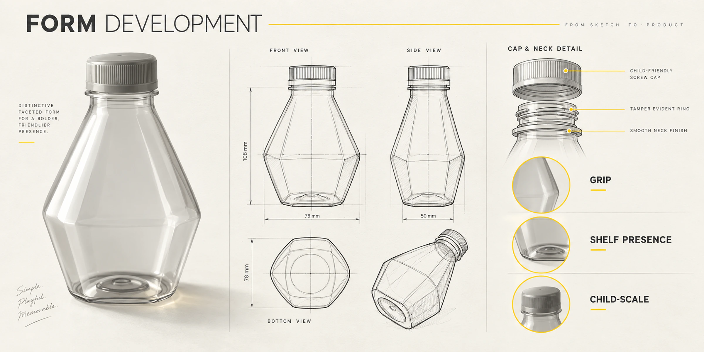
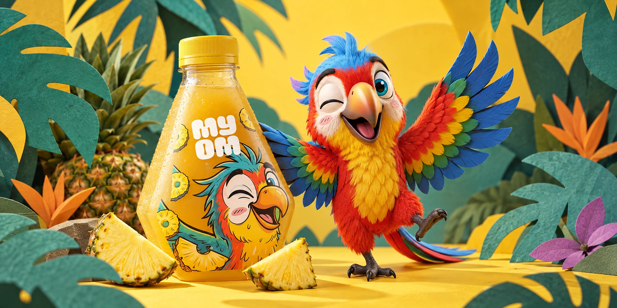
Angled shoulders and a faceted base give the bottle a recognisable outline. The narrower neck keeps the closure visually separate from the illustrated label. That balance gives the character room to speak while the bottle itself becomes another cue for the brand.
Colour identifies the flavour family
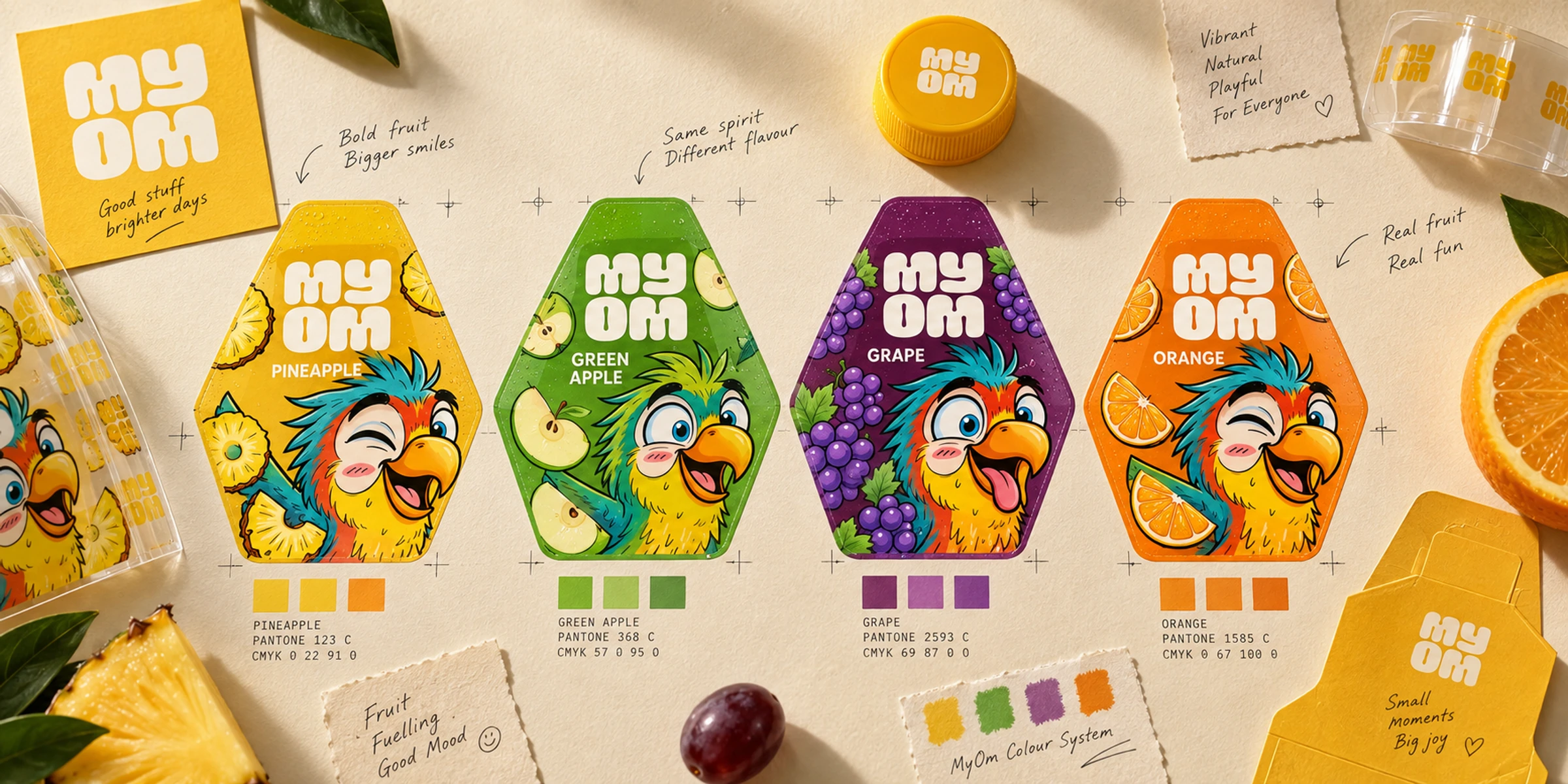
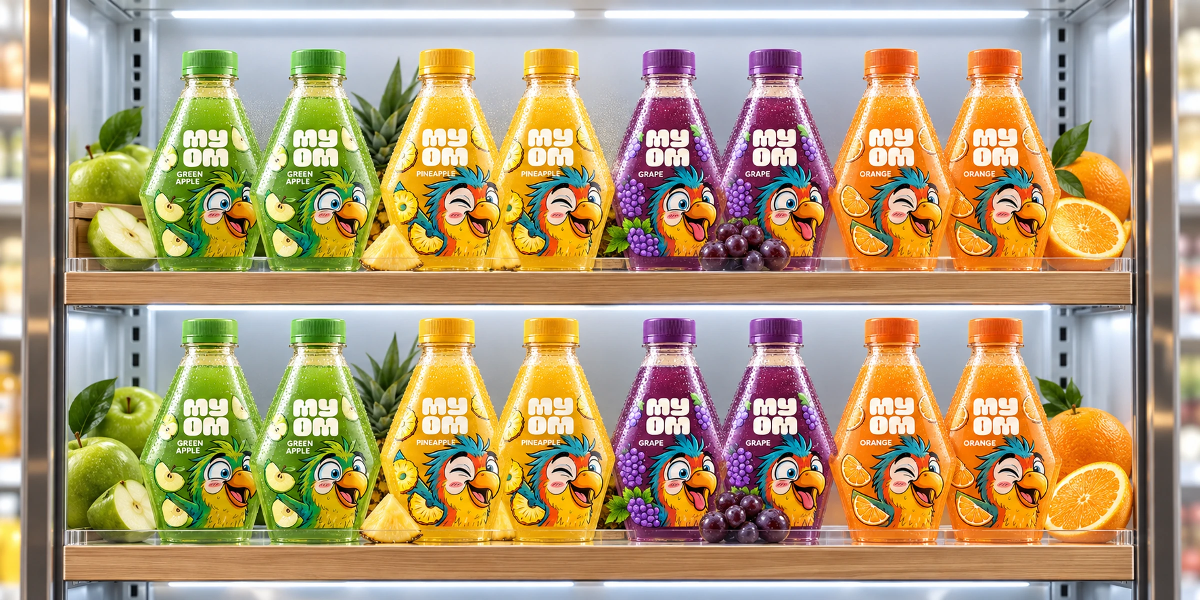
Yellow, green, violet and orange distinguish the four flavours. Fruit cues and the parrot’s expression change between labels, while the wordmark and bottle remain consistent. Each variation belongs to the same packaging family.
A recognisable bottle across four flavours
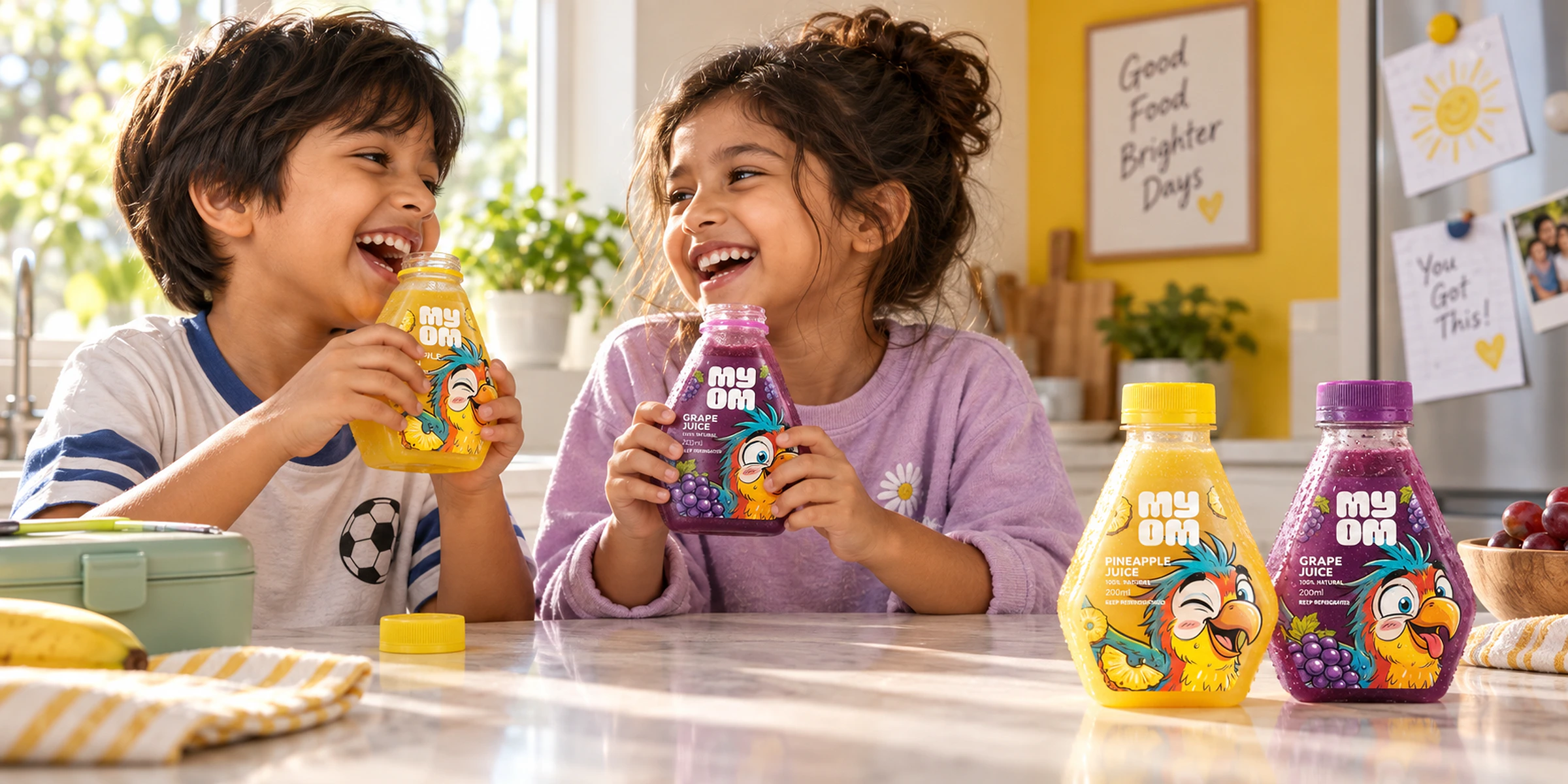
Pineapple, apple, grape and orange each have a colour and fruit cue within a shared label structure. The parrot and faceted silhouette connect the range, giving children a character to recognise and parents a consistent place to find the product information.