LegioKIT
LegioKIT’s diagnostic-kit identity connects a clear blue signature with organised packaging and colour cues for individual reagent components.
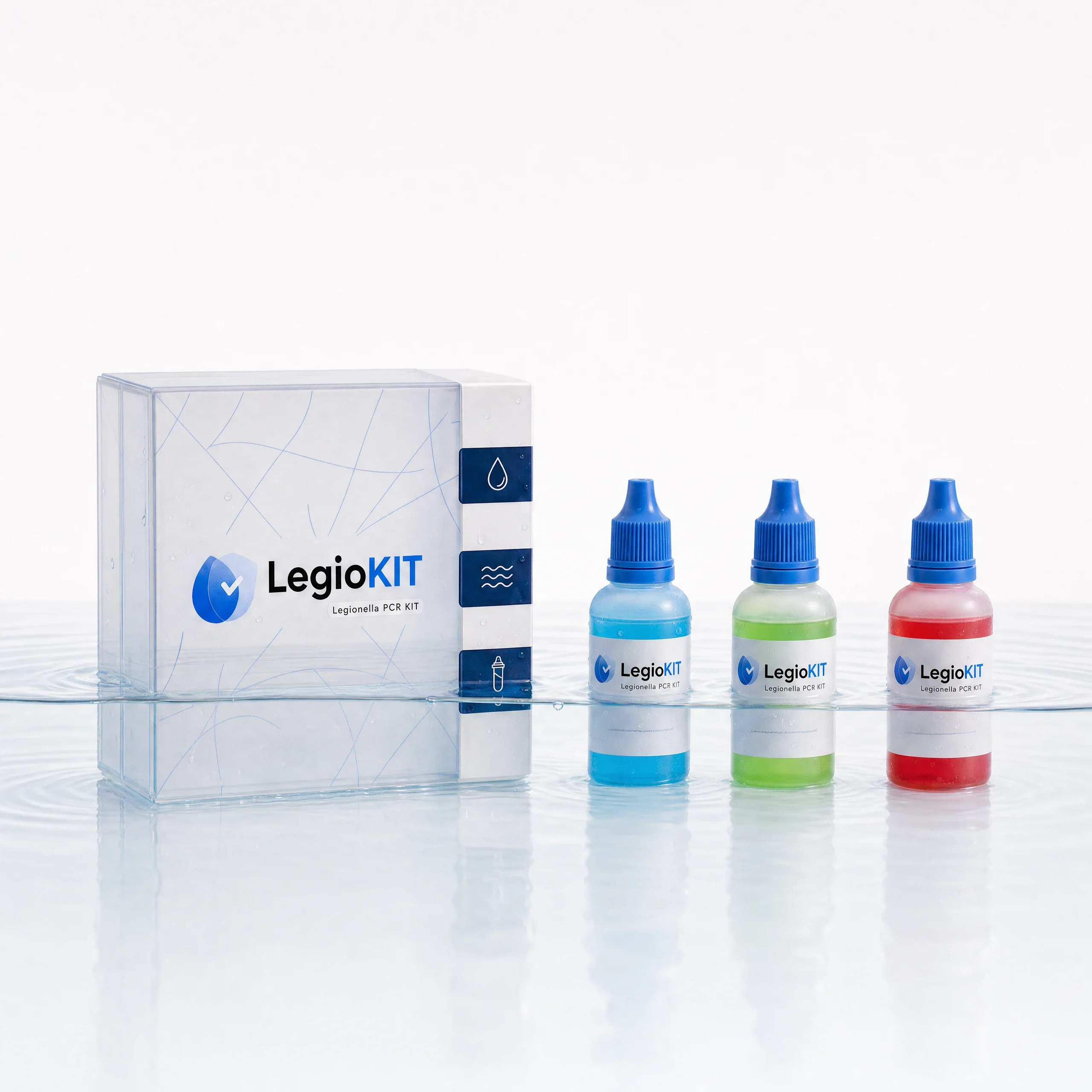
A brand developing diagnostic kits for bacteria.
Create a consistent identity across diagnostic-kit packaging and component labels, with clear relationships between colour, mark and product information.
Brand identity & packaging design
Visual identity, packaging system and reagent labels.
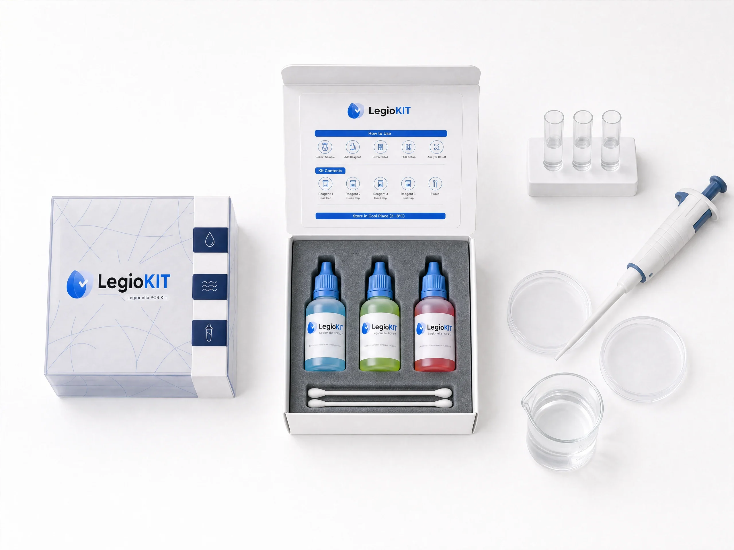
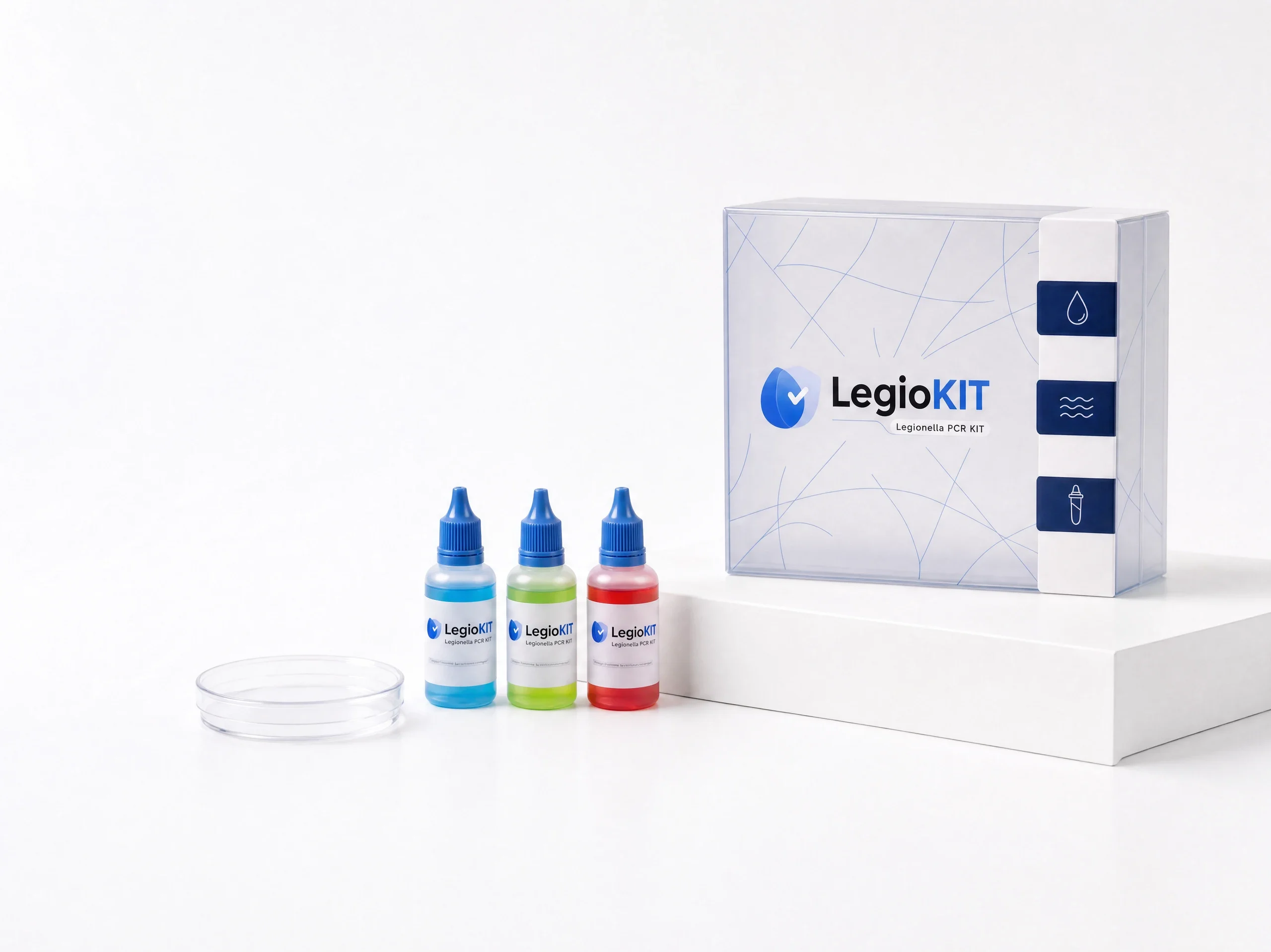
The design connects the outer packaging, inside-lid panel and reagent labels through a consistent blue signature. Component colours provide variation within that structure, giving the diagnostic kit a coordinated visual identity at both package and bottle scale.
Design by Ali Komeili. Project visuals supplied by the designer.
Clarity around a diagnostic kit
LegioKIT develops bacterial diagnostic kits for laboratory work. The outer box and its smaller components need to feel related without letting the brand graphics compete with product information. A blue droplet-and-check mark gives the kit a clear signature, while white space and consistent label placement provide the information structure.
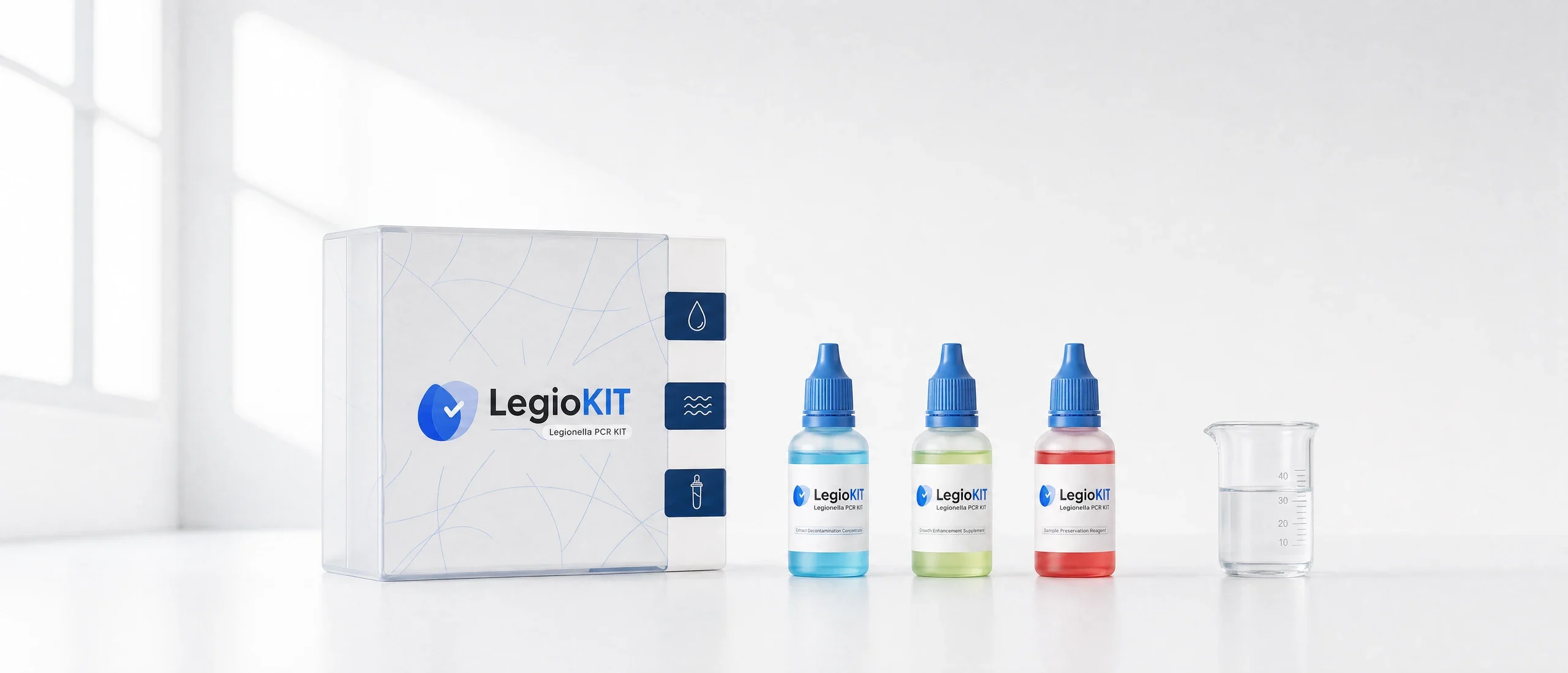
Colour helps separate the components
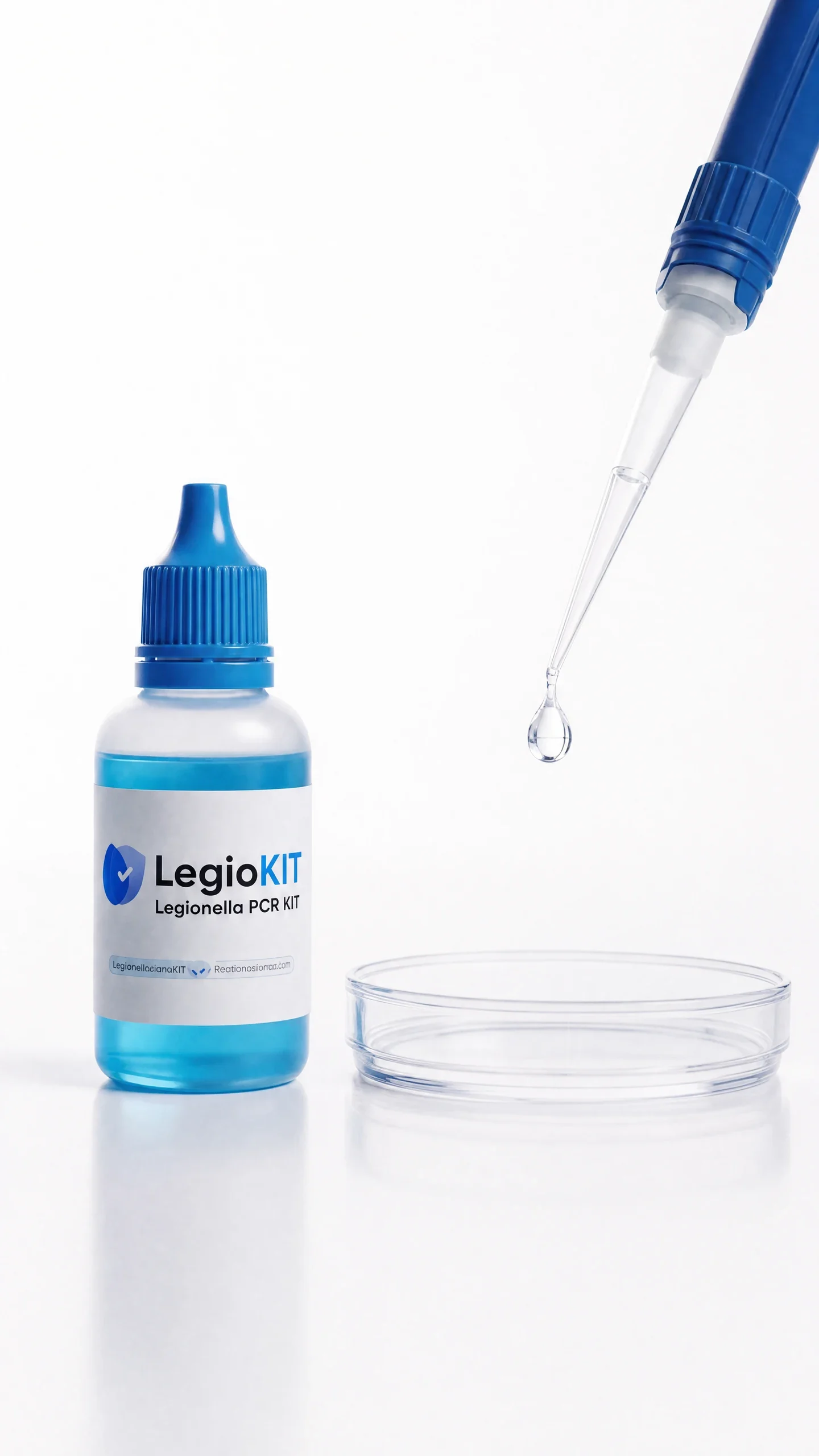
Blue caps and white labels give the bottles a shared identity. Cyan, green and red distinguish the components at a glance, with the same wordmark placement repeating across the range. The outer pack uses finer linework, allowing its larger surface to carry more of the visual system.
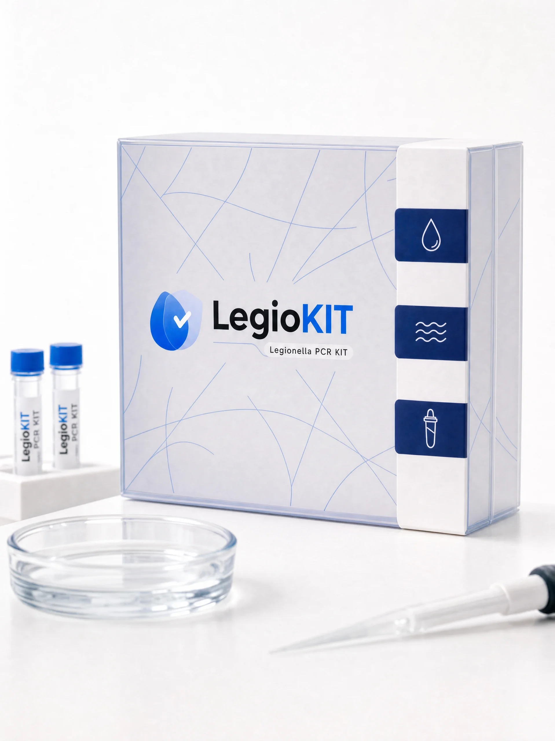
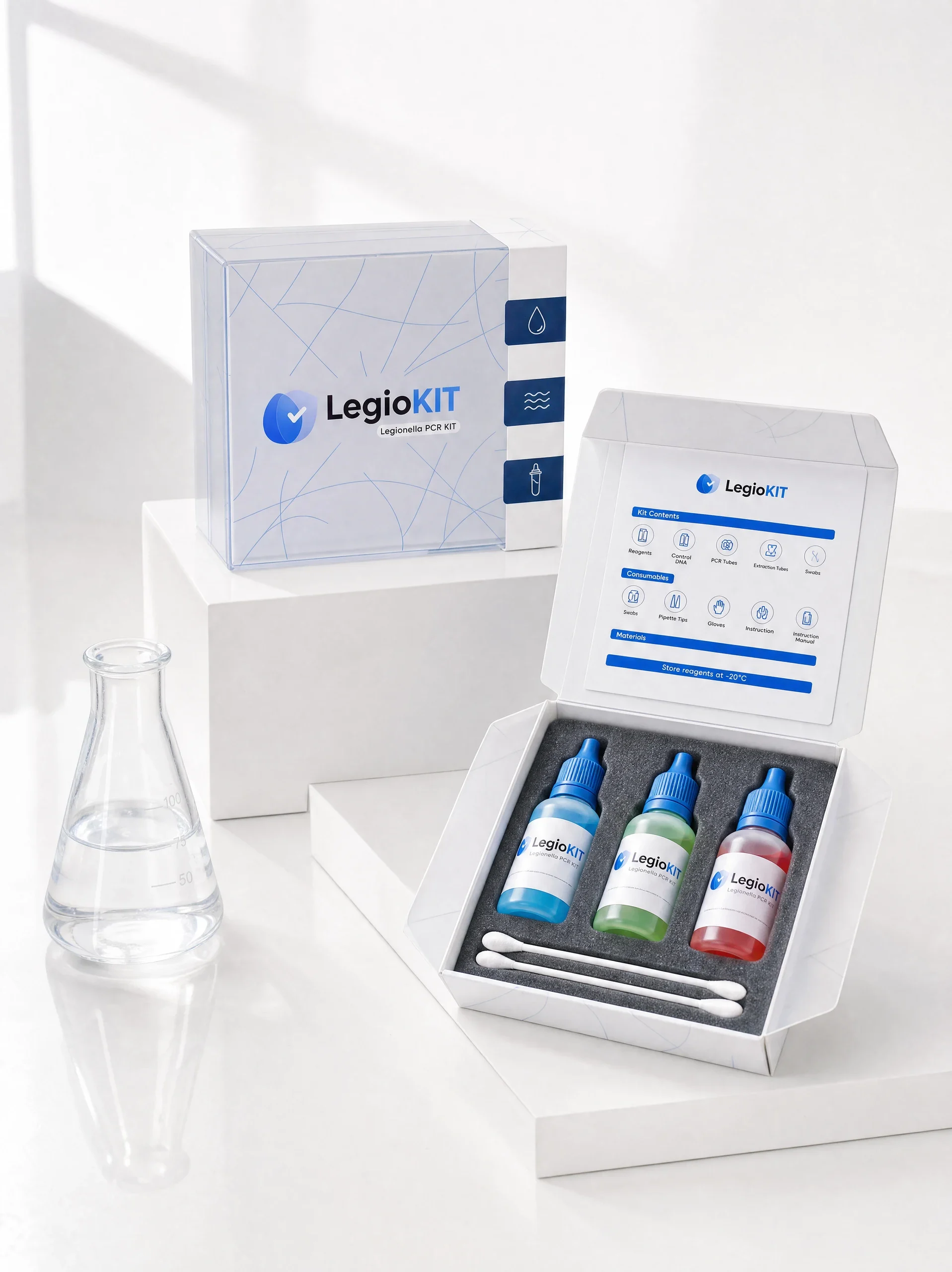
Colour separates, structure connects
Blue caps and aligned white labels hold the reagent family together. Cyan, green and red distinguish the three bottles in the visual presentation. Consistent brand placement connects these colour differences to the larger kit identity.
Space to notice the details
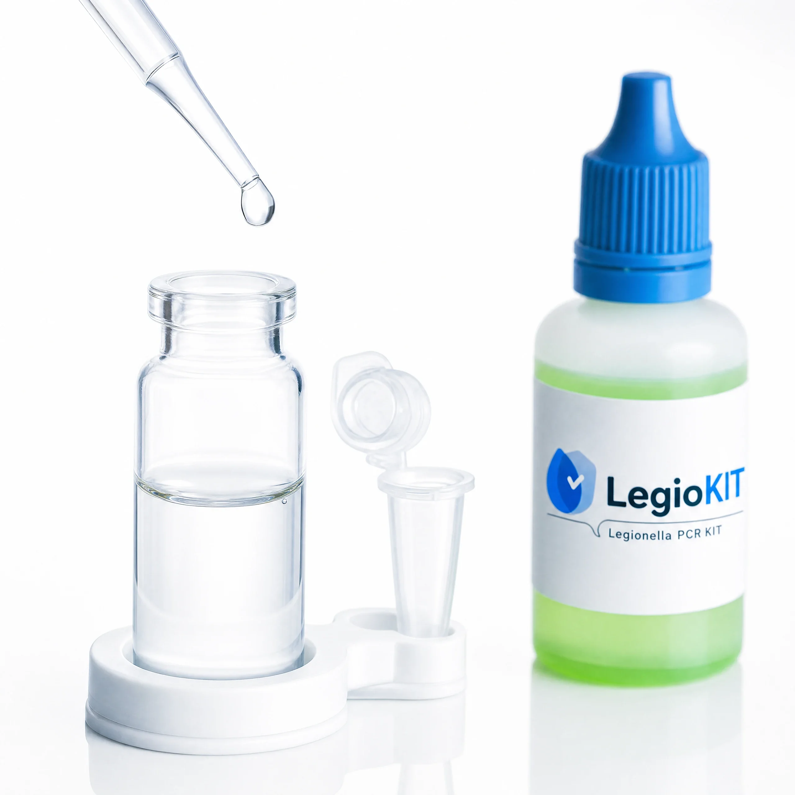
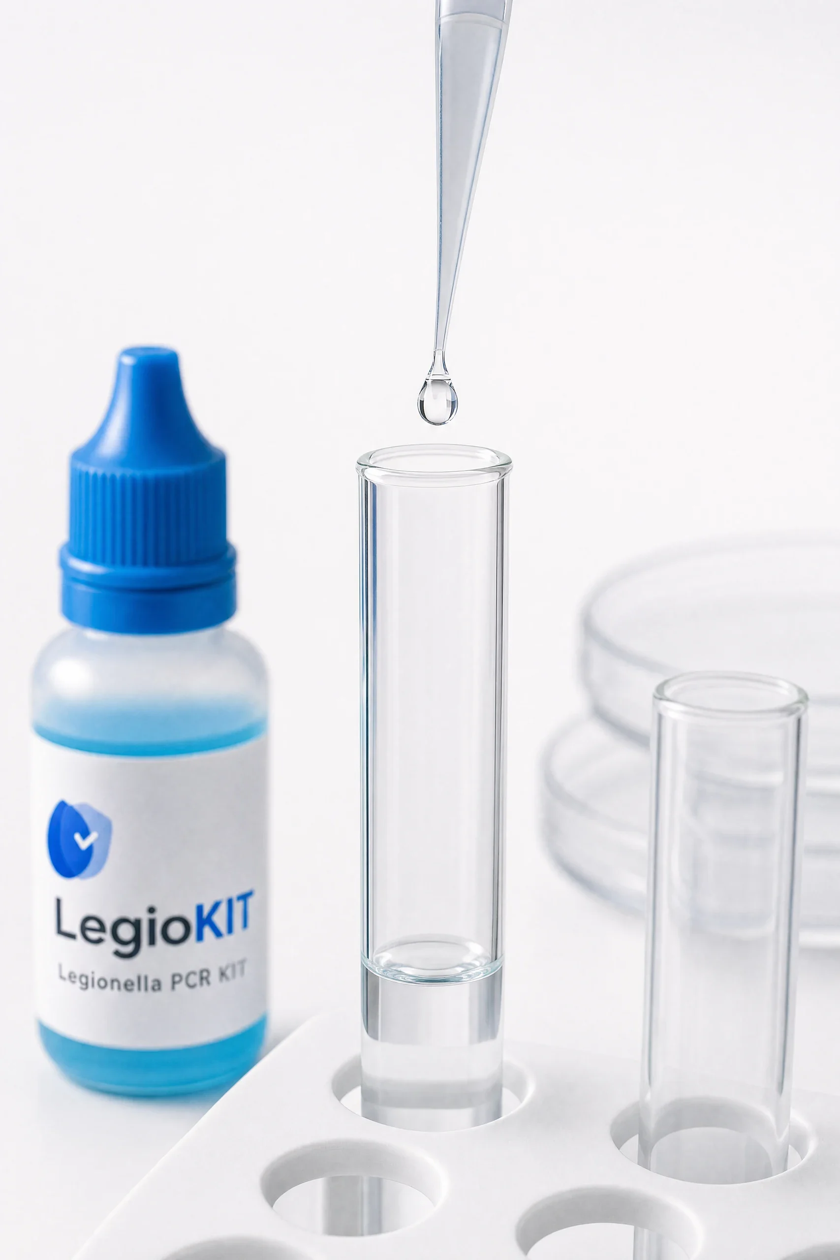
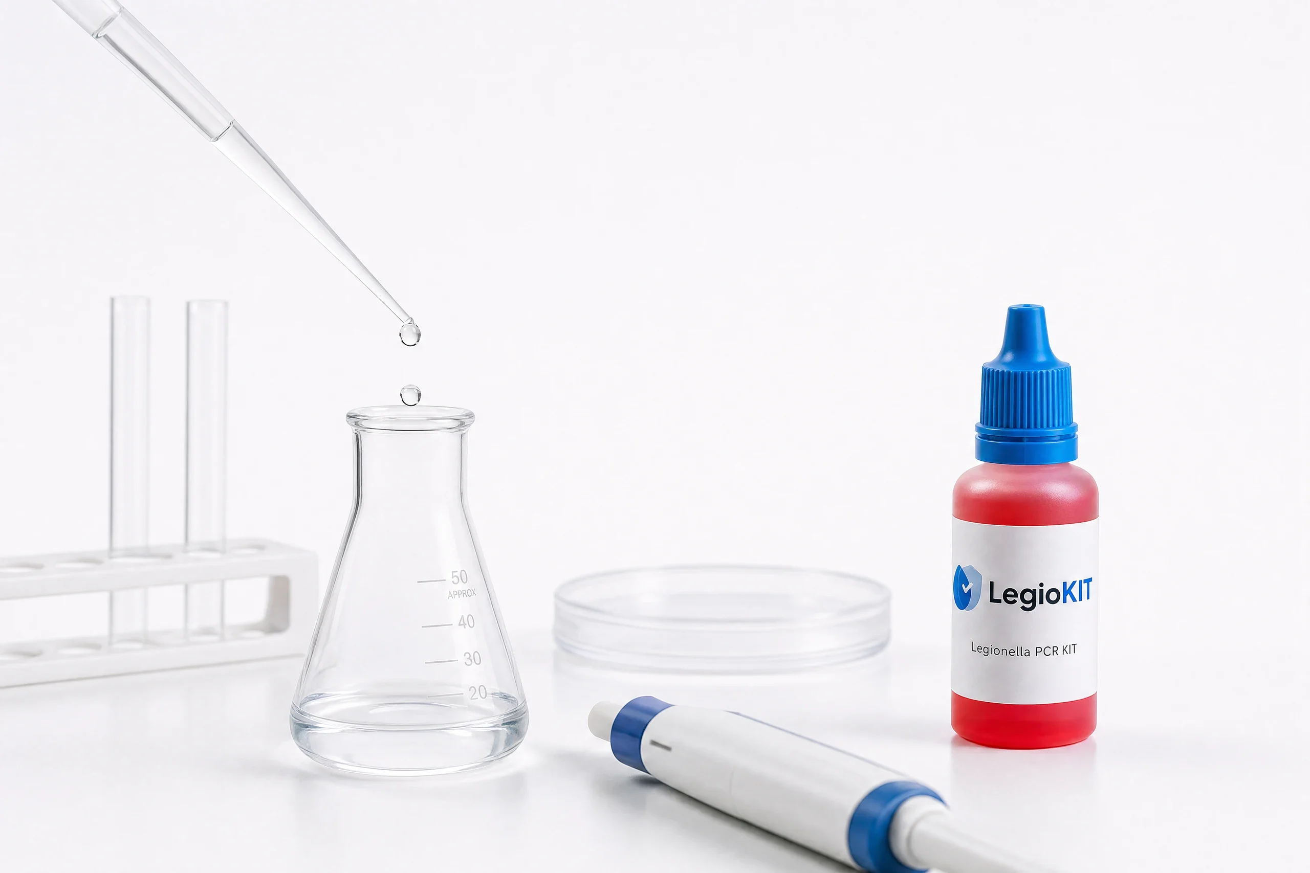
Close views bring the label, glass and droplet into focus. Wider compositions restore the relationship between the package and its contents. The presentation moves between these scales while keeping the same restrained white-and-blue atmosphere.
The box and its contents belong together
The design connects the outer packaging, inside-lid panel and reagent labels through a consistent blue signature. Component colours provide variation within that structure, giving the diagnostic kit a coordinated visual identity at both package and bottle scale.