Lakota
Lakota’s identity connects Pouya Jamalian’s specialist music teaching with bilingual lettering, illustrated learning materials and tactile instrument packaging.

A music education company and teaching studio in Saadat Abad, Tehran, led by Pouya Jamalian, a leading Iranian educator in Lakota flutes and ocarina.
Connect the authority of specialist music teaching with an approachable visual identity that works across learning materials, instrument packaging and the physical experience of a Tehran studio.
Visual identity, illustration, pattern design, packaging and brand applications.
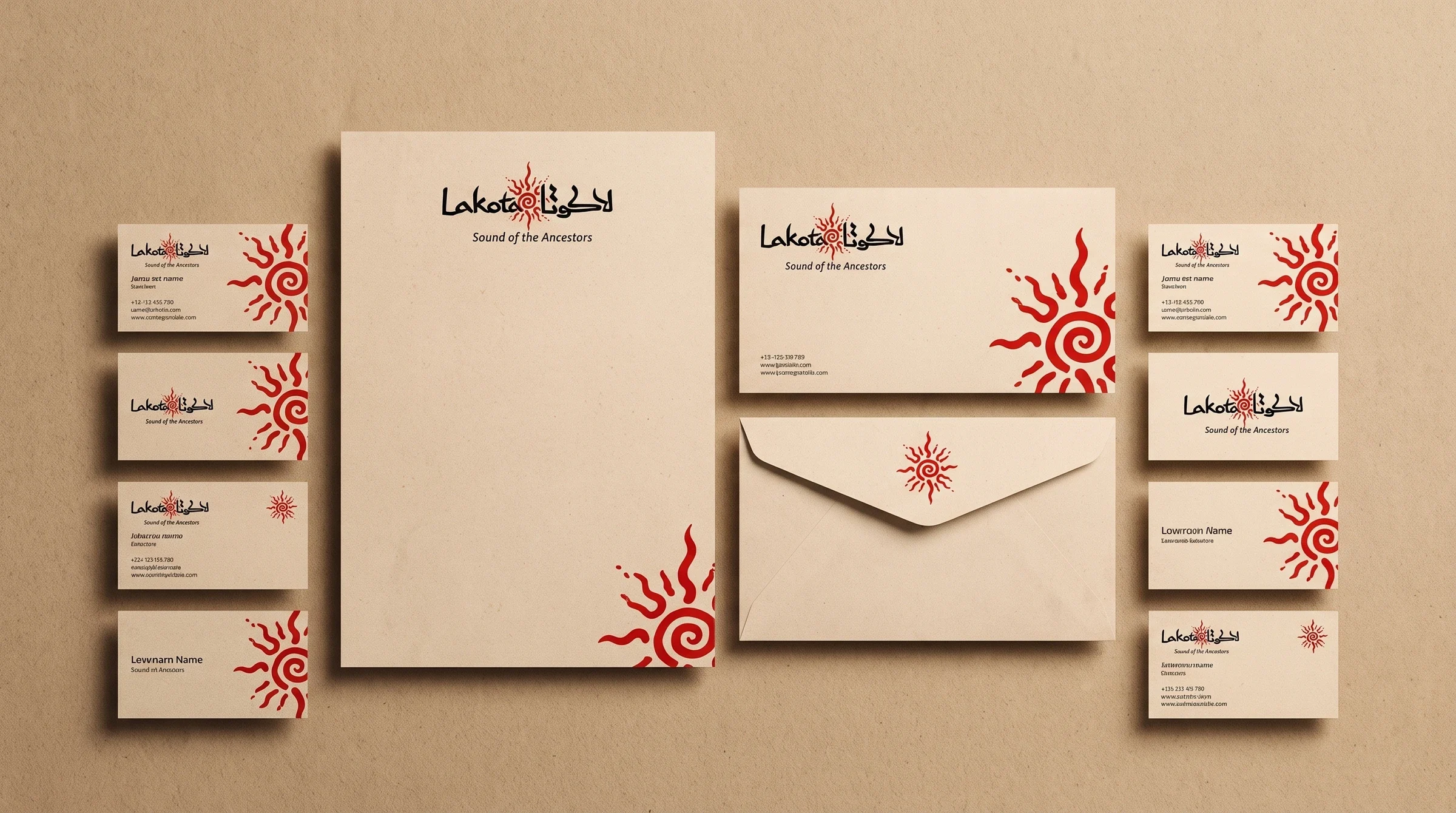
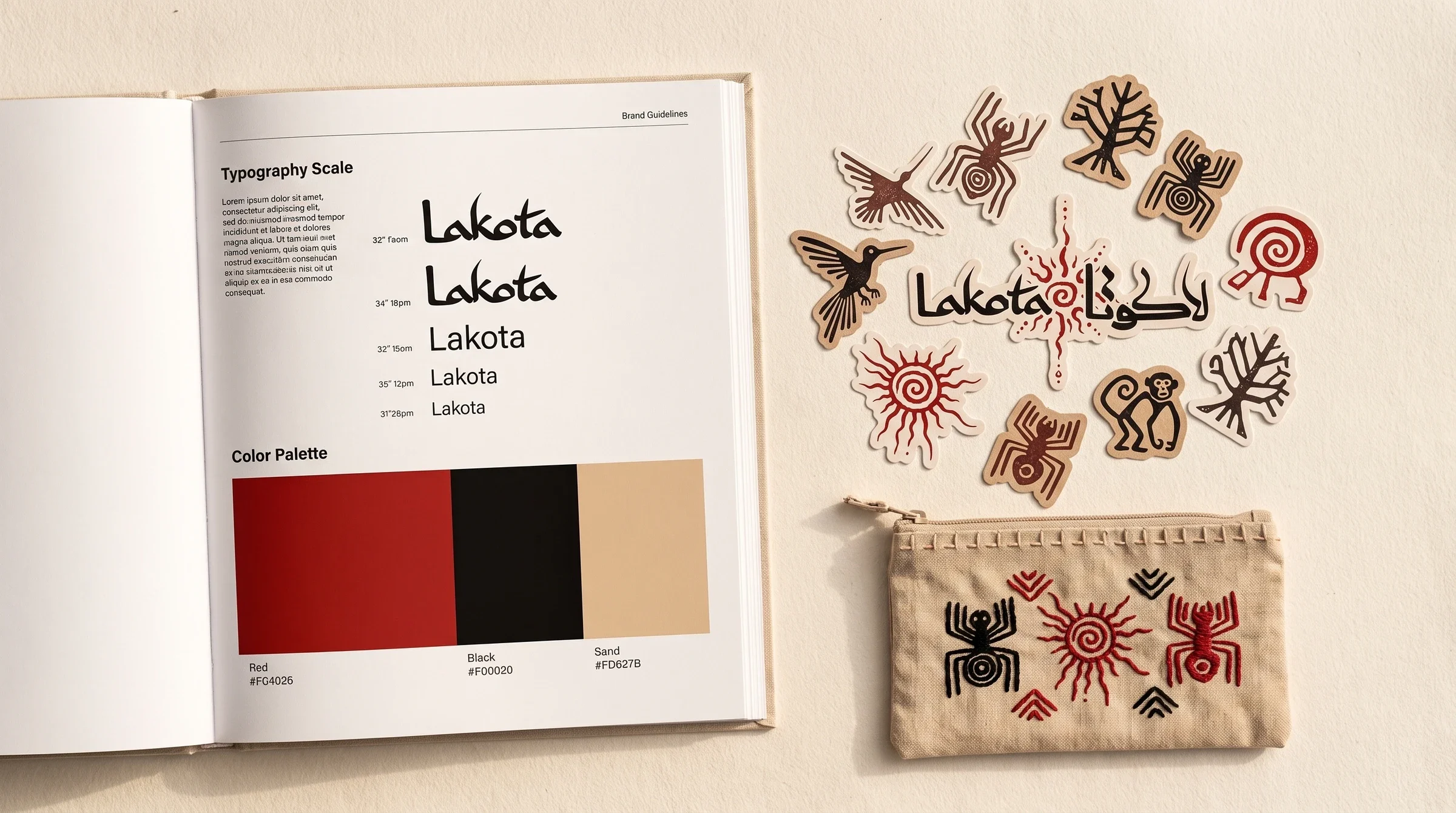
Identity system, motif library, geometric patterns, typography and colour direction, printed collateral, stickers, instrument packaging and visual presentation.
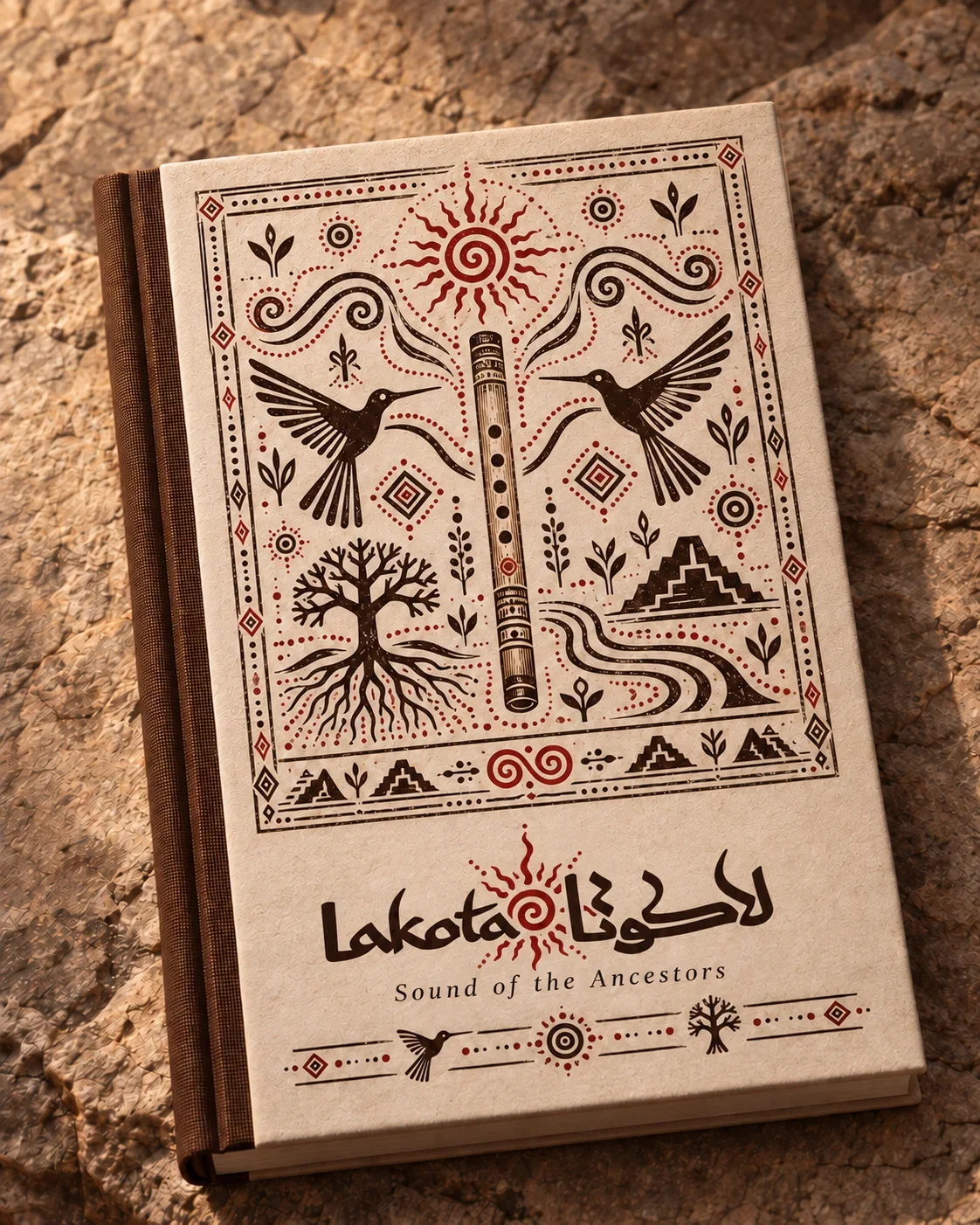
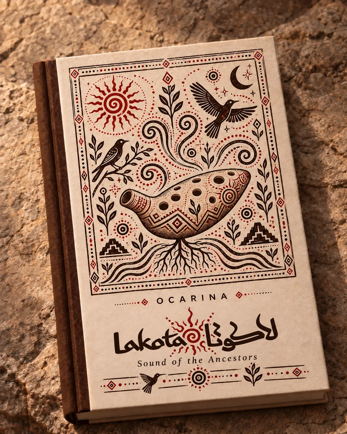
Bilingual lettering, patterned educational covers and tactile packaging connect the school’s teaching and instrument touchpoints. The identity gives students a recognisable world around their first encounters with the instrument, with graphic rhythm carrying the same warmth into each format.
Client and lead educator: Pouya Jamalian. Brand presentation: Ali Komeili.
A welcoming place to learn an instrument
Lakota is Pouya Jamalian’s flute and ocarina school in Saadat Abad, Tehran. Students come for specialist knowledge and a personal introduction to an instrument. The identity gives that teaching a warm visual presence through bilingual lettering, illustration and materials that feel close to the objects students handle and play.
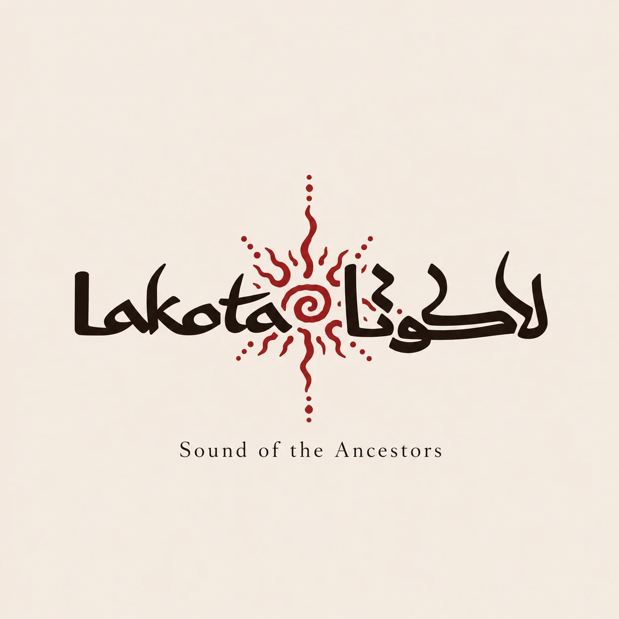
Two scripts share a visual centre
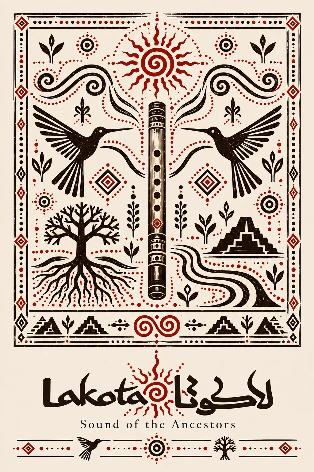
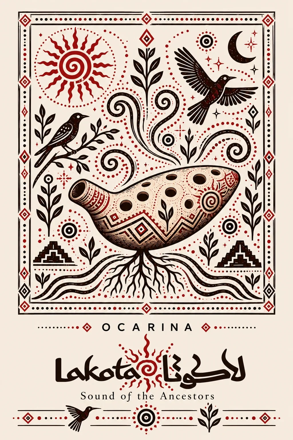
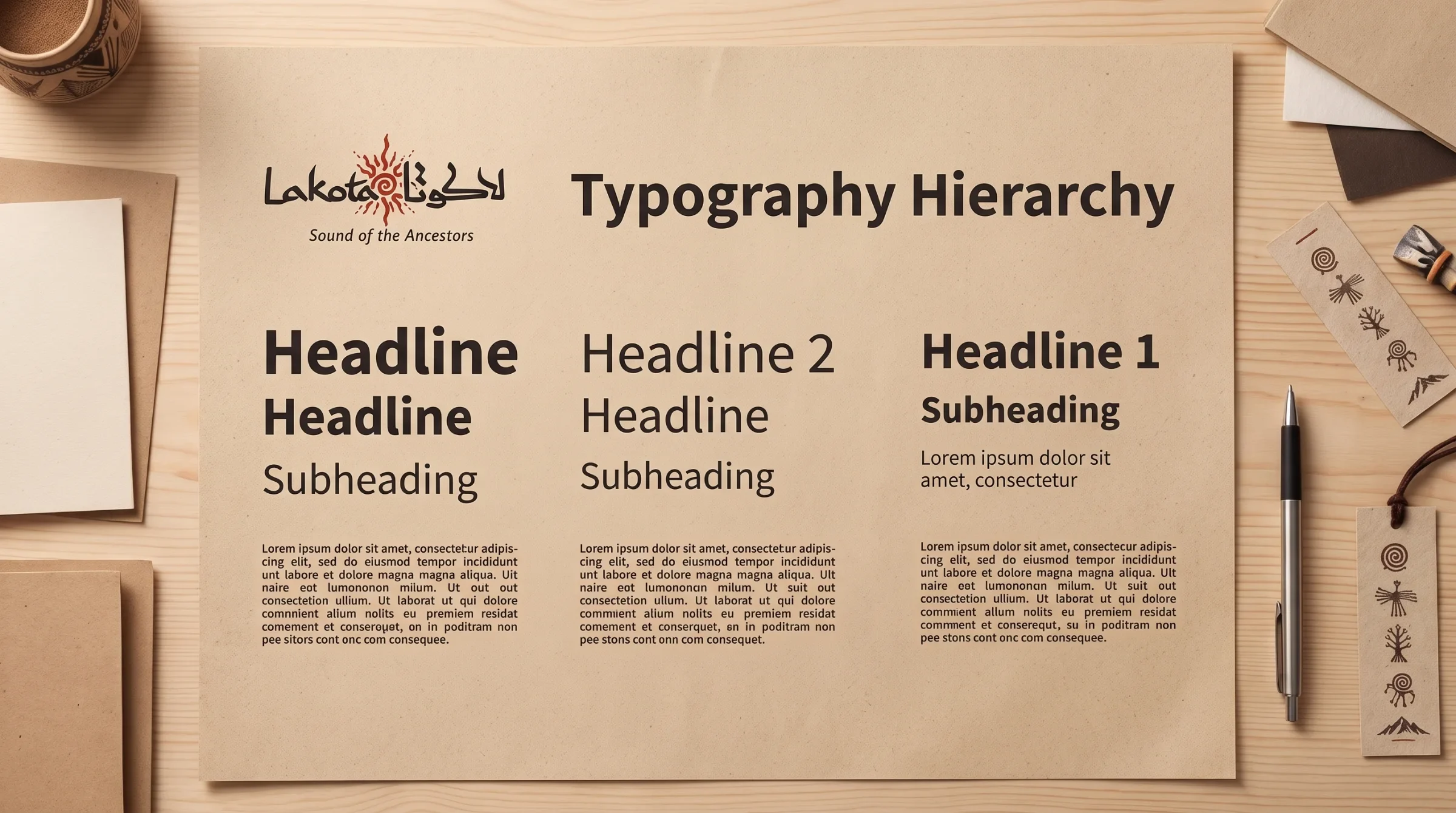
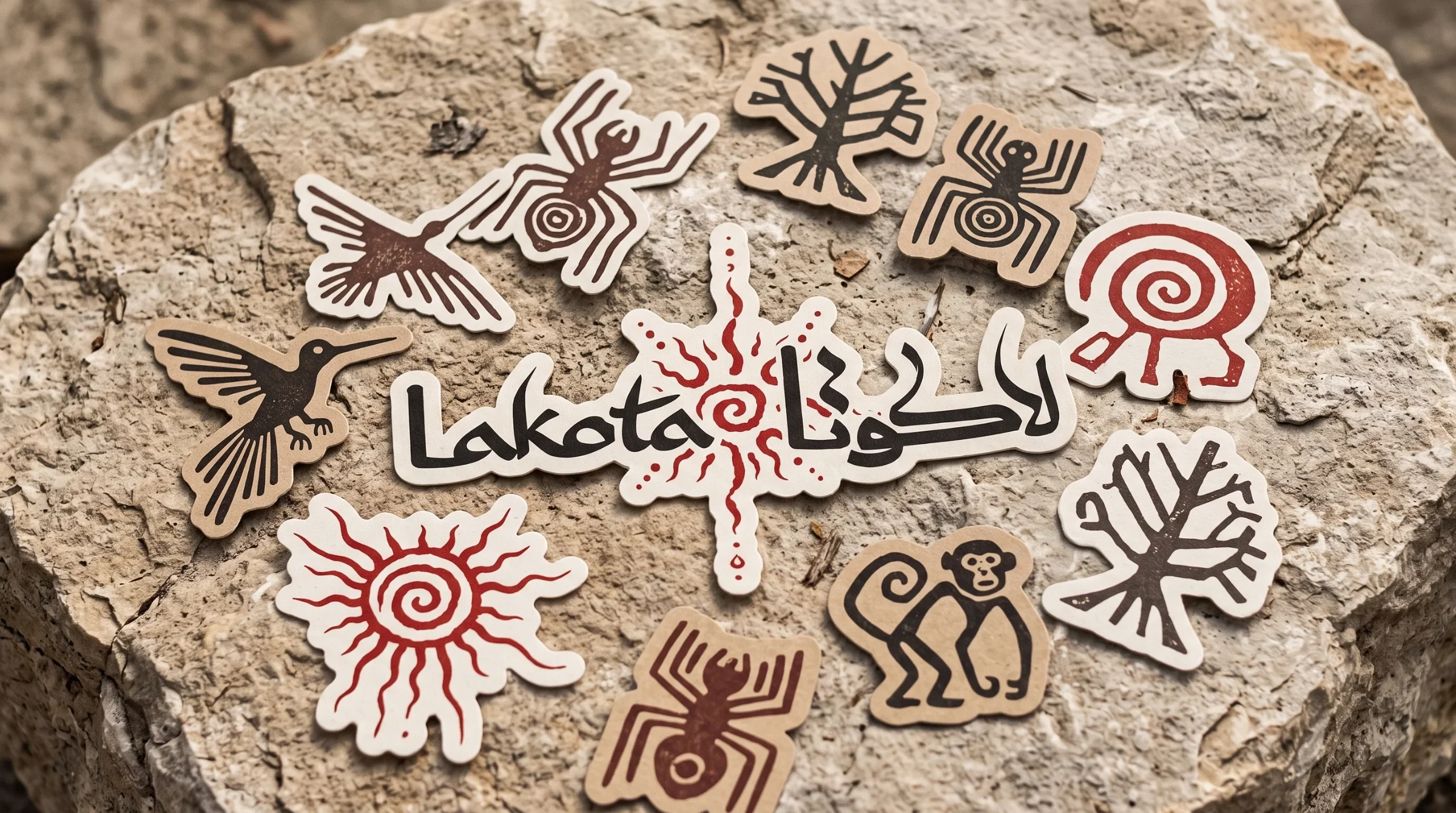
Persian and Latin lettering meet around the red spiral sun. Irregular strokes give the name a handmade quality, while the controlled cream, brown and red palette provides consistency. The central symbol carries that relationship into motifs, educational covers and instrument details.
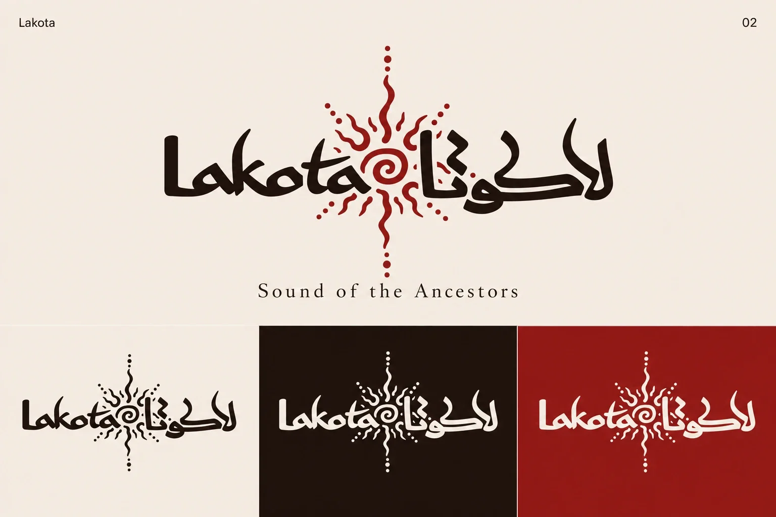

One language for learning and craft
The central design challenge is to connect two experiences: the confidence students seek in a teacher and the curiosity they feel toward an unfamiliar instrument. Illustration introduces character, while a controlled system of typography, pattern and colour gives the presentation clarity. Together, these elements create continuity between education and instrument culture.
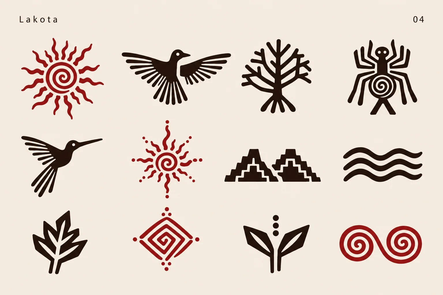
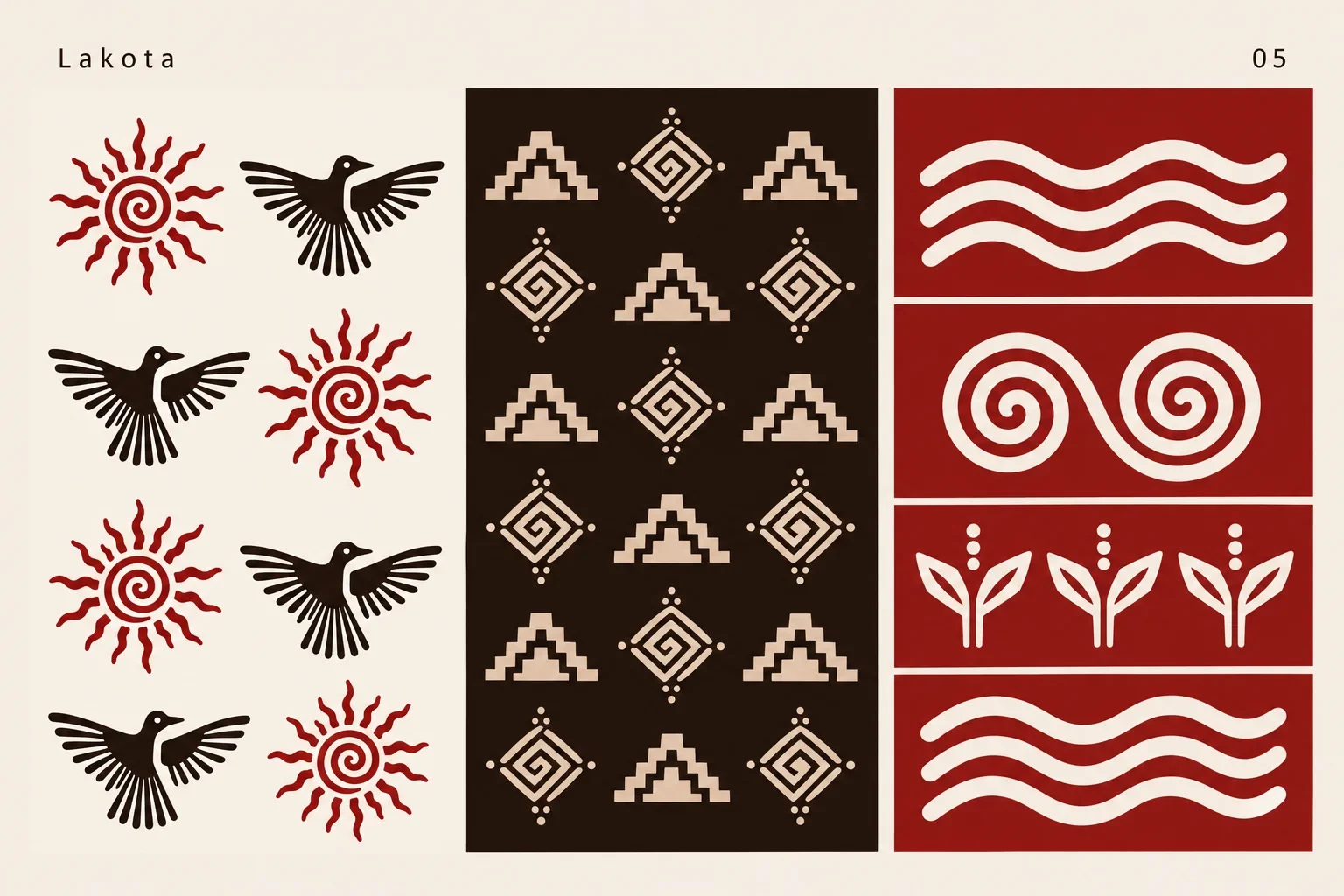
Rhythm becomes a graphic system
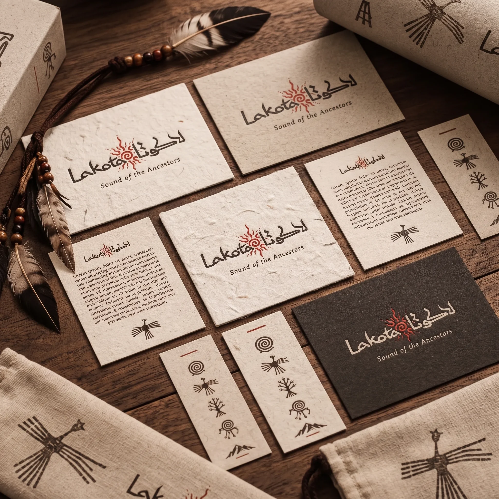
Repeated geometric forms give the identity its visual rhythm. The motifs can stand alone, repeat as a surface pattern or frame a composition. Their changes in scale keep the system lively across small stickers and larger printed pieces, while the restrained palette holds the applications together.
An identity with a physical presence
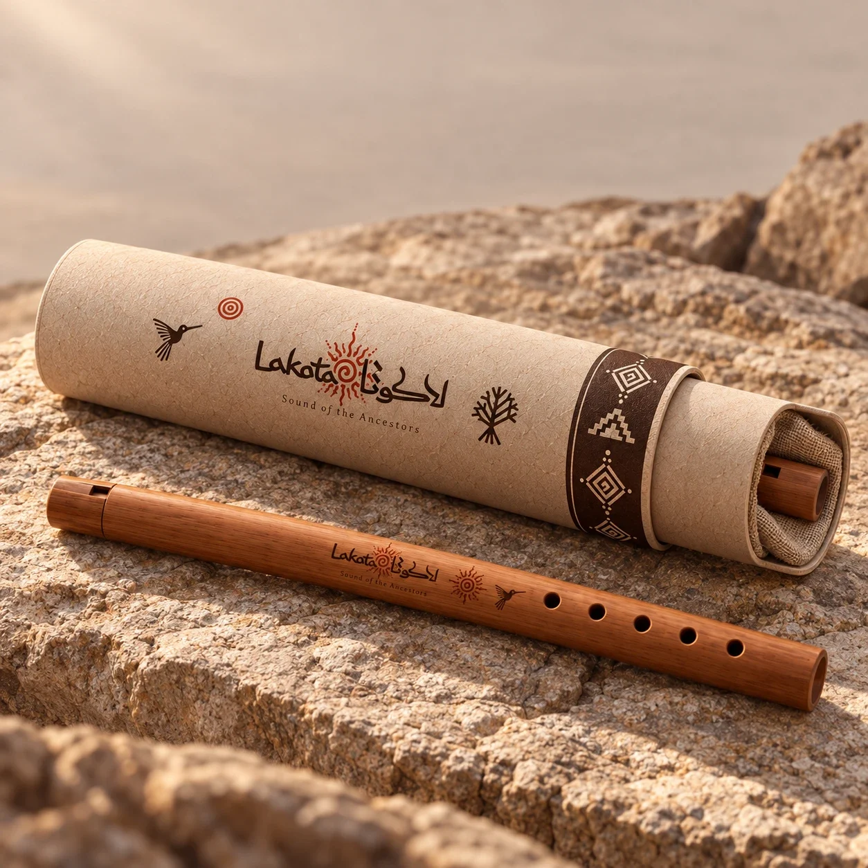
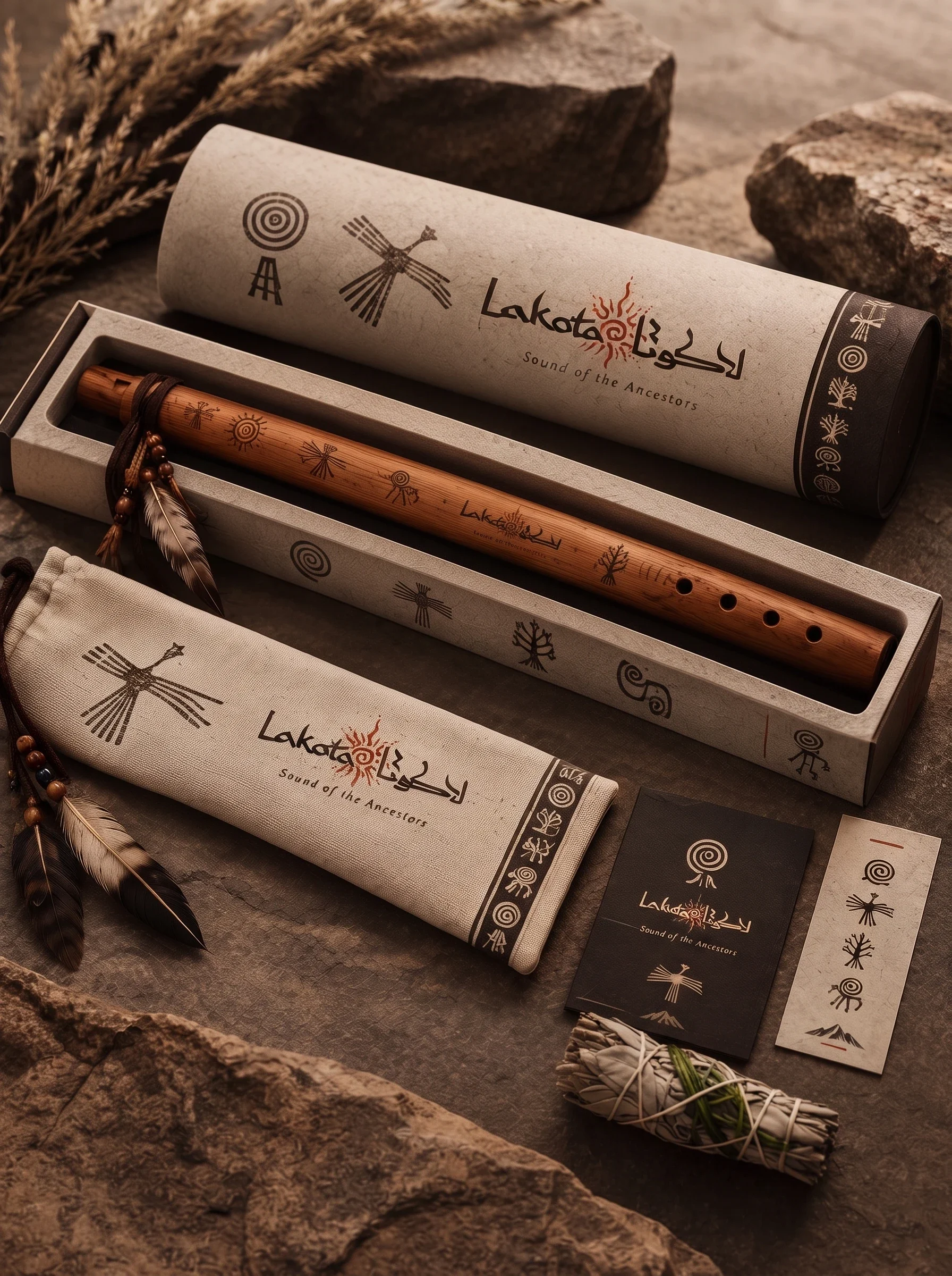
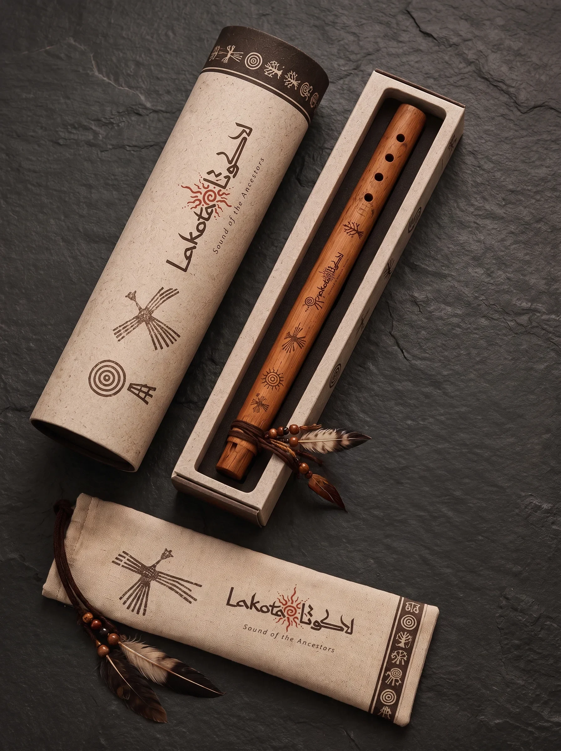
Paper, wood and fabric make the brand feel close to the instruments it represents. Illustrated panels and tactile surfaces give packaging an expressive role, while clear placement of the brand elements helps each object remain recognisable. The imagery presents these touchpoints as a connected family.

From first encounter to first note
The narrative moves from the visual system into its use: printed pieces introduce the brand, packaging gives an instrument a considered arrival, and playing imagery brings the story back to people. The result is a consistent identity that supports a specialist school without making its teaching experience feel distant.
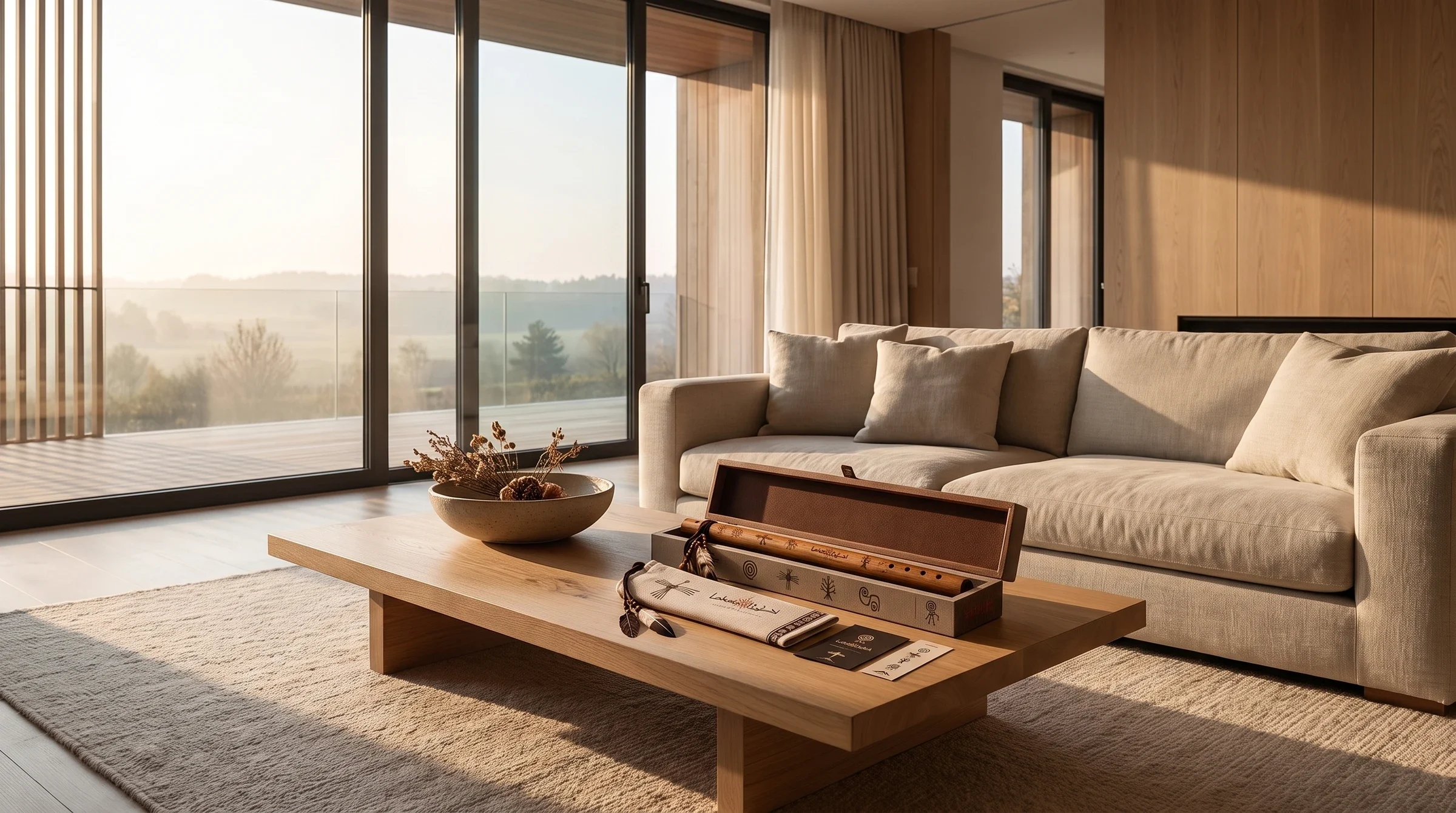
The learning experience has a common language
Bilingual lettering, patterned educational covers and tactile packaging connect the school’s teaching and instrument touchpoints. The identity gives students a recognisable world around their first encounters with the instrument, with graphic rhythm carrying the same warmth into each format.