Lacto
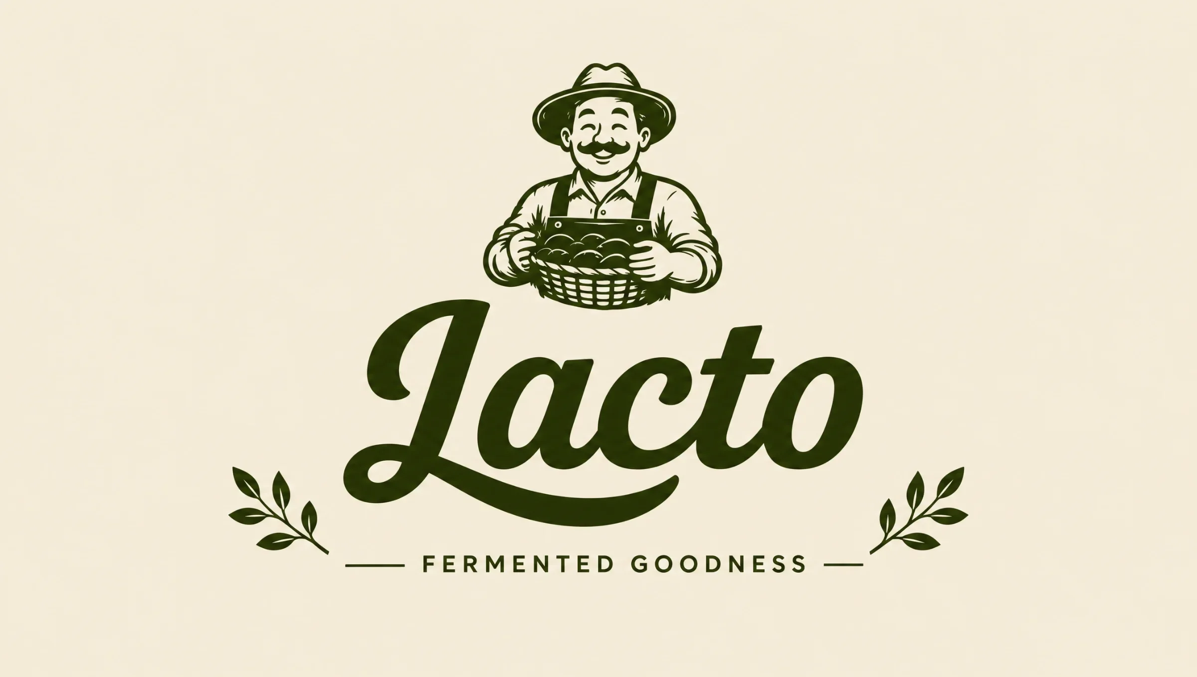
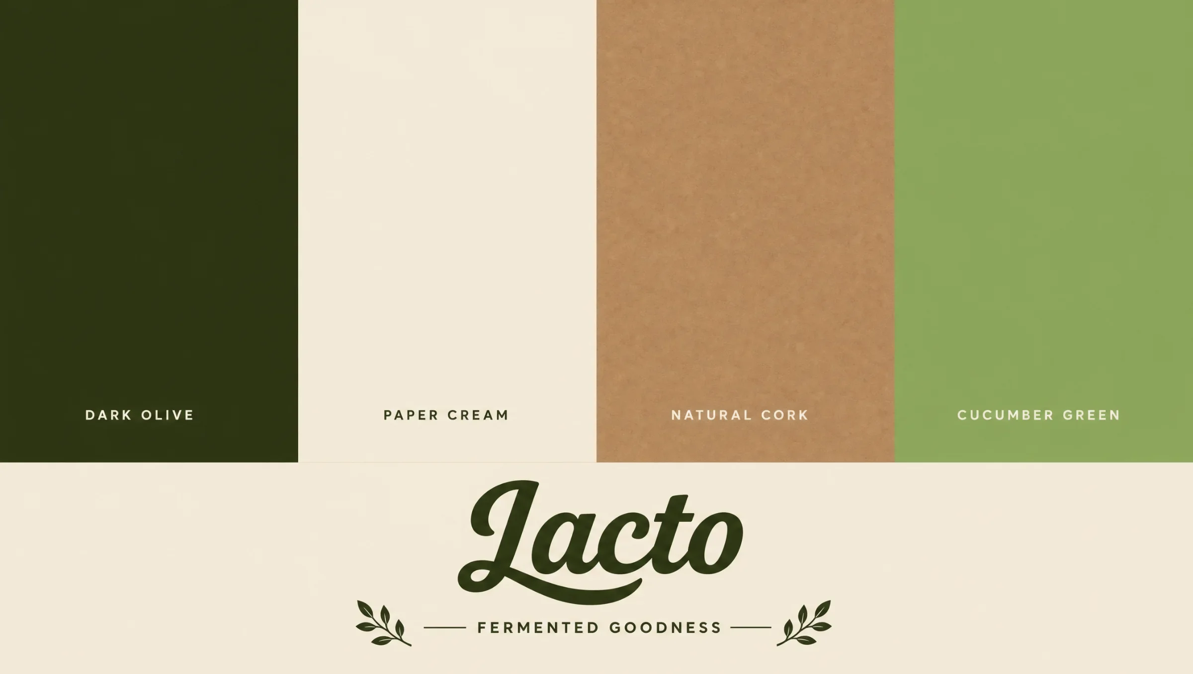
Lacto’s fermented-vegetable identity connects an illustrated grower with clear variety cues and warm packaging for the everyday table.
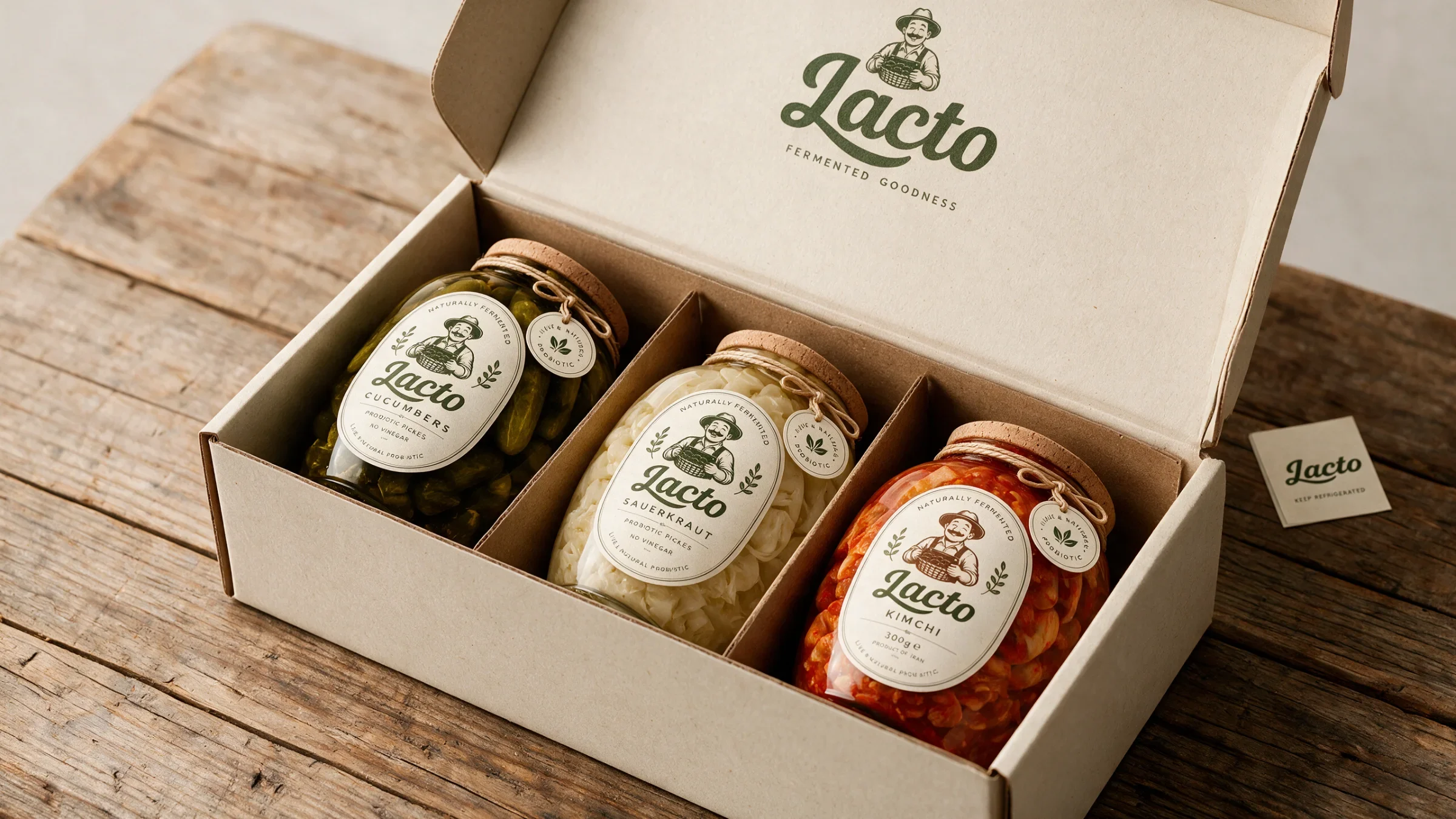
A warm identity and packaging system for Lacto connects fermented vegetables with a character-led label, earthy colours and everyday food scenes.
Give a family of fermented vegetable products a shared identity while making the individual varieties recognisable across labels, jars and supporting imagery.
Visual identity, character illustration and packaging presentation.
Wordmark, illustrated character, label family, colour palette, product-family imagery, gift-box and food-scene presentations.
The wordmark, grower and label structure connect the three varieties to gift packaging and kitchen imagery. Transparent jars keep the contents visible; illustrated ingredients make the range feel familiar.
Design presentation by Ali Komeili. Product, interface and environmental applications are shown as presentation mockups.
Make fermented food feel familiar
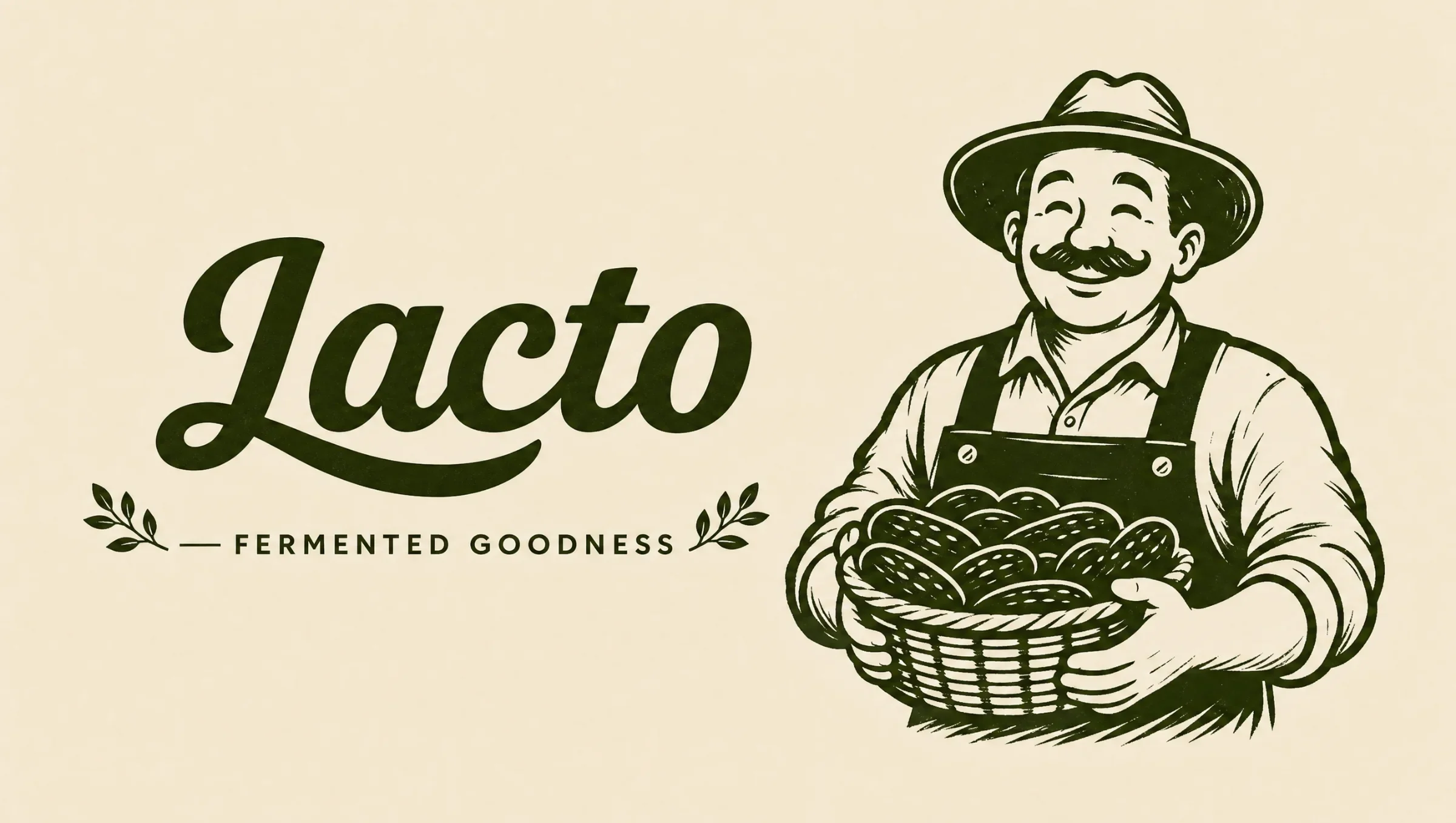
Lacto brings cucumbers, sauerkraut and kimchi into one fermented-food range. For people choosing something for an everyday meal, the illustrated grower gives the brand a friendly face. Script lettering, vegetable drawings and cream-and-olive labels connect the food to its ingredients and give each jar a recognisable place in the family.
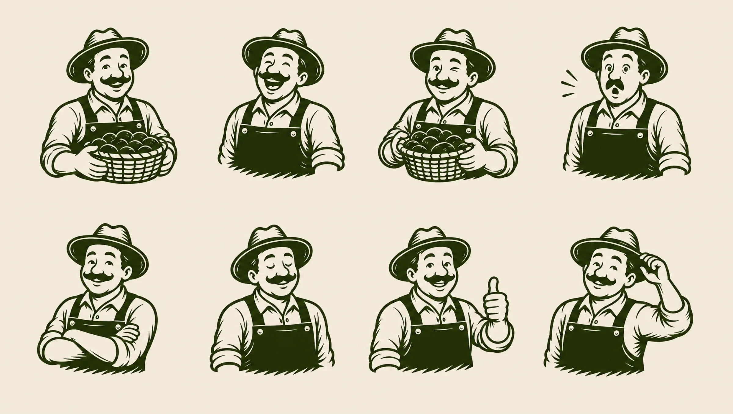
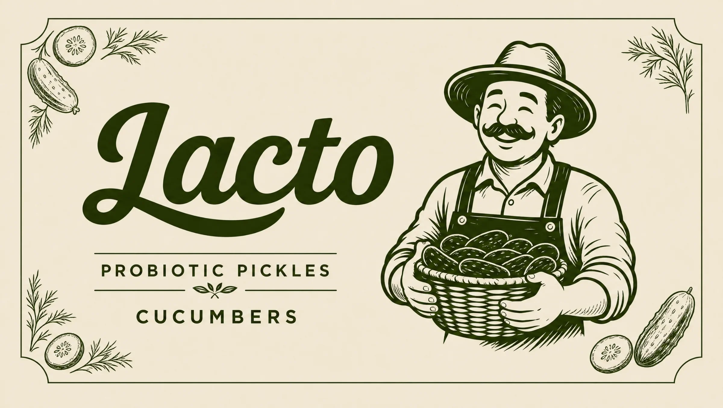
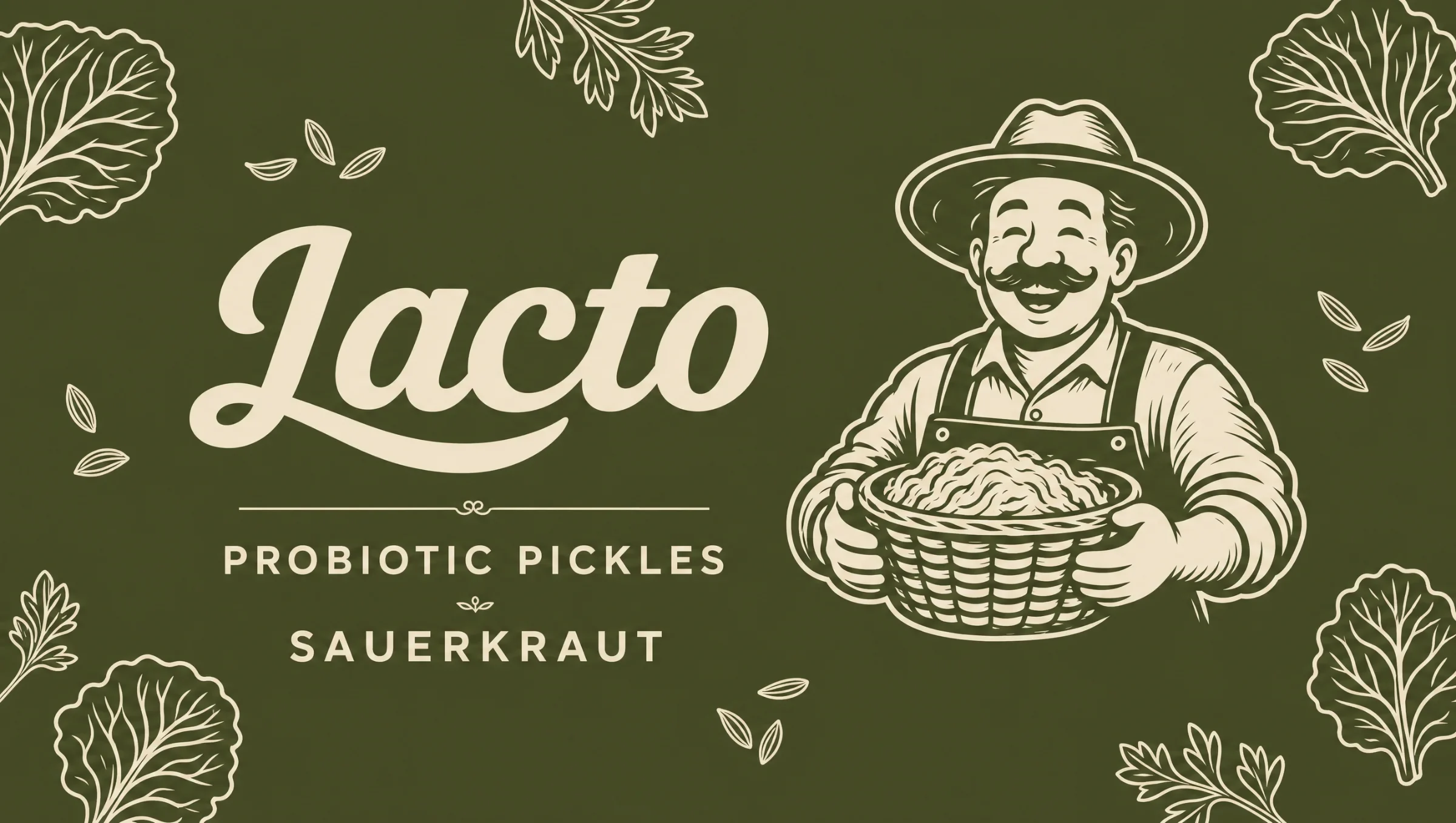
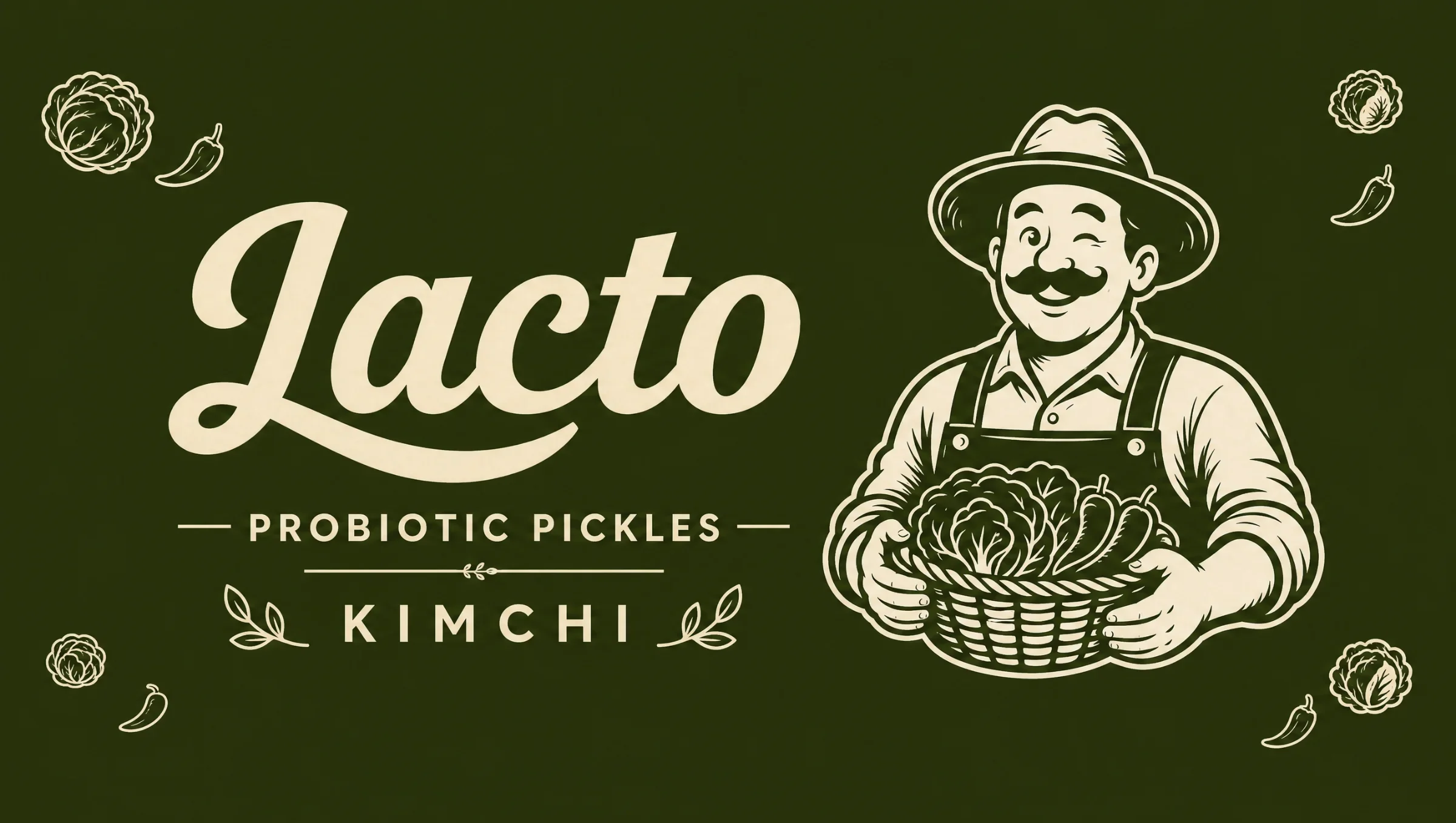
The grower connects the different jars
The character carries a basket of vegetables, making the ingredient story part of the identity. Gestures and expressions add variation around a stable silhouette. Product names and vegetable details do the more practical work of separating the jars within the shared label frame.
Three varieties share a frame
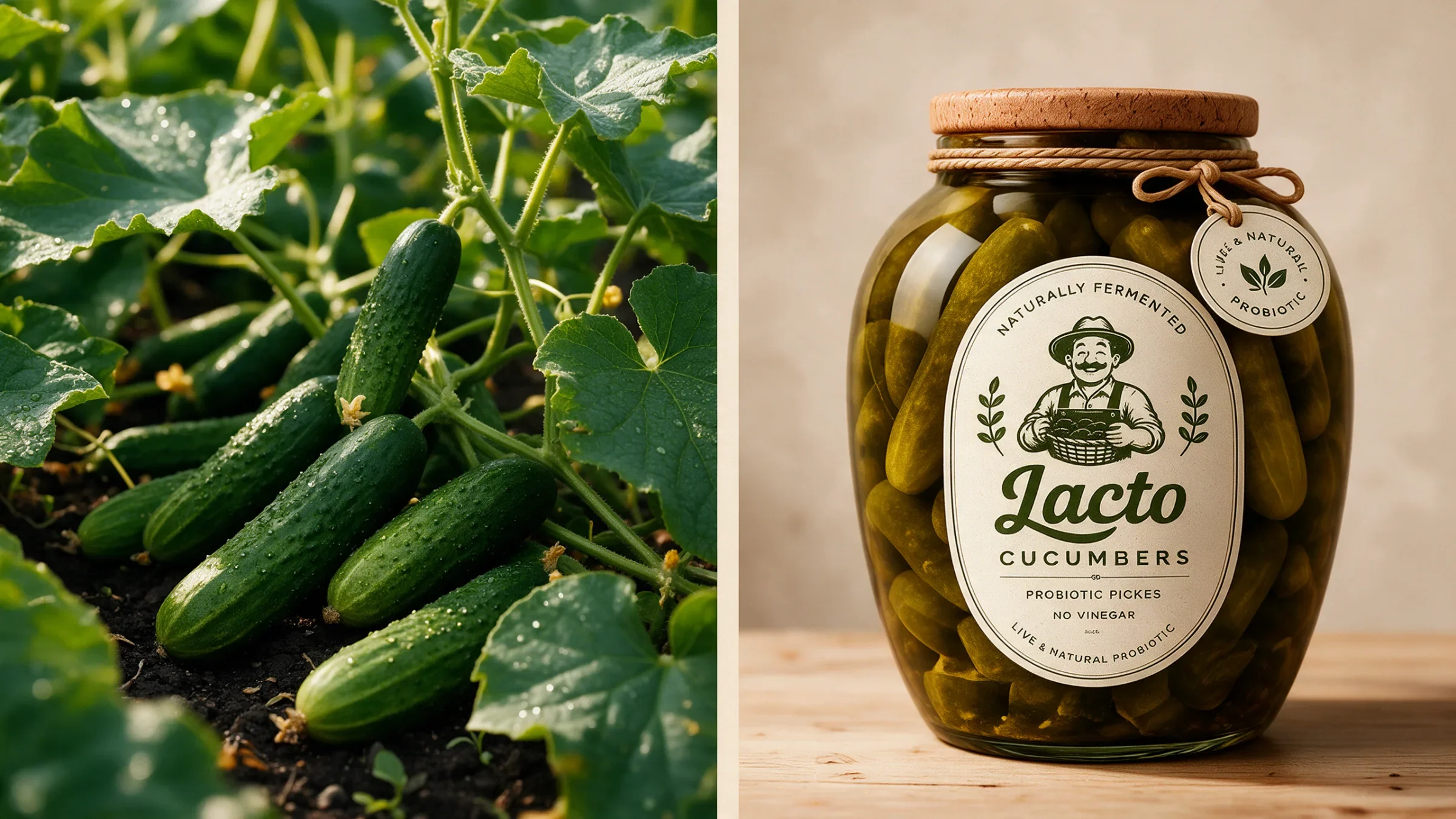
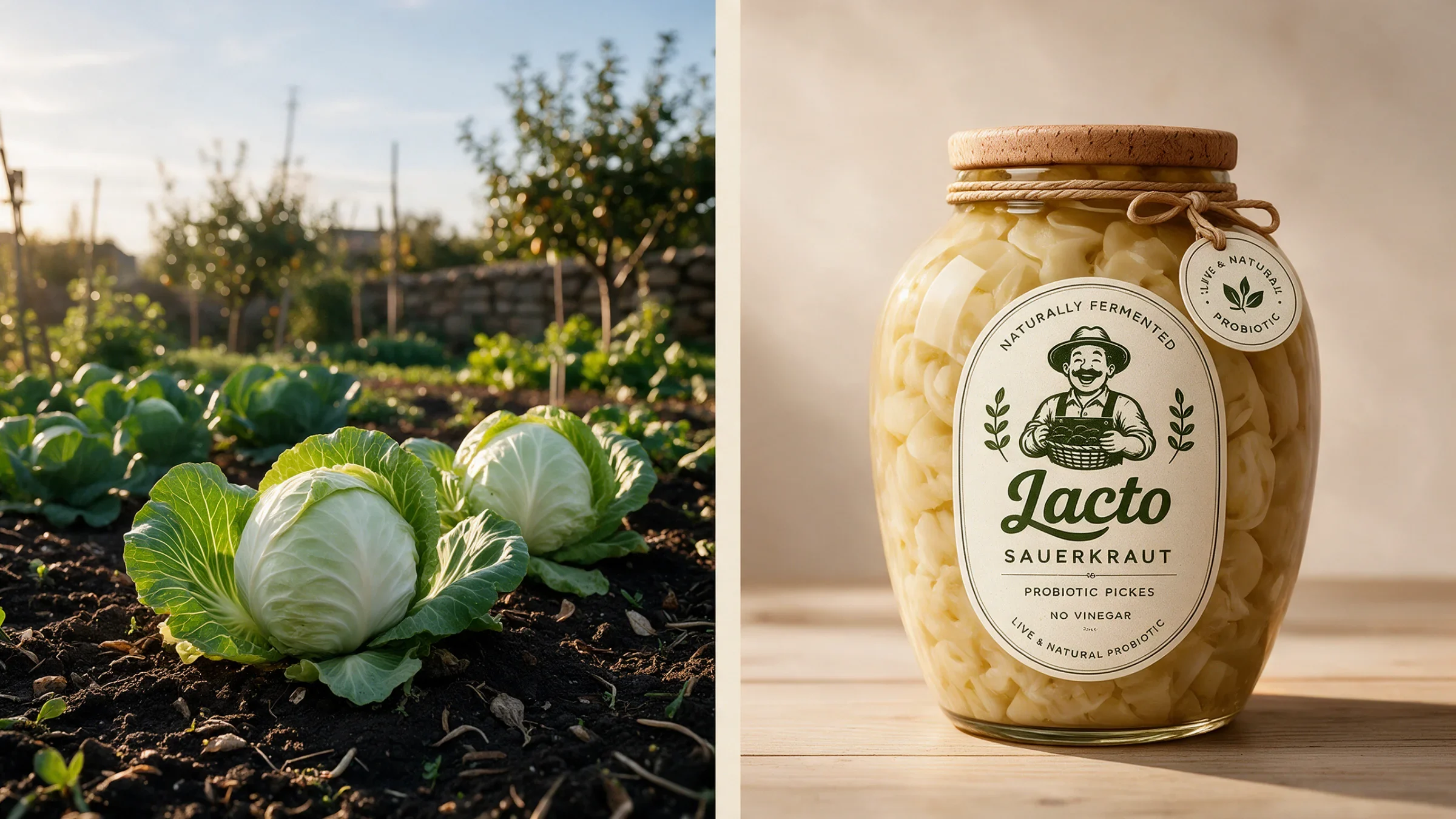
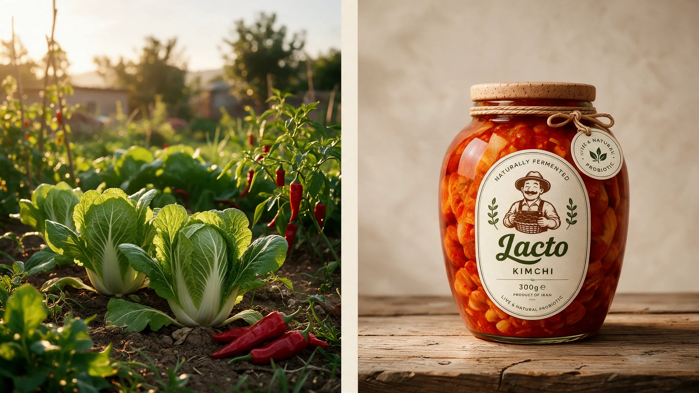
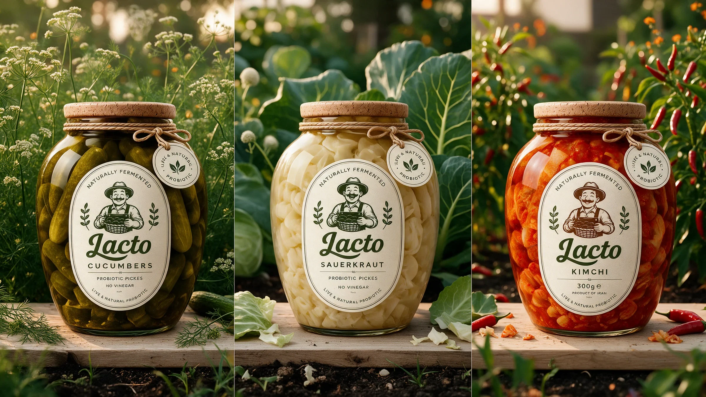
Cucumbers, sauerkraut and kimchi share a recognisable label structure: the script name, a central character and decorative vegetable details. Cream and olive treatments vary the expression while the jars reveal different contents. Together, these elements give the family consistency without making every product identical.
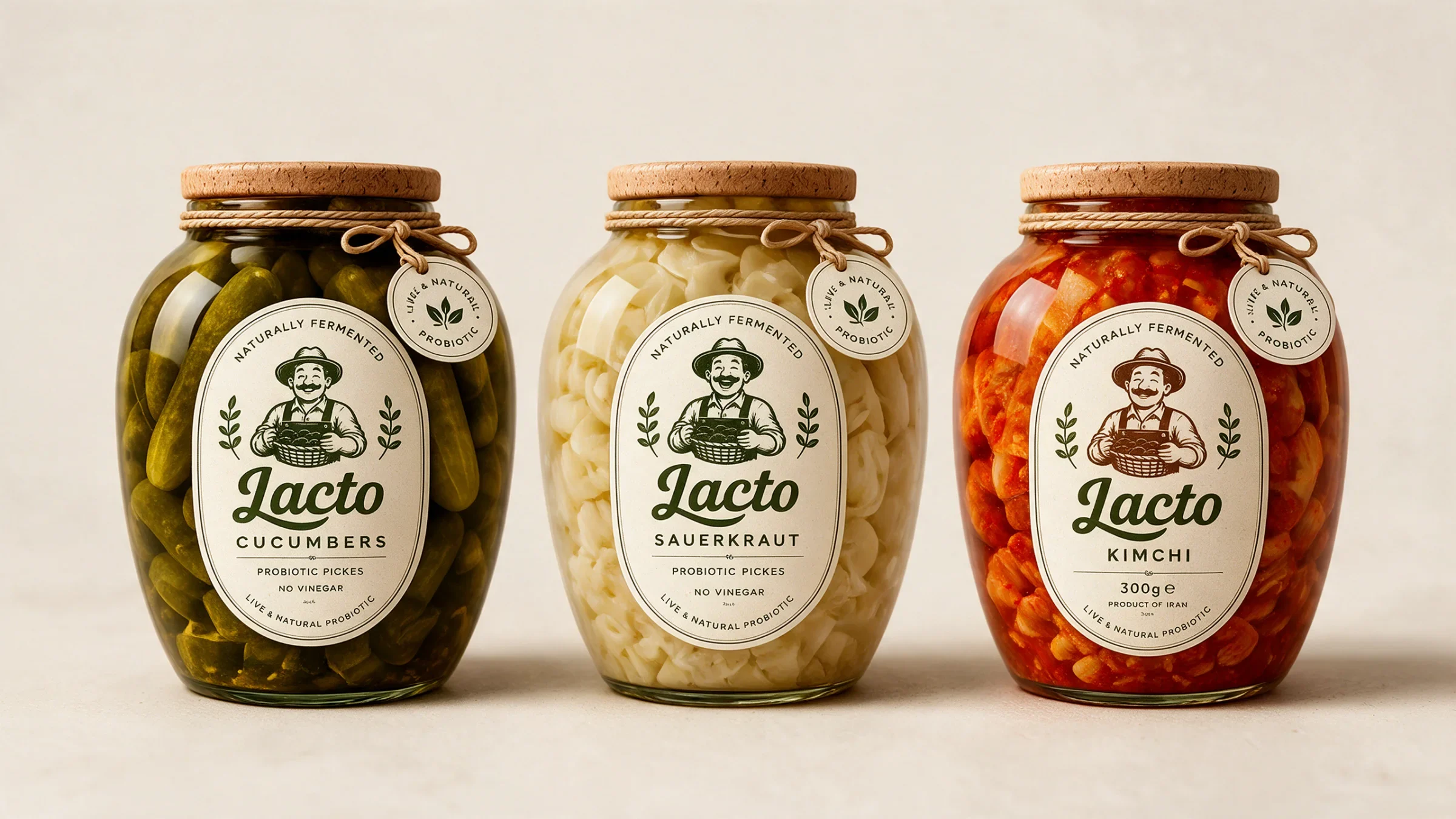
The ingredient stays in the picture
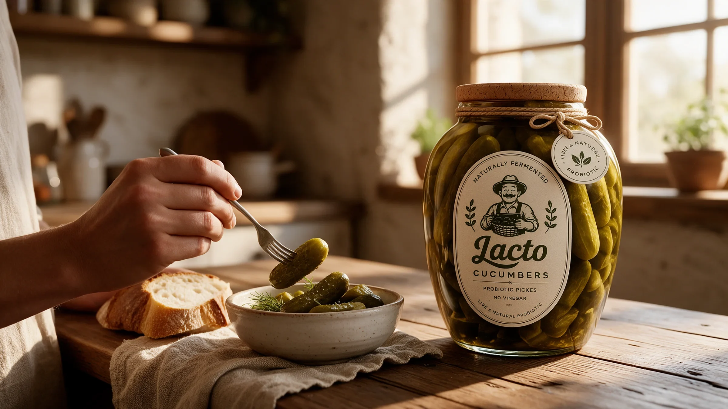
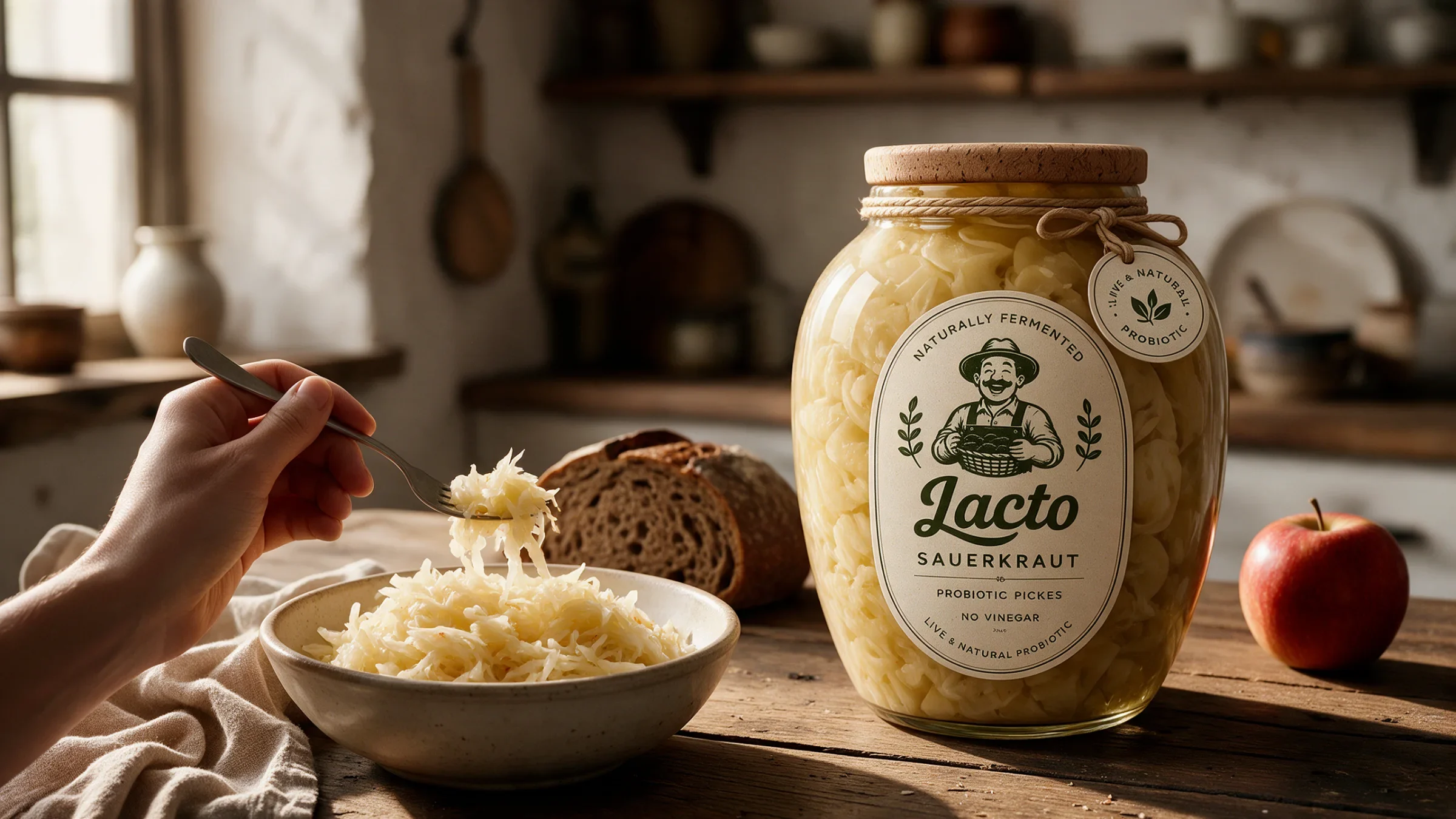
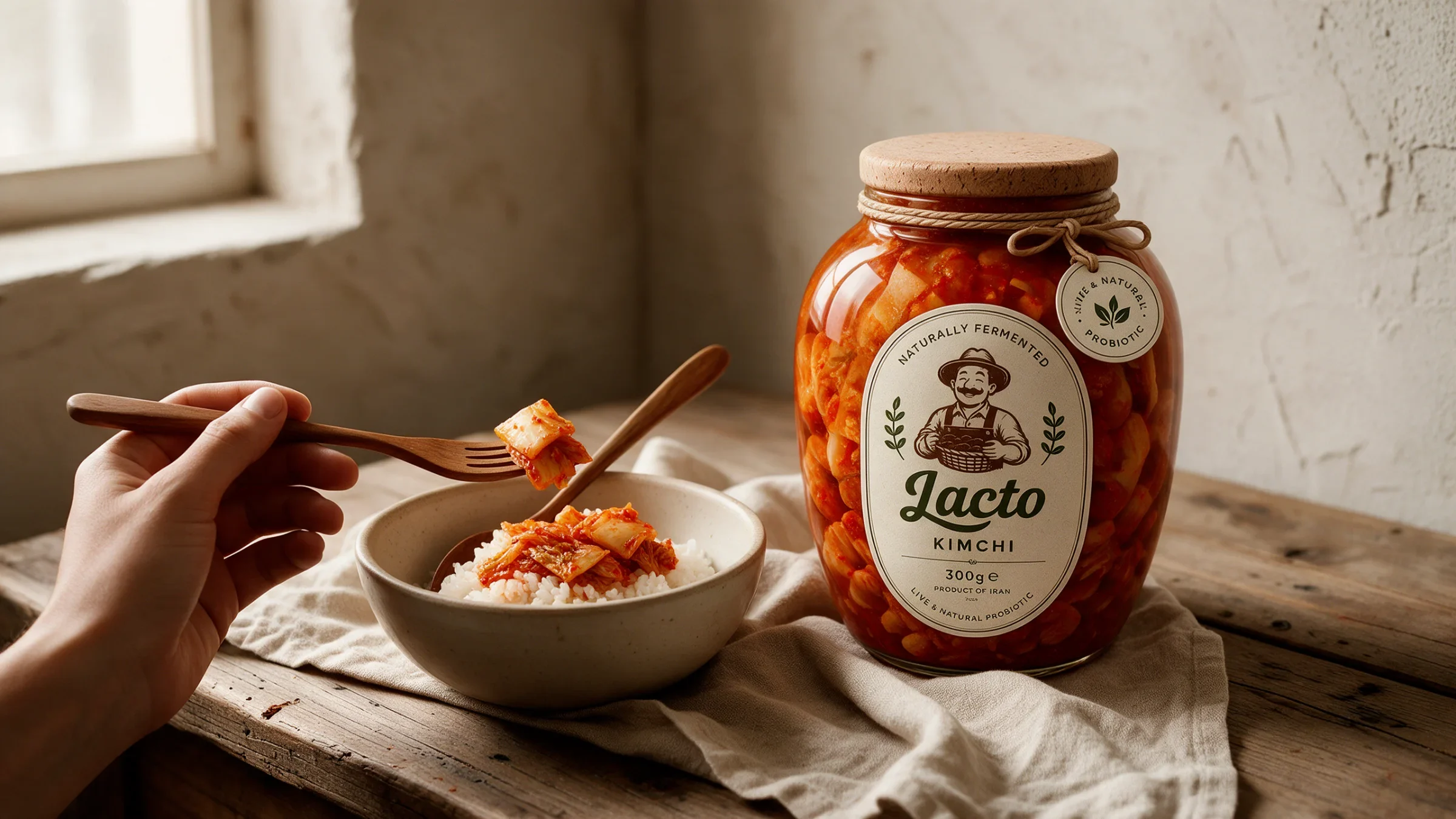
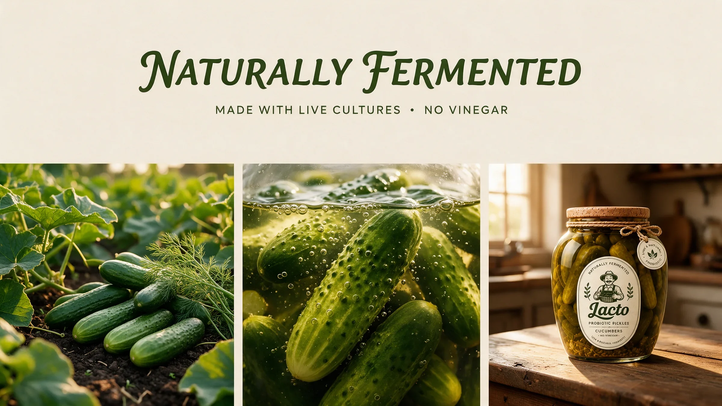
Each paired scene places a jar beside the vegetables that define it. The garden photographs introduce texture and colour beyond the label, connecting the illustrated identity with a more tactile food world. The sequence moves from green cucumbers to pale cabbage and red kimchi.
A brand made for everyday moments
The kitchen scenes bring the packaging into use, with bowls, bread and hands around the jars. Warm light and wooden surfaces echo the label’s cream and cork tones. The images change the scale of the story from a product family to a meal.
A shared language beyond the label
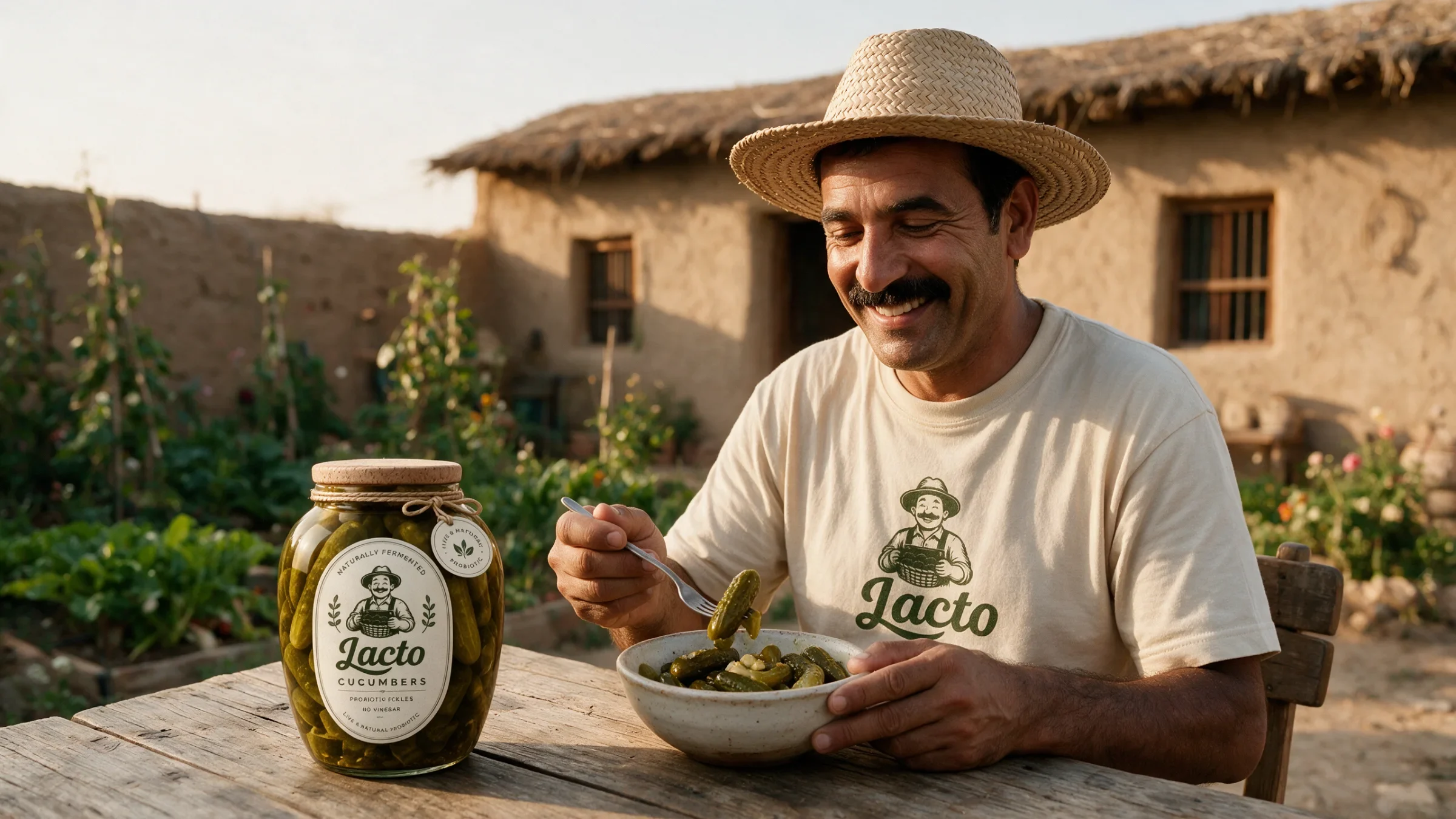
The gift-box mockup gathers the three varieties into one set, while the grower scene connects the illustrated character with the brand’s wider imagery. The fermentation-themed board adds another communication format. Each application uses the same palette and familiar mark to carry the story.
A food family ready for the table
The wordmark, grower and label structure connect the three varieties to gift packaging and kitchen imagery. Transparent jars keep the contents visible; illustrated ingredients make the range feel familiar. The system carries the same warmth from a shelf view into a meal.