AuraLeaf
AuraLeaf’s botanical identity pairs a refined wordmark and leaf drawings with a coordinated glass-bottle family and brand applications.

A botanical visual identity for AuraLeaf pairs a restrained wordmark with glass-bottle studies, leaf illustrations and a deep-green brand environment.
Connect botanical imagery and precise product presentation in a coherent identity that can extend from small bottle labels to digital and environmental applications.
Visual identity, packaging visualisation and brand applications.
Typography and palette boards, botanical illustration series, bottle-design studies, packaging and digital mockups, stationery and environmental presentations.
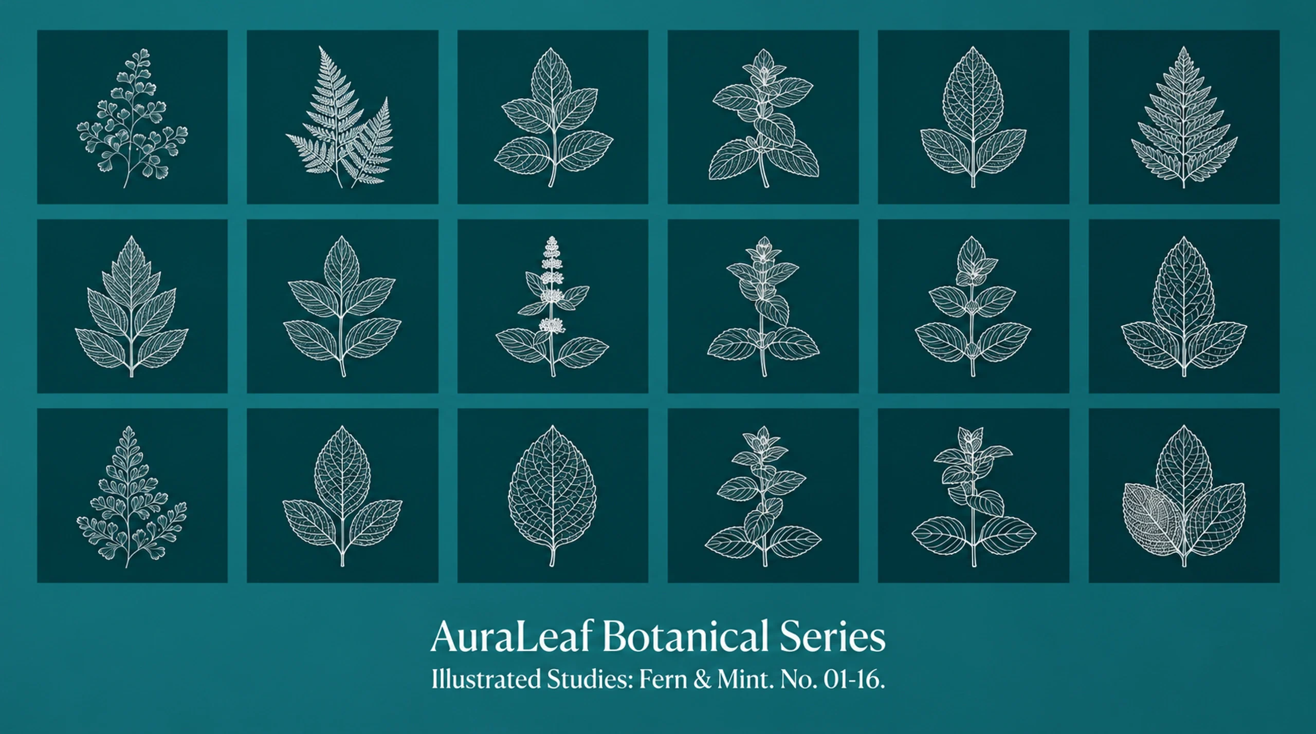
Fine plant drawings and deep green connect the bottle family to packaging, stationery and larger brand applications. Product scenes carry more colour and texture; smaller communication pieces use a quieter version of the identity.
Design presentation by Ali Komeili. Product, interface and environmental applications are shown as presentation mockups.
Bring botanical care into focus
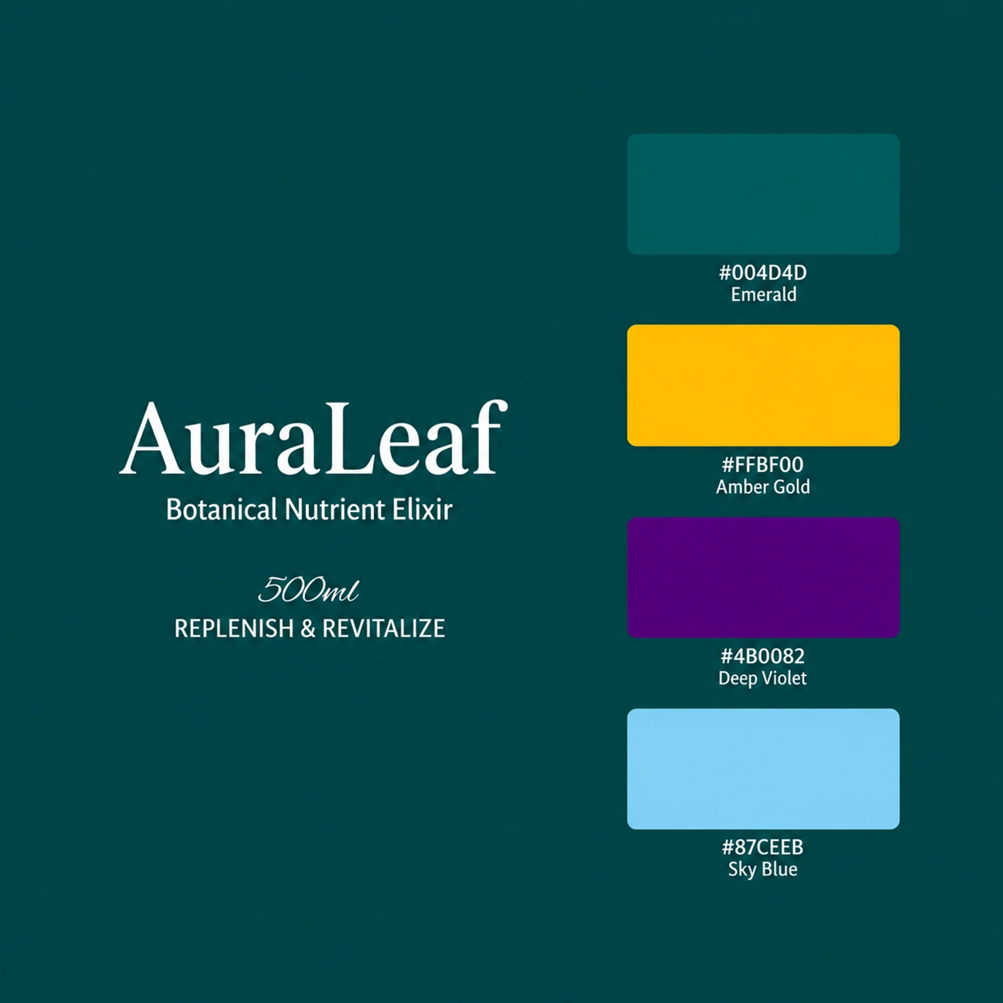
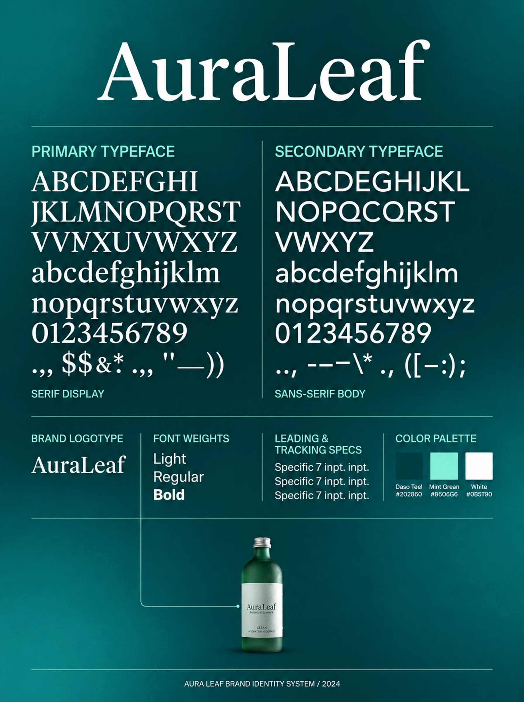
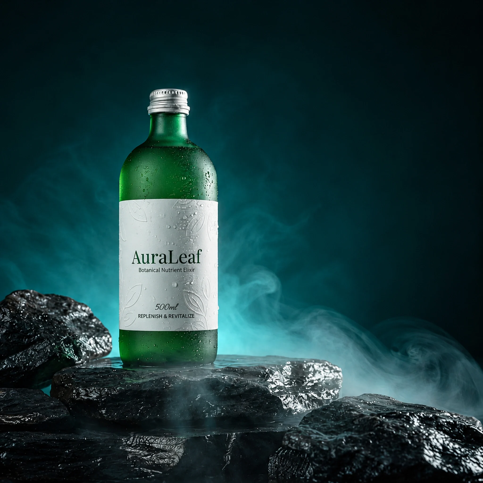
AuraLeaf places botanical care within a refined product world. The identity speaks through a restrained serif name, fine plant drawings and glass bottles that give colour and material a visible role. Deep green provides the common setting, keeping the varied product scenes connected to a calm, considered brand character.
Let the bottle carry the variation
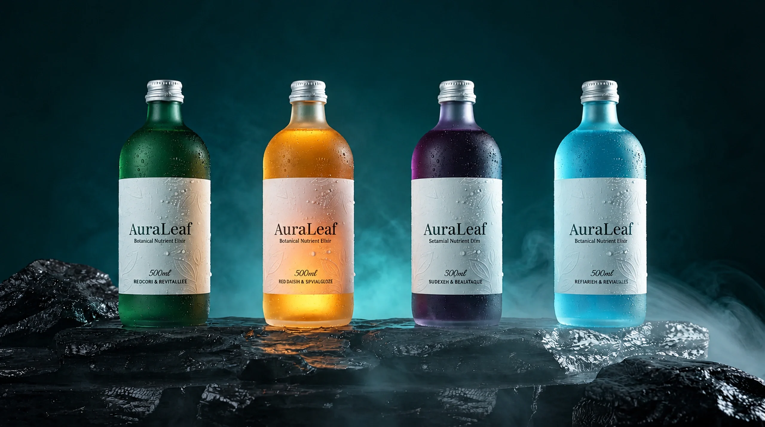
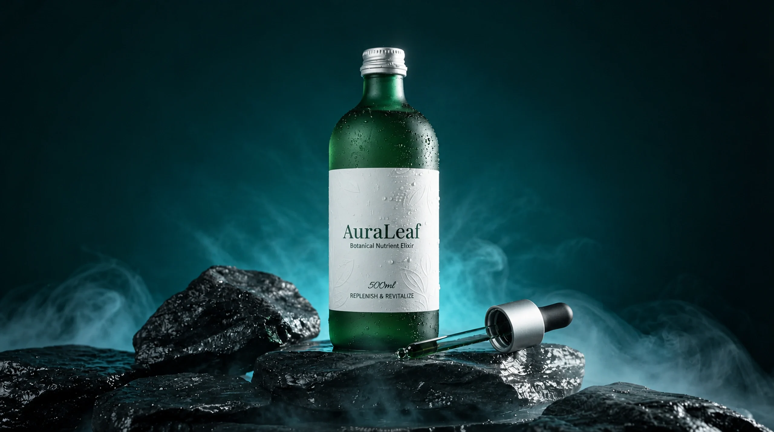
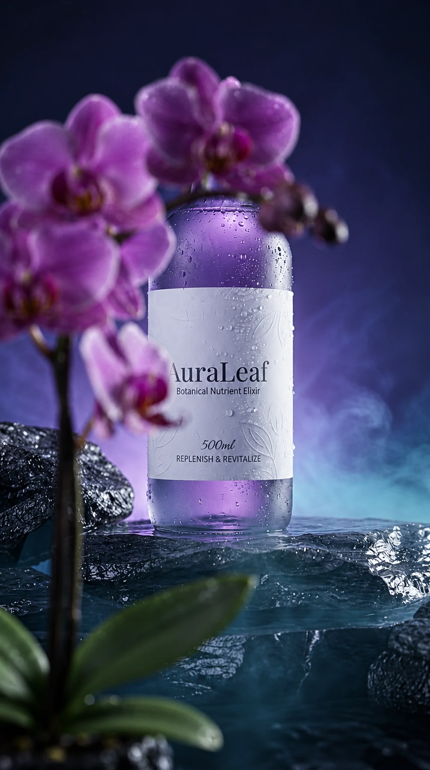
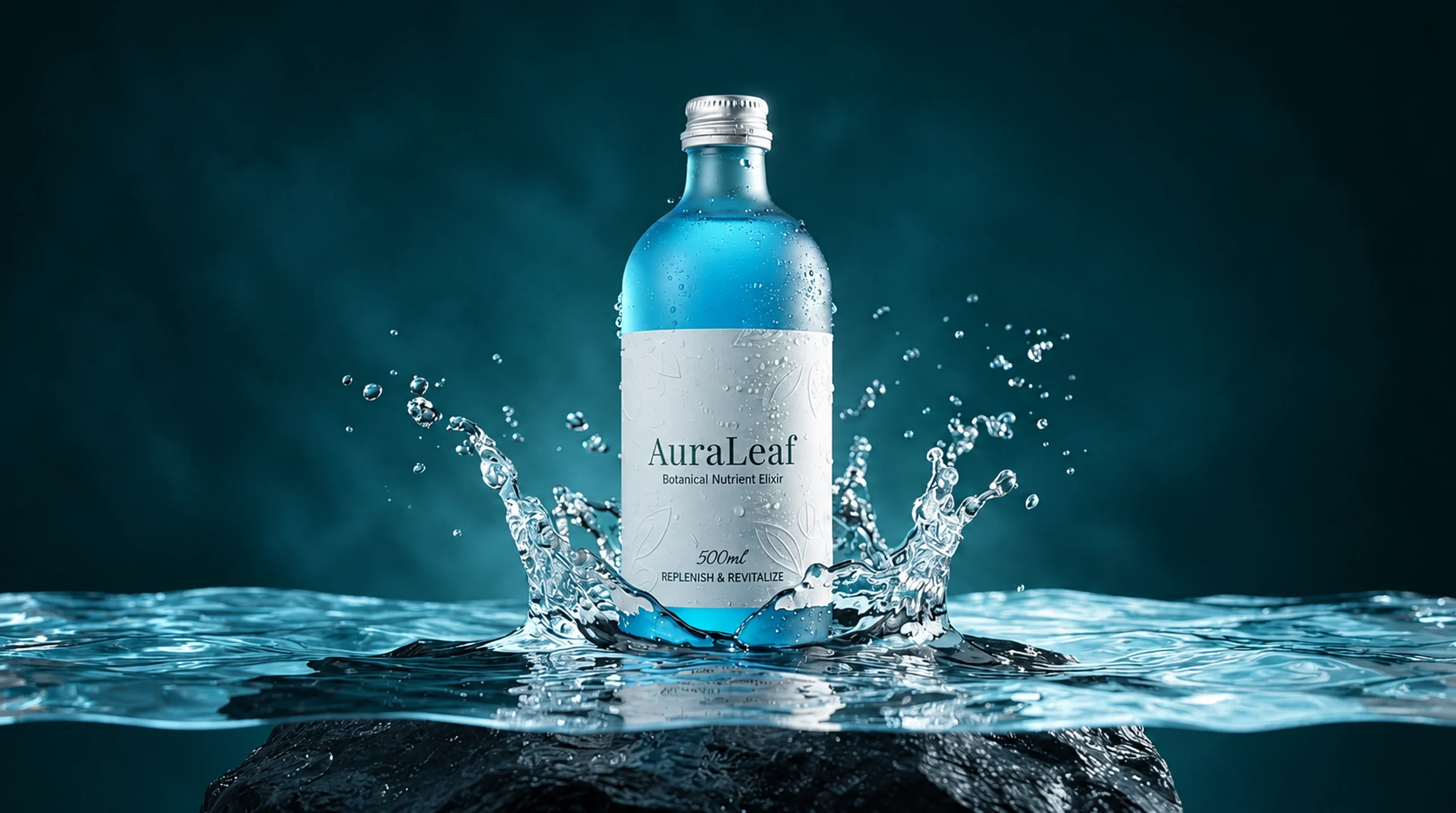
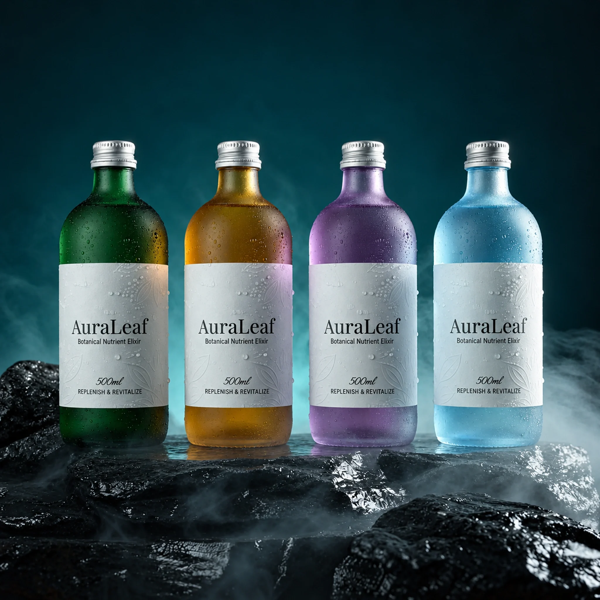
The vessel, patterned closure and small label remain consistent while amber, violet and blue change the surrounding mood. Autumn leaves, flowers and water extend each colour into a scene. A restrained name gives those material and botanical details room without losing the product’s identity.
The object gives the identity shape
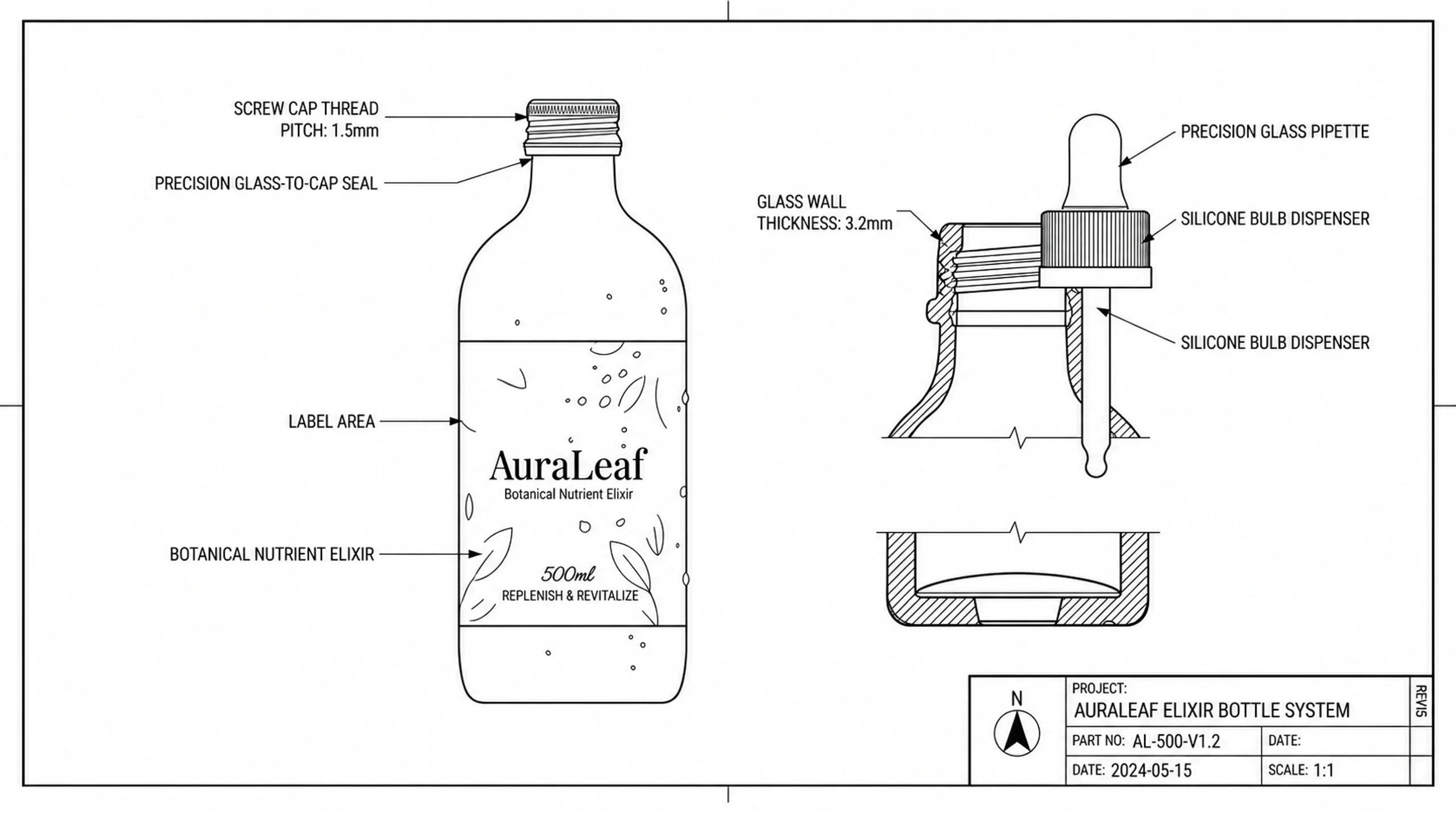
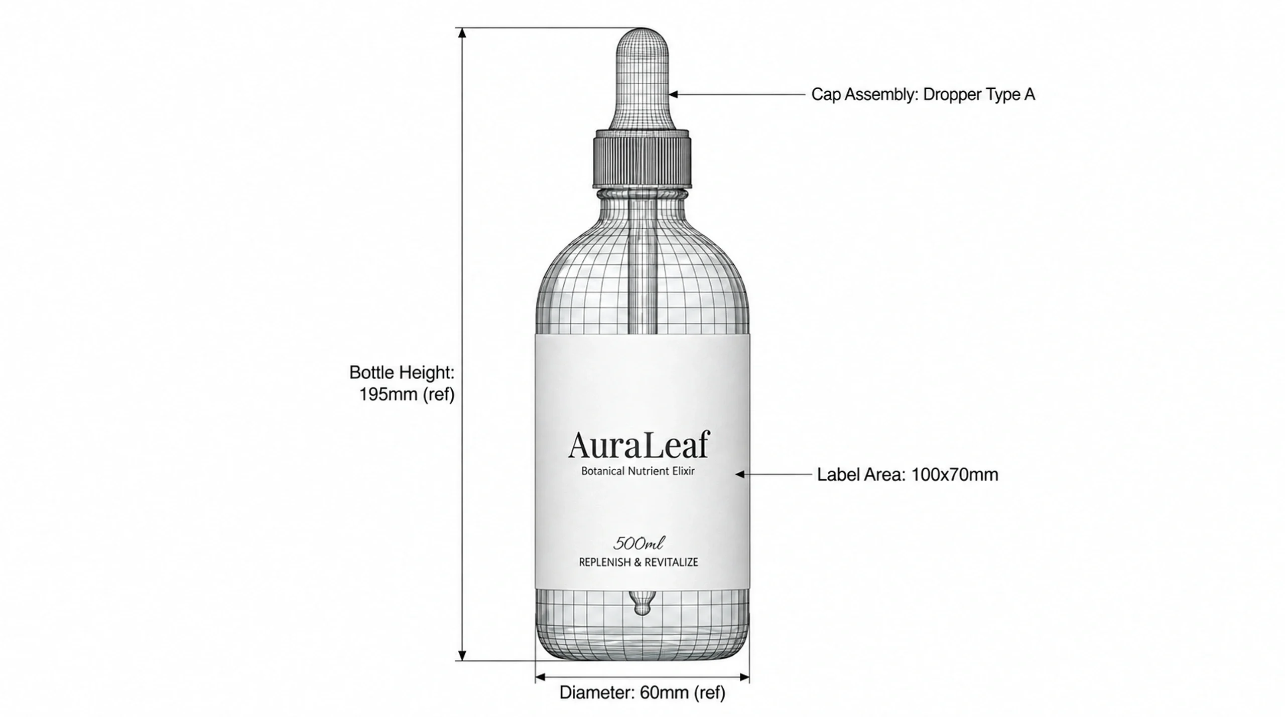
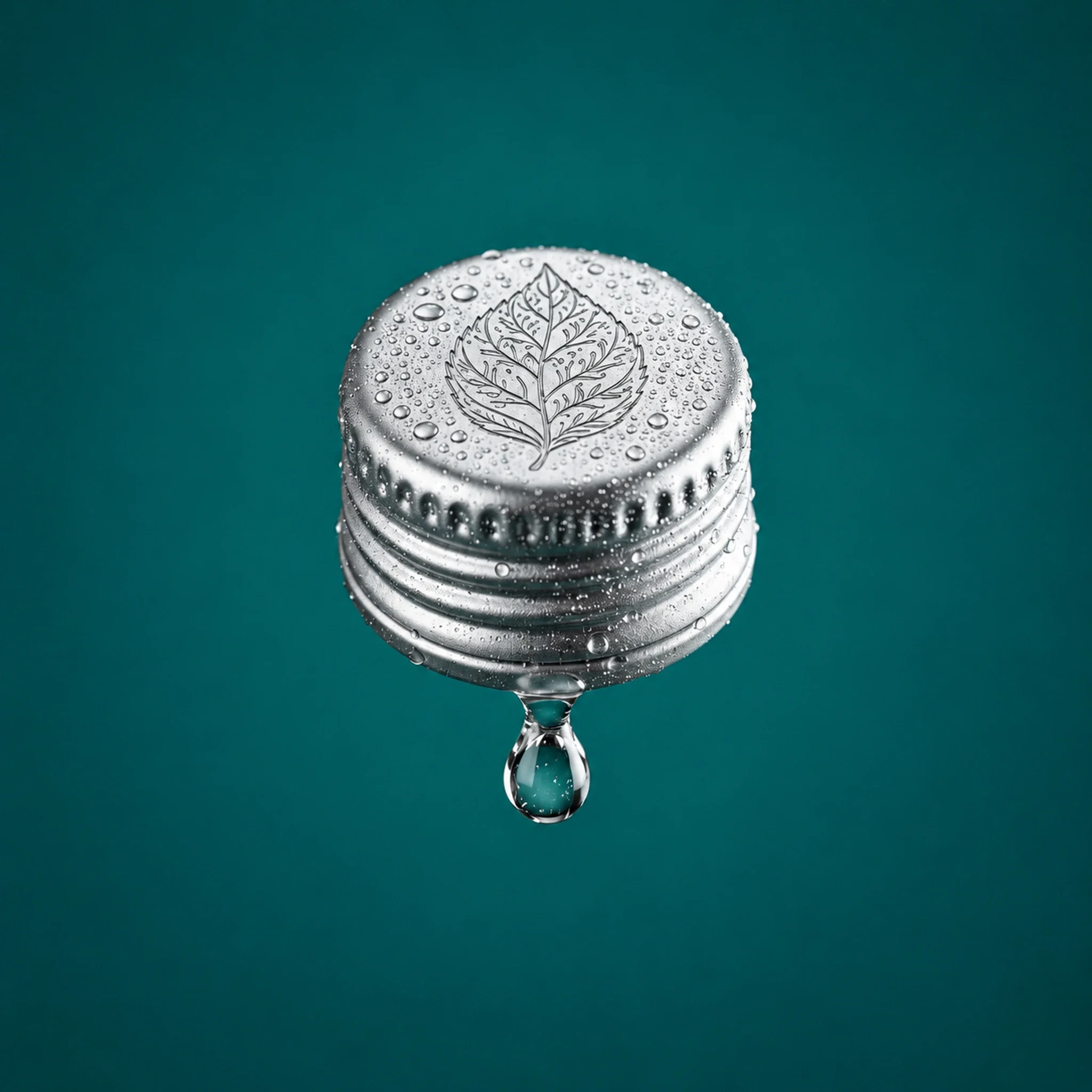
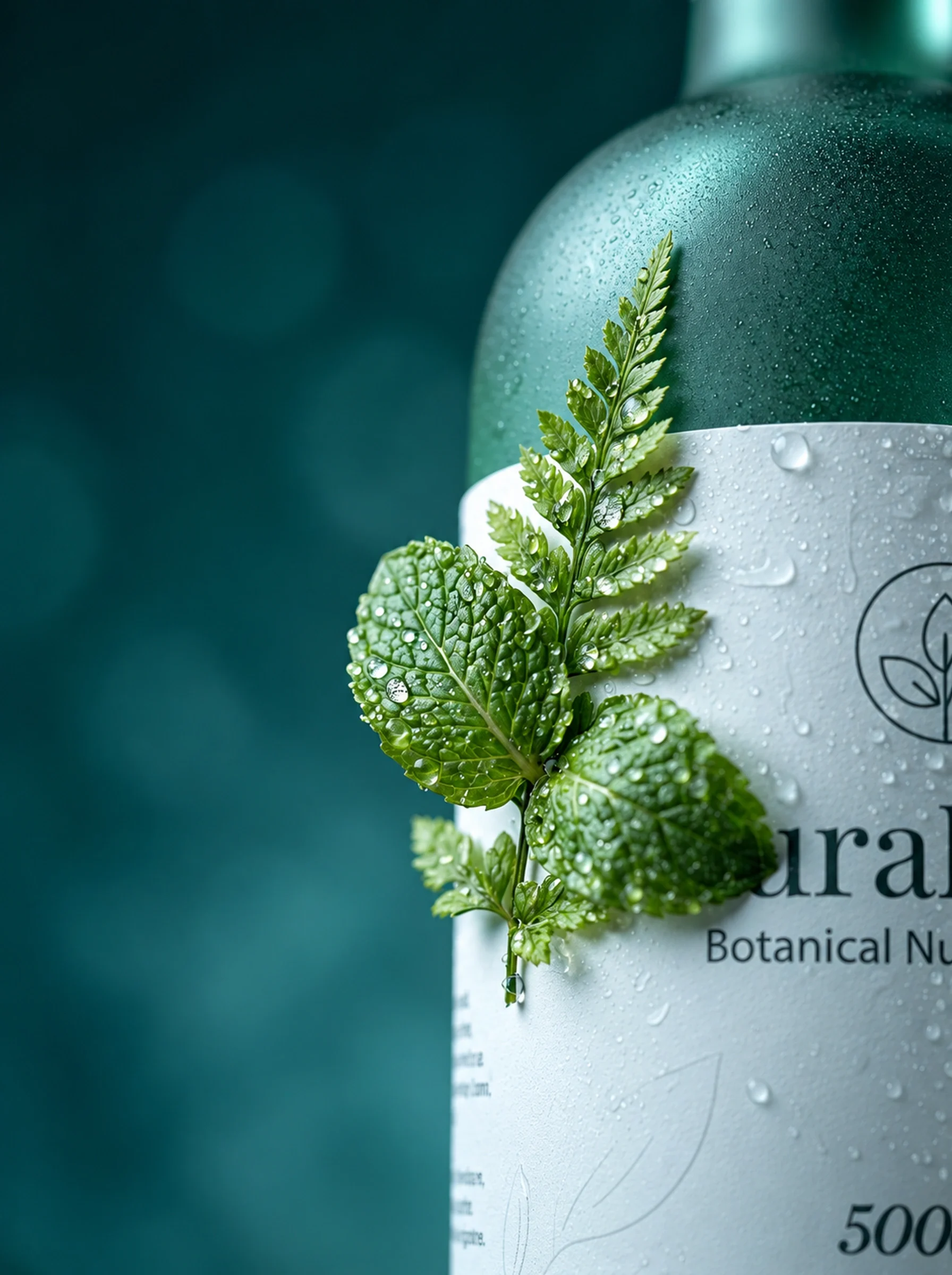
The bottle studies separate the form into a main vessel, closure and dropper. Technical-style drawings show how those elements relate, while the closure detail returns to their visual character.
Each colour creates its own scene
Amber, violet and blue move the bottle into different visual settings: autumn leaves, flowers and water. The bottle shape and quiet label remain consistent across those changes. The repeated form gives the family coherence while colour and surrounding texture create a different mood for each scene.

From the bottle to the hand
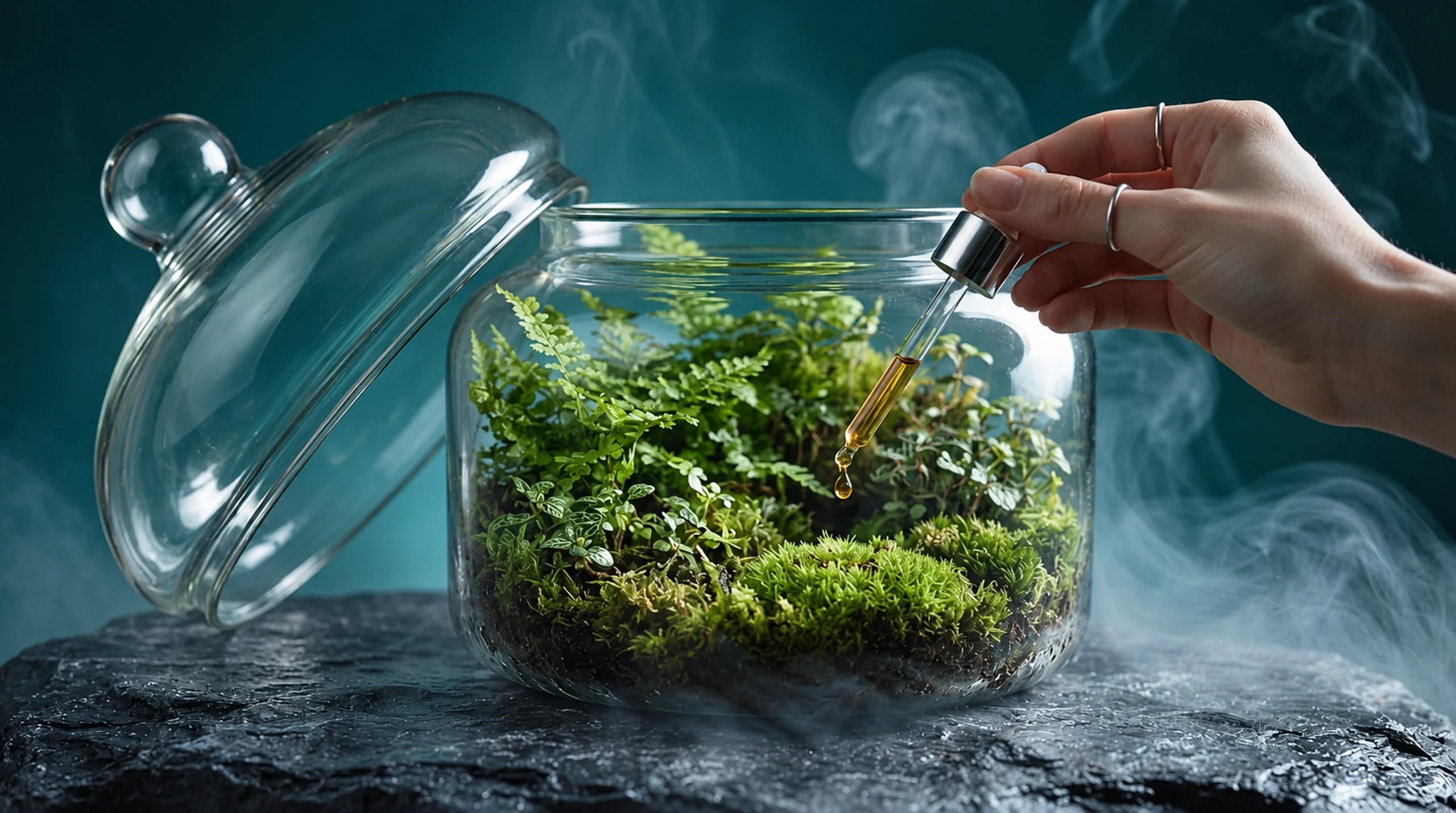
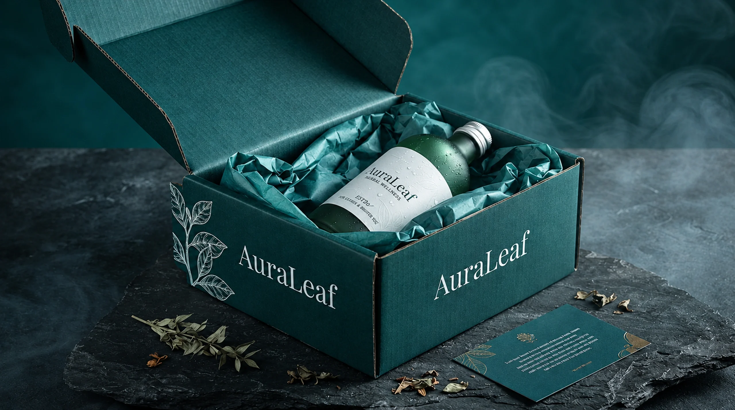
The handheld and terrarium scenes change the focus from a still object to a gesture. The boxed set gathers the identity into an unboxing presentation. These supplied mockups explore possible brand contexts, keeping the same green palette and measured typography across very different compositions.

The identity works at a smaller scale
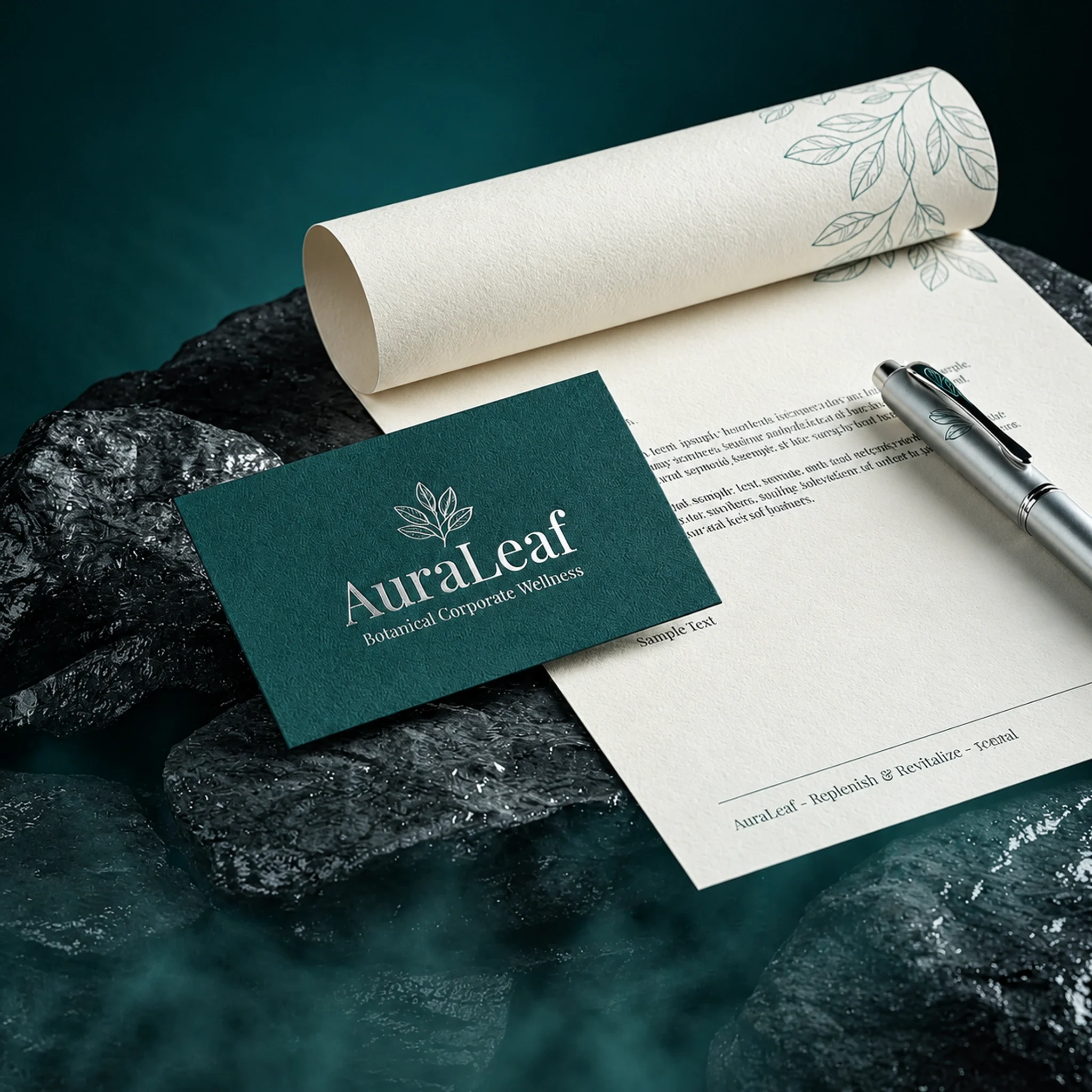
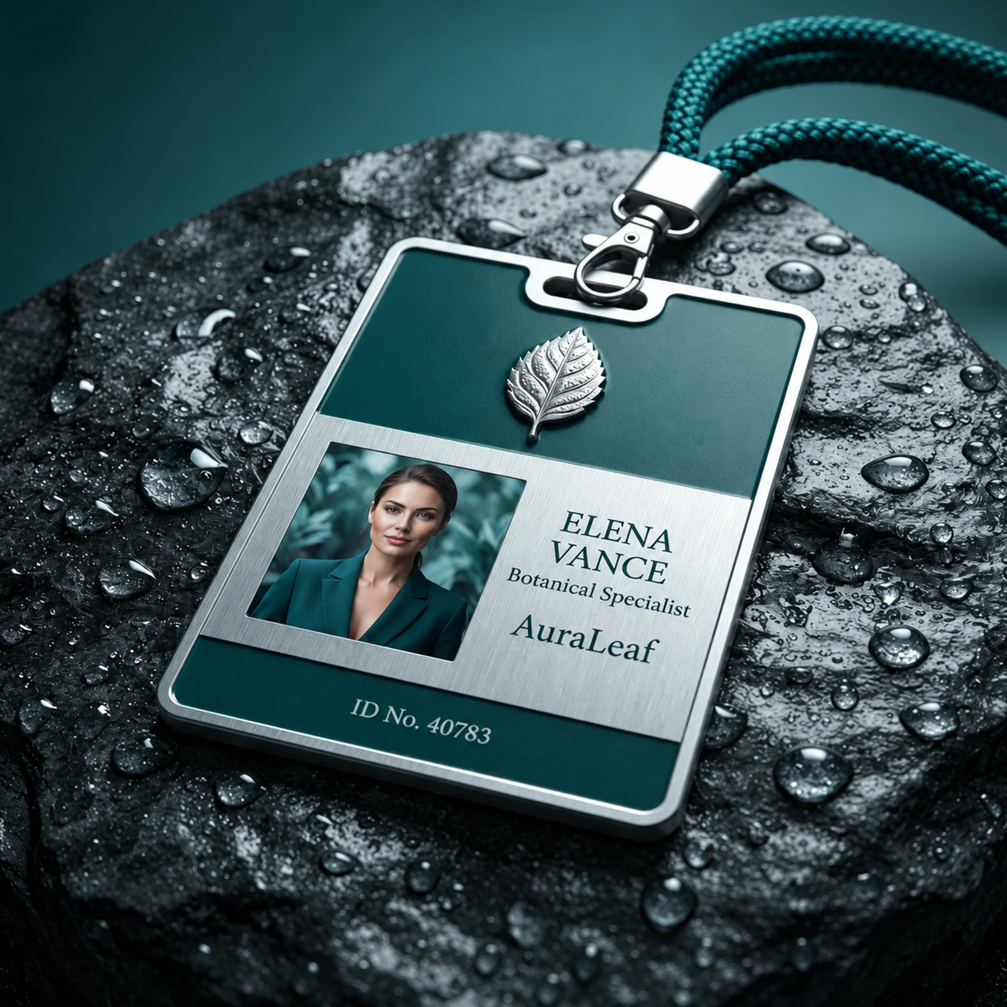
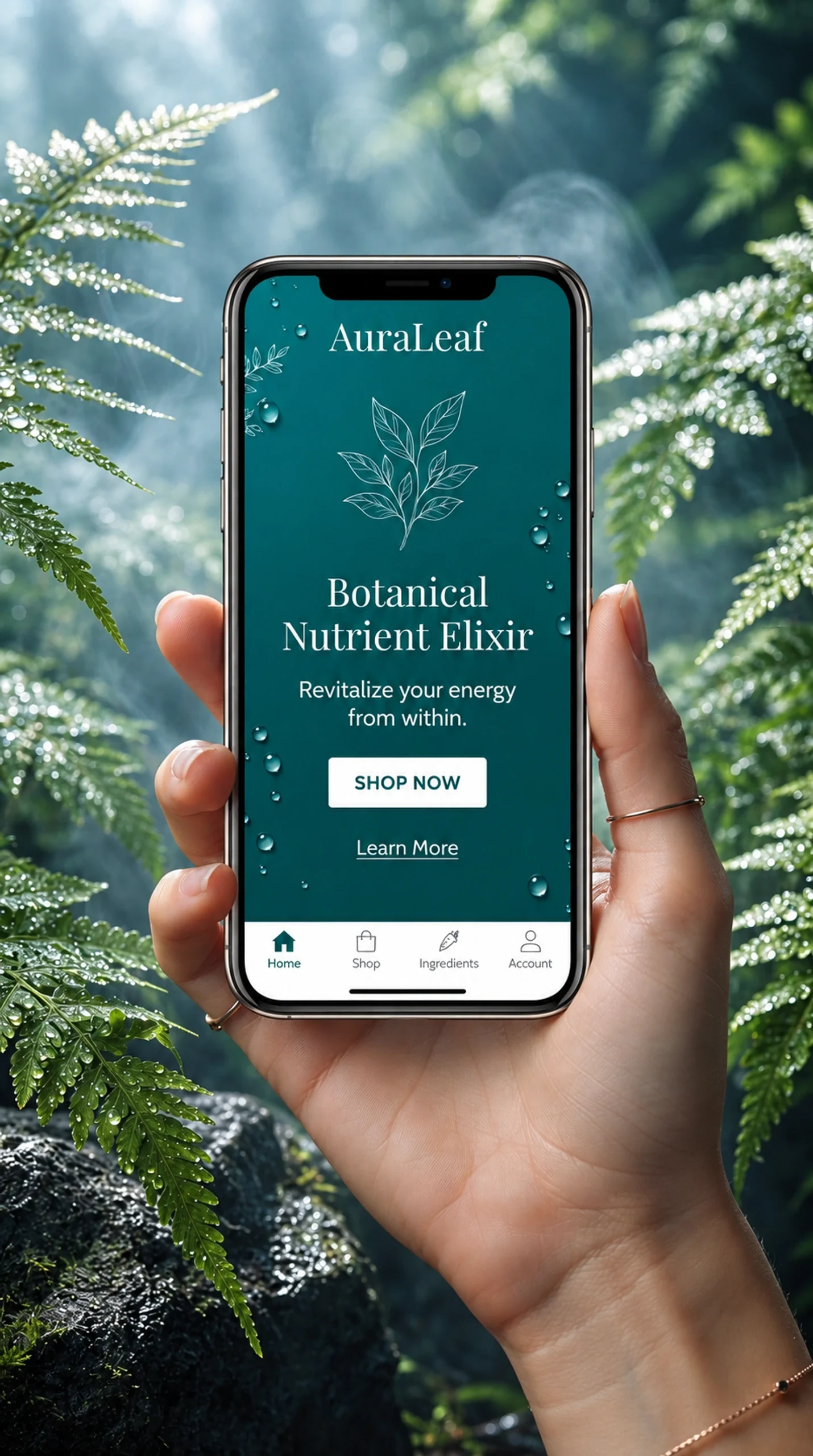
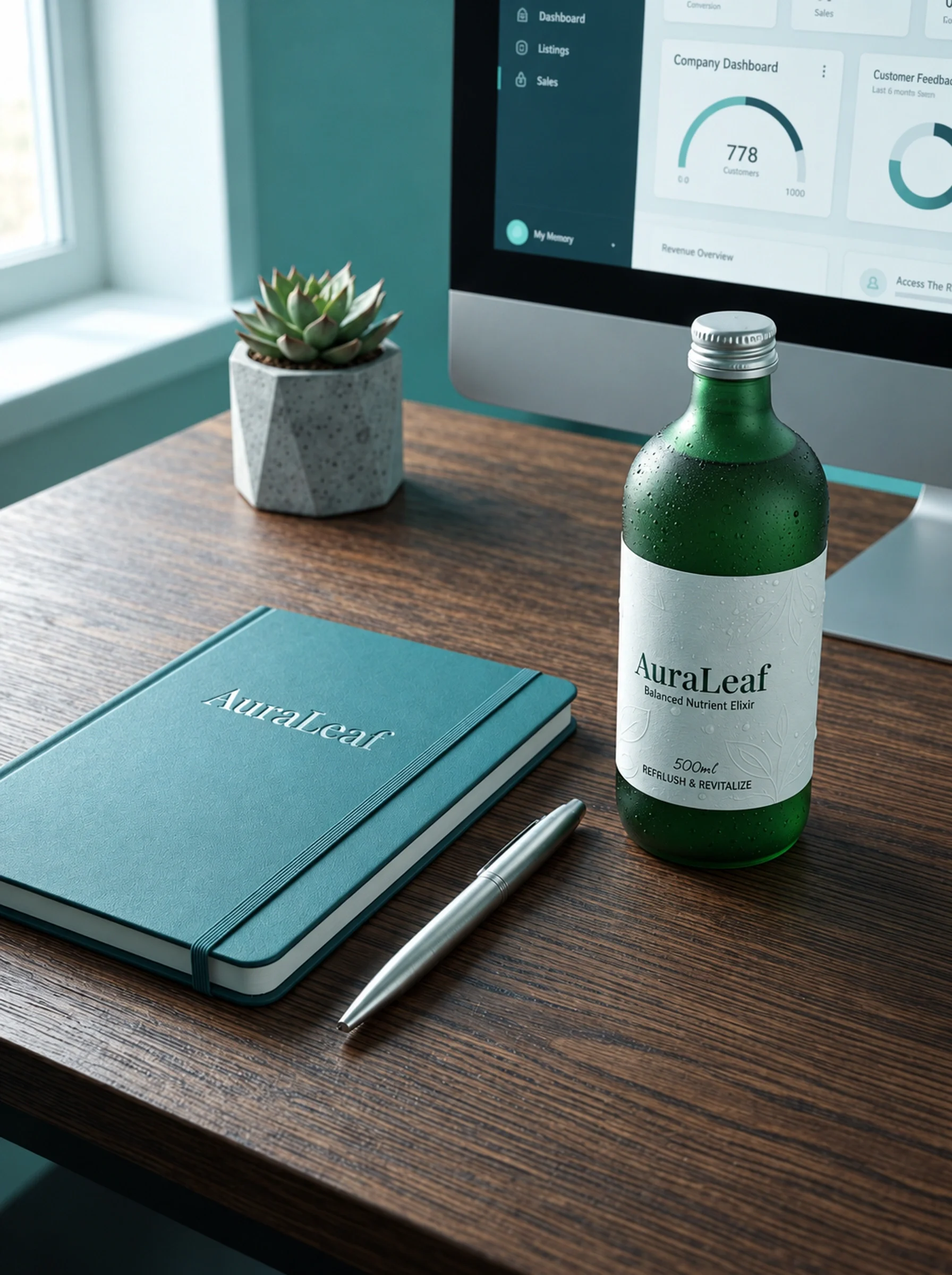
Stationery, a staff badge and a mobile page show a quieter version of the visual system. The wordmark and green field do most of the work, with botanical details used selectively. The desk presentation connects these smaller pieces back to the bottle.
A visual world beyond packaging
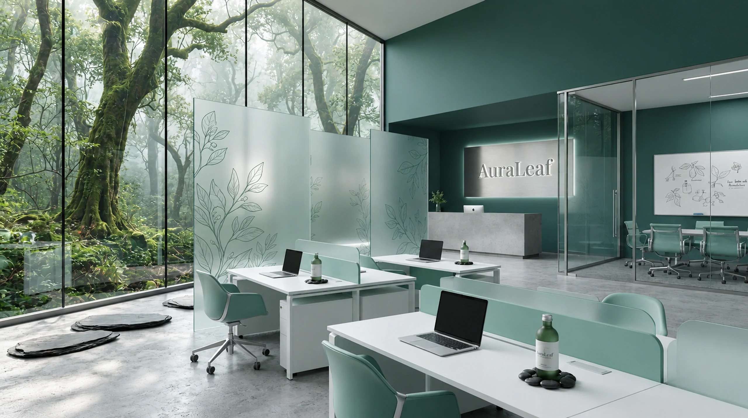
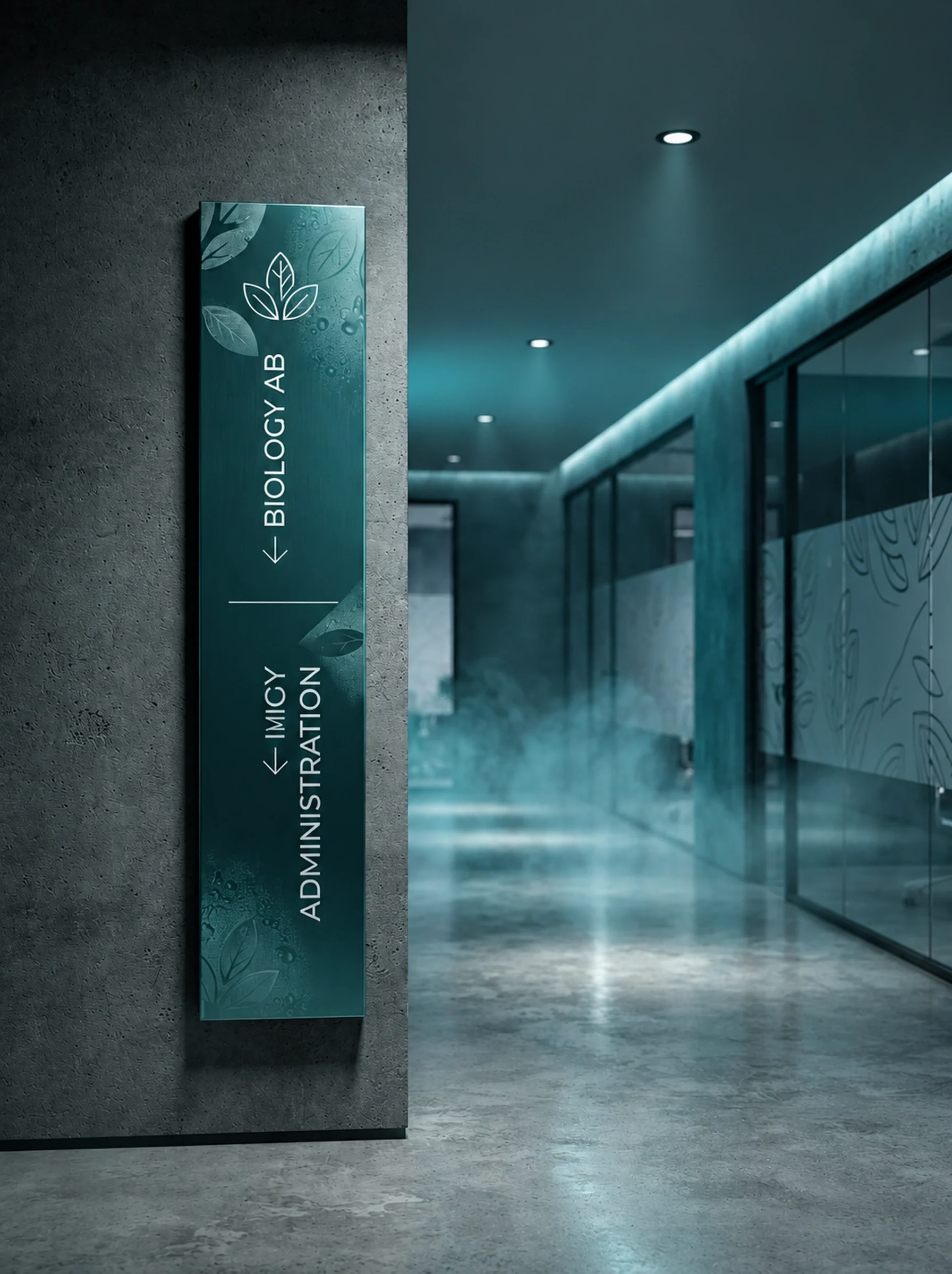
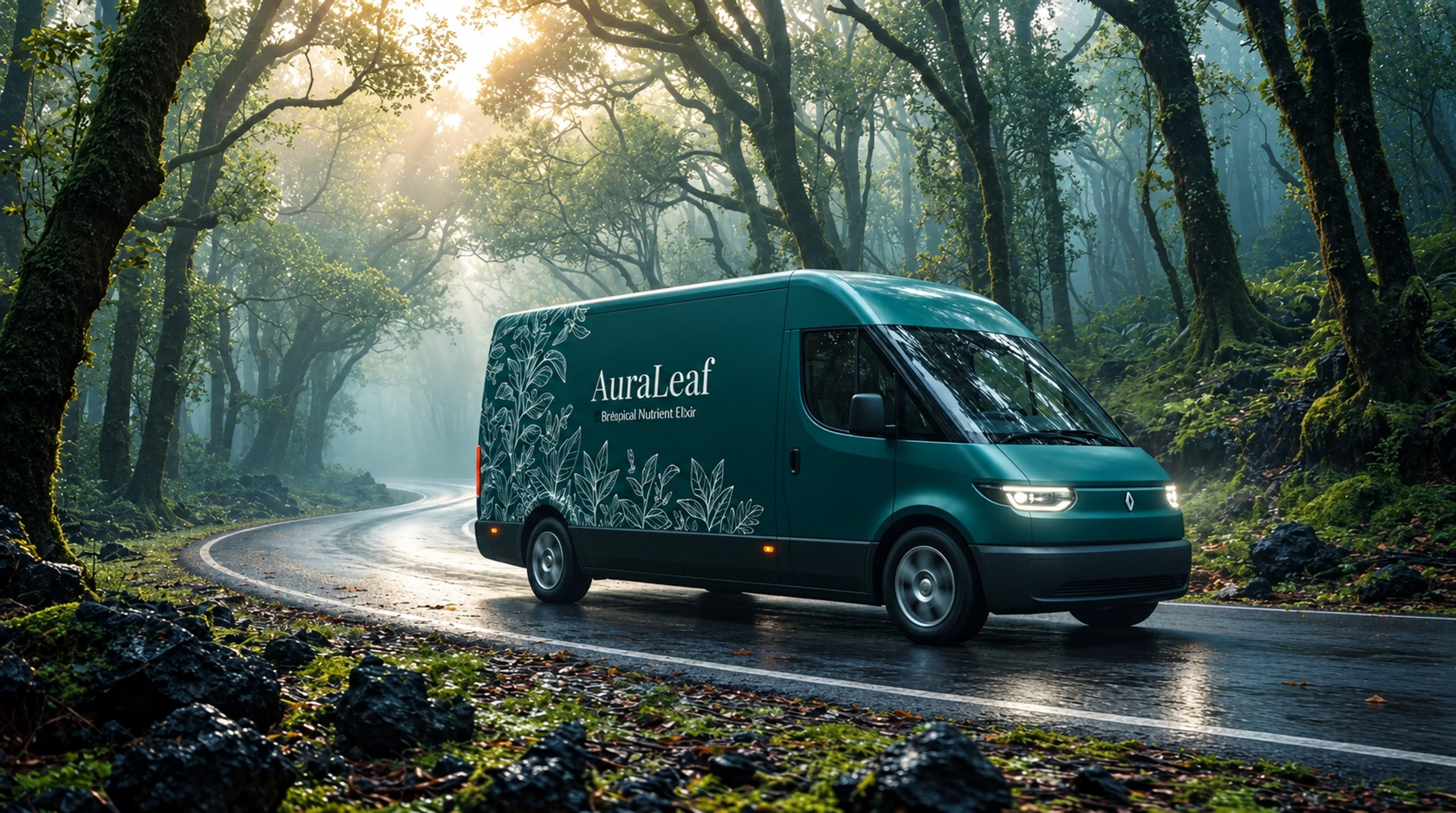
The workspace, interior sign and vehicle mockups extend the identity into larger settings. Muted green surfaces and restrained branding keep the environmental scenes connected to the product imagery. Together, they show the proposed system moving from a small printed label to a surrounding brand world.
A botanical world across scales
Fine plant drawings and deep green connect the bottle family to packaging, stationery and larger brand applications. Product scenes carry more colour and texture; smaller communication pieces use a quieter version of the identity. The result keeps a shared atmosphere across very different surfaces.